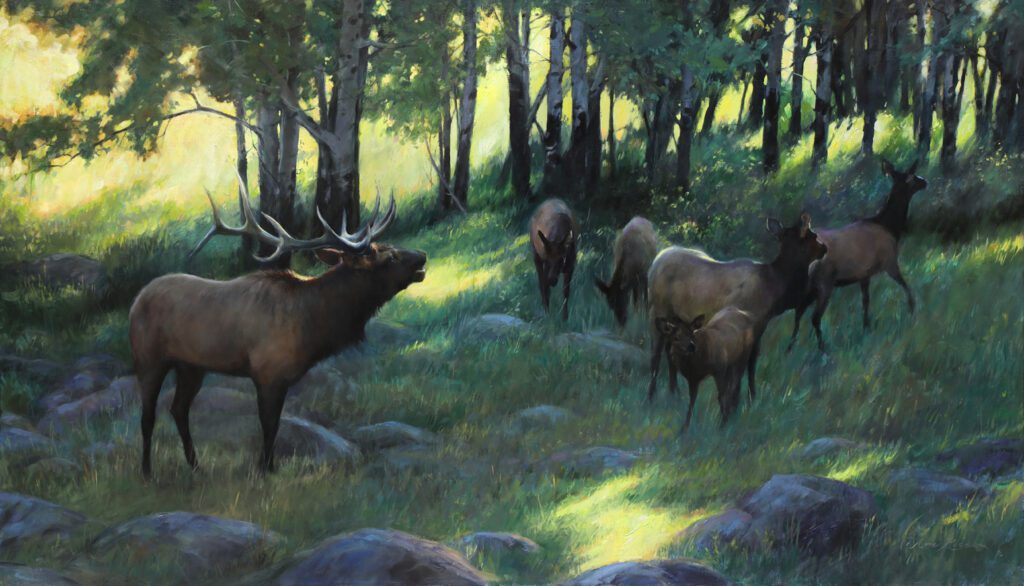
• Skip to primary navigation
  • Skip to main content
  • Skip to footer
  • Help Desk
  • My Account

OPA - Oil Painters of America

Dedicated to the preservation of representational art

  • Home
  • About
    • Mission, Policies & Bylaws
    • Board of Directors
    • Presidential History
    • Frequently Asked Questions
    • History
    • OPA Staff
    • Contact Us
  • Membership Services
    • Member Login
    • Membership Information
    • State & Province Distribution For Regionals
    • Update Member Information
    • Membership Directory
    • Contact Membership Department
  • Events
    • Exhibitions
    • Online Showcase
    • Lunch and Learn
    • Virtual Museum Road Trip
    • Paint Outs
  • Resources
    • Brushstrokes Newsletters
    • Ship and Insure Info
    • Lunch & Learn Video Archives
    • Museum Road Trip Video Archives
  • Services
    • Sponsorship Opportunities
    • Scholarships
    • Critique Services
    • Workshops
    • Have A HeART Humanitarian Award
  • Online Store
  • Awardees
  • Blog
    • OPA Guest Bloggers
    • Blogger’s Agreement (PDF)
    • Comment Policy
    • Advertisement Opportunities
  • Show Search
Hide Search

Archives for August 2021

Skies

Deborah Tilby · Aug 30, 2021 · Leave a Comment

Golden Glow by Deborah Tilby OPAM
12″ x 16″ – Oil

The topic of skies in the landscape comes up all the time with my private students and is a subject with which many painters struggle. I thought I would share a few things I have learned.

I will start with the most obvious, which is that the sky sets the tone of the painting.  If you are depicting a sunset, sunrise, cloudy day, fog or even bright midday sun, the sky should convey that mood. Care must be taken to make sure that the mood established in the sky is carried through the rest of the landscape.

Newer painters often forget that everything in a painting must be bathed in the same light. This means that the landscape must reflect the sky in temperature of light.  This is obvious when painting a strong sunrise or sunset, but can be easy to miss when painting a scene with subdued light, especially when the light is a cooler color temperature.  For example, if the sky’s light is cool and the artist paints the reflected light a warm color temperature, the painting simply will not work. The same temperature MUST be carried throughout the entire painting.
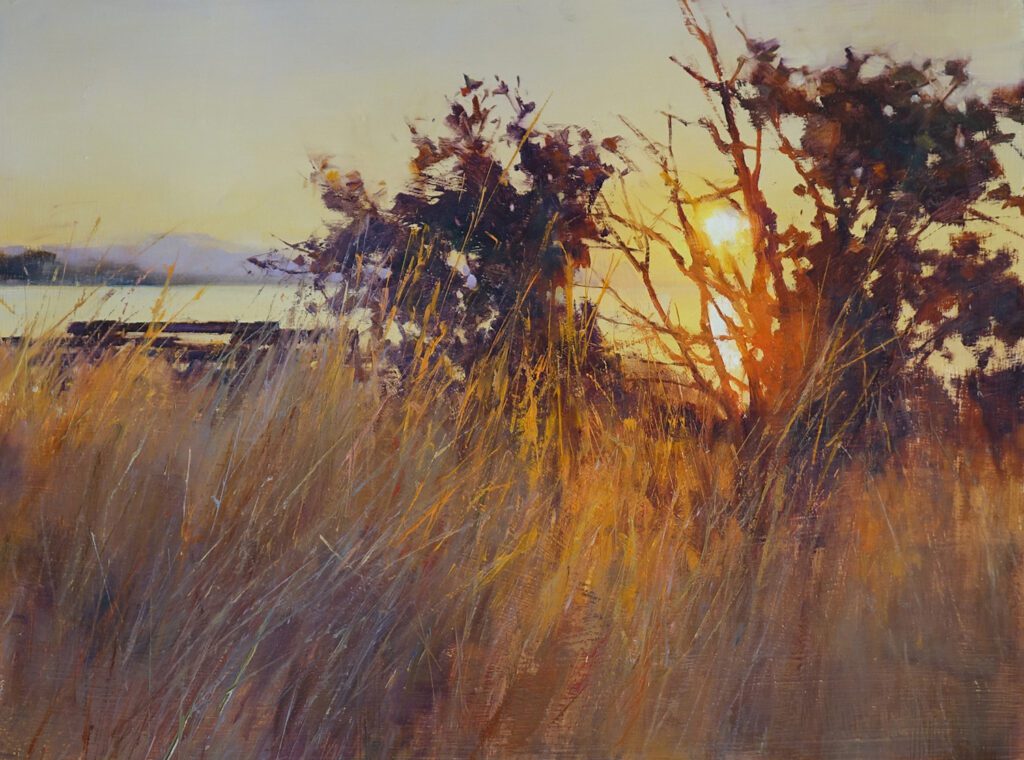
Rainy Day Cows by Deborah Tilby OPAM
20″ x 30″ – Oil

The sky is also an important compositional device and has much to contribute to the overall design. For example, when there are strong diagonals within the landscape, clouds can be arranged to counterbalance with diagonals of their own in the opposite direction (in a subtle manner of course!)  Another example is when the painting contains a series of horizontals in its land forms, the artist can choose to either echo the effect with more horizontals in the clouds, or contrast with more vertical cloud formations.
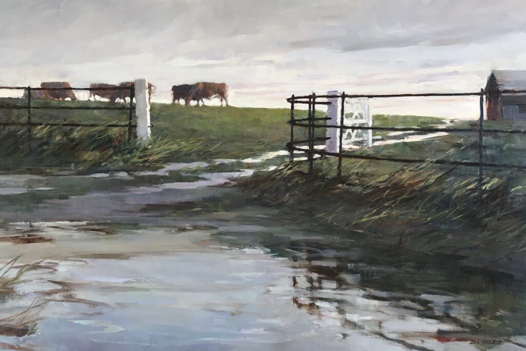
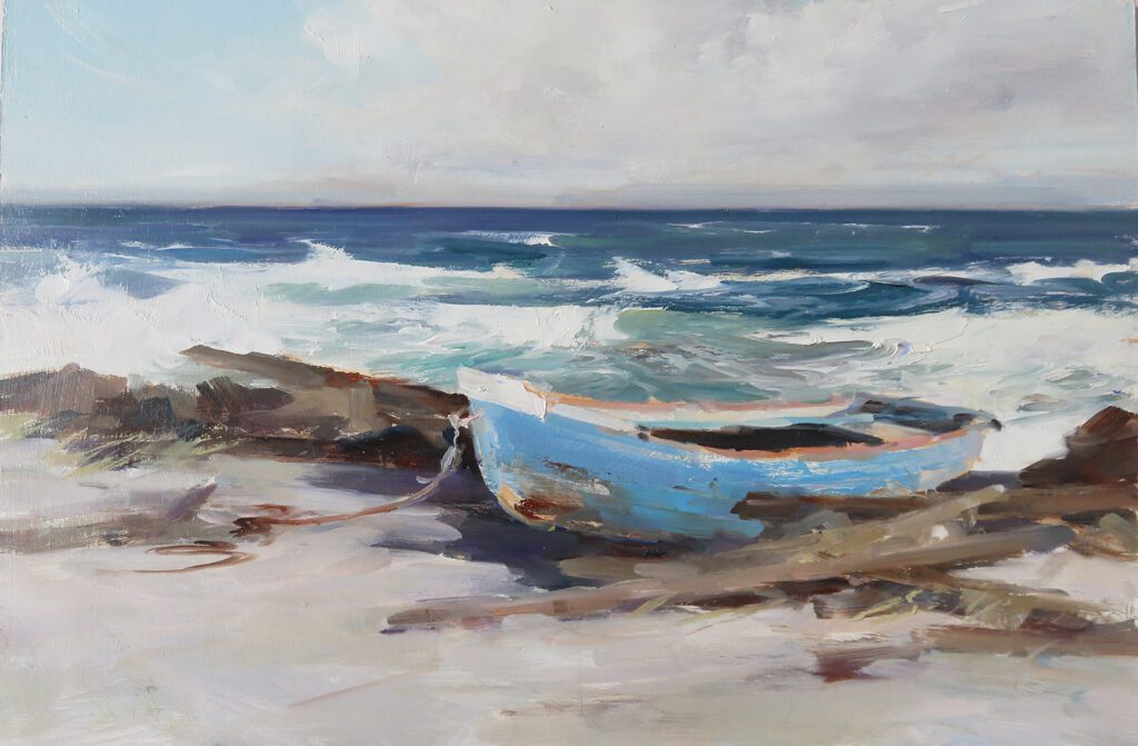
Horses by Deborah Tilby OPAM
12″ x 24″ – Oil

Often times the sky contributes to the overall success of the painting by being subdued in form, value and color, while still playing an important role in setting the mood.  If the landscape or seascape is very complex with lots going on, the sky needs to be very low contrast and subtle so as not to draw attention away from the busier areas of the painting.
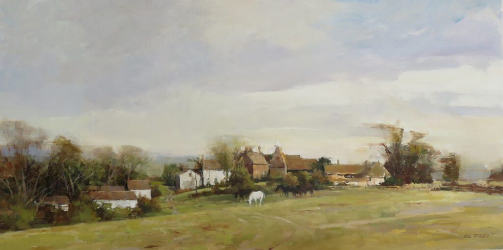
By The Sea, study by Deborah Tilby OPAM
8″ x 12″ – Oil

The mistake I see most often with my novice students, and sometimes elsewhere, is the habit of painting a blue sky with a color that is very intense and/or far too dark, particularly a dark Ultramarine Blue.  This takes all the light out of the sky, and makes it look artificial. Remember to squint to see how light in value the sky really is in comparison to the other planes of the landscape.

Also, it is important to remember when painting clouds, our job is to give the impression that they are light, airy and full of moisture; they are not solid objects. In an impressionistic painting, all sorts of colors can be introduced into the clouds, just remember to keep the colors subdued to avoid making them look heavy.  
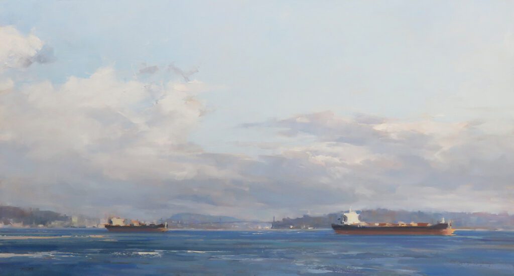
A View of the Bridge by Deborah Tilby OPAM
13″ x 24″ – Oil

So…pay attention to the sky in all stages of your painting and do not make it an afterthought!  Better to plan the design, values, temperature, intensity and edges right from the beginning.

Deborah Tilby  SFCA,  OPAM

www.deborahtilby.com

https://www.instagram.com/deborahtilby/

Video References in Portrait Painting

Susan Patton · Aug 16, 2021 · Leave a Comment

Cherished by Susan Patton
30″ x 30″ – Oil

Character, Personality, Spirit, Soul – these qualities cannot be measured by the length of the nose or the distance between the eyes. Yet, they are what a client is looking for when they commission me to paint a portrait. They can be revealed, however, in the movements, gestures and tendencies of the sitter. They are glimpsed when a subject interacts with the world around them, for example the way they tilt their head in response to a question, or nod when emphasizing certain words, or the way they move their hair, or even the way they keep their eyes on a nearby person they love. These small but revelatory motions cannot be captured in a single, still photograph. Yet, they are crucial for understanding personality and for creating a meaningful portrait.

In addition to painting studies from life, I use photographs as reference — multiple photos instead of just a single one. But even a series of photos, after a month or two in the studio, become quiet and stagnant. The memory of the photoshoot is much less in the front of my mind and it becomes harder to recall who I am painting, not just how they look. And it is who I am painting that matters. So that is why I began taking videos during my photoshoots.

Lady Lee by Susan Patton
40″ x 30″ – Oil

Usually, I try to take the video when the client is “off guard”, though I always let them know at the beginning of the session that I will be filming. I want to see the unhindered character traits and mannerisms of my subject because those traits often form a large part of how the person is perceived. Video also helps me better understand the anatomy of my sitter because it captures him or her turning their head, providing a three-dimensional view of the skull, very helpful for understanding the upturn of the nose, or how deep the eyes are, etc., (photos often lack this level of information). 

In addition to life sittings when possible, and after studying the videos to watch for clues of character, I will choose a “main” photo reference that most portrays the sitter and get it approved by the client. Between sittings, I will use this still photo 75% of the time, but also flip through other pictures to see various angles and skin tones more clearly. But there comes a time as I work when I forget what it was like, really like, to be around the person. That is when I re-watch the video and see if I am capturing the spirit of the person. I will study the “hints” (the movements and tendencies) and see if I have captured a sense of personality in the collection of shapes on my canvas. I watch my subject’s head as it turns, and see if I have the skull correctly rendered. I look at proportions such as how the head compares to the body or to the arm length. I pick up the brush and trust myself as I work, using the rolling video which forces me to see the person as a whole. 

Moving beyond still images, I see the need to use more modern devices and watch people move, laugh, talk and breathe, and see if my painting holds the image of a being that loves, thinks and feels. It just makes sense to me. I cannot always have that person, child, or animal sit still for me to paint from life, so the video is the second-best option. 

A study of “Shaila” from a live portrait sitting

There are other advantages as well.  When I ask a client to send me a video (so that I can appreciate the character and get a sense of who I am painting), it goes beyond a technical request: it is a tribute that honors the subject. It shows my deep respect not only for the person but also for the art of portraiture. It reminds me to not merely copy a photo and “miss the forest for the trees.” It gives my eyes a break and stimulates my brain to think. 

I do not know what will come next in our options for references when painting portraits – maybe a hologram sitting? But I do know this: we are past the age of still photos. I think the reason we like them is that they are “safe.” Necessary? Yes, I believe so, for a big portion of the painting. But let us also bring out the video and paint, and put the photo on standby for a while. Use the photo for technical information, but do whatever it takes to paint the person. Between sittings, or in lieu of sittings, videos are a great tool to study the unique, subtle, quirky, or beautiful movements that remind us of the breath behind the body, and help us capture it with a paintbrush. 

*This youtube video is an example of my process of taking video for a portrait commission: 

Dr. Allen Smithers (detail) by Susan Patton
30” x 24” – Oil on Panel

Epiphany: on Music and Breaking the Rules

Anna Rose Bain · Aug 2, 2021 · Leave a Comment

The Valley Patriarch by Anna Bain OPA
24″ x 42″ – Oil on linen

I am a professional artist, but what some people don’t know about me is that I have played piano since I was eight years old. I was classically trained all the way through college, with a major in art and a minor in music. I took all the music classes: ​ ​ theory, aural skills, counterpoint. I even took voice lessons and sang in ​the ​choir. I loved music with a passion that rivaled my love for art… it was that big a part of my life.

Still Life with Weights by Anna Bain OPA
9″ x 12″ – Oil on linen panel

But there came a point when I had to choose, because I couldn’t devote 100% of my time to both. These art forms each demand much more of a person when it comes to choosing a career path. I chose painting, and the music gradually diminished in my life.

Recently, however, I’ve returned to playing piano once in a while just for fun. Since I’ve played some of the same stuff over and over for the last 15 years, I decided to order some new sheet music to freshen up my repertoire.

At first I was excited to play the new material, but I quickly realized that the music was just “ok”. Honestly, I got rather bored playing these lovely but cliche arrangements of popular songs.

This made me realize that I have changed. I’m not a student anymore, but a person who is capable of taking something and making it my own. And as a recovering rule-follower, it has taken me years to realize that I can do this. The possibilities are limitless.

Curiosity and Chaos by Anna Bain OPA
36″ x 24″ – Oil on aluminum

Now I know why my high school piano teacher was pushing the “Fake Books” on me, but I never wanted to try them. Now I know why jazz musicians can really let loose, and why improv performers can take an ordinary tune and turn it into something amazing.

What does this have to do with art? Well, as with the music, I am arriving at a similar place in my painting. One can spend a lifetime playing scales or painting color charts, and working solely on technique, but at some point, we have to break away and start becoming artists. We have permission to use our imagination and just roll with it. Let the art carry us on an unexpected journey. Those of us who struggle with perfectionism will constantly hear voices in our heads telling us to play it safe, and do things the comfortable or traditional way. Follow the “rules” because they are time-tested.

But that is ridiculous! I have the vocabulary, and I’ve had it for years-both as an artist and a musician. Why did chord charts always scare me? Because it meant I had to take something and be “original” with it! Why does breaking away from classical art scare me? Because it means I am forging new territory and I have to own it.

Free Spirit by Anna Bain OPA
16″ x 8″ – Oil on linen panel

I’ve been having conversations with other artists about ways that we can break away from traditional molds. Here are a few ideas:
​

  • ​Glaze an area down to improve the value structure and overall design.
  • Eliminate or add elements either from another reference source or from your imagination.
  • Do an entire painting in only one color family.
  • Choose unusual subject matter (I am currently starting a series on people working out at the gym!).
  • Go through stacks of old studies and paintings and analyze why they worked or didn’t.
  • Drastically change some of them to see if your problem solving skills have improved since you first painted them.

The list goes on and on. I would love to hear what you have to say — how are you successfully “breaking the rules” in your art?

Footer

  • Home
  • About
    • Mission, Policies & Bylaws
    • Board of Directors
    • Presidential History
    • Frequently Asked Questions
    • History
    • OPA Staff
    • Contact Us
  • Membership Services
    • Member Login
    • Membership Information
    • State & Province Distribution For Regionals
    • Update Member Information
    • Membership Directory
    • Contact Membership Department
  • Events
    • Exhibitions
    • Online Showcase
    • Lunch and Learn
    • Virtual Museum Road Trip
    • Paint Outs
  • Resources
    • Brushstrokes Newsletters
    • Ship and Insure Info
    • Lunch & Learn Video Archives
    • Museum Road Trip Video Archives
  • Services
    • Sponsorship Opportunities
    • Scholarships
    • Critique Services
    • Workshops
    • Have A HeART Humanitarian Award
  • Online Store
  • Awardees
  • Blog
    • OPA Guest Bloggers
    • Blogger’s Agreement (PDF)
    • Comment Policy
    • Advertisement Opportunities

© 2025 OPA - Oil Painters of America · Design by Steck Insights Web Design Logo