• Skip to primary navigation
  • Skip to main content
  • Skip to footer
  • Help Desk
  • My Account

OPA - Oil Painters of America

Dedicated to the preservation of representational art

  • Home
  • About
    • Mission, Policies & Bylaws
    • Board of Directors
    • Presidential History
    • Frequently Asked Questions
    • History
    • OPA Staff
    • Contact Us
  • Membership Services
    • Member Login
    • Membership Information
    • State & Province Distribution For Regionals
    • Update Member Information
    • Membership Directory
    • Contact Membership Department
  • Events
    • Exhibitions
    • Online Showcase
    • Lunch and Learn
    • Virtual Museum Road Trip
    • Paint Outs
  • Resources
    • Brushstrokes Newsletters
    • Ship and Insure Info
    • Lunch & Learn Video Archives
    • Museum Road Trip Video Archives
  • Services
    • Sponsorship Opportunities
    • Scholarships
    • Critique Services
    • Workshops
    • Have A HeART Humanitarian Award
  • Online Store
  • Awardees
  • Blog
    • OPA Guest Bloggers
    • Blogger’s Agreement (PDF)
    • Comment Policy
    • Advertisement Opportunities
  • Show Search
Hide Search

Archives for July 2021

Color as My Visual Statement in Painting

Jennifer Balkan · Jul 19, 2021 · Leave a Comment

I consider myself a colorist.  That is, I find that color palette inspires the visual message I wish to convey in my painting.  Interestingly though, color is subordinate in what I do. As a more-or-less representational painter, color always submits to value.  My goal is to make a thing look like a thing.  And the way to achieve this is through getting my values on point, and by accurately drawing patterns of shapes in order that the abstract pattern ultimately mimics the likeness of a thing.  Color is inconsequential at this stage. It is through attaining an accurate pattern of shapes varying in tone that I create my visual interpretation and representation of what is natural.  

Now these values, or patterns of light and dark shapes, take their form in particular mixtures of colors.  And it is through achieving an accuracy in these patterns that we can then create the illusion of three-dimensional form on a two-dimensional surface.  And as we create this illusion, and make our marks with intention, we eagerly guide our viewers through our painting compositions.  Through the particular choices of colors used in the manners that follow, I use color to make my visual statement.  

Color is only one of the common elements in a work of art.  Elements are stylistic features through which an artist conveys her visual expression.  (Other elements are line, shape, form, space, texture and value.)  An artist might adhere to several of these elements in a work, but choose to emphasize one in particular and use it to make the visual statement.  

There are various approaches to using color in painting.  It can be used as light; as tone; as pattern; as form; as symbol; as movement; as harmony; as contrast and as mood.  

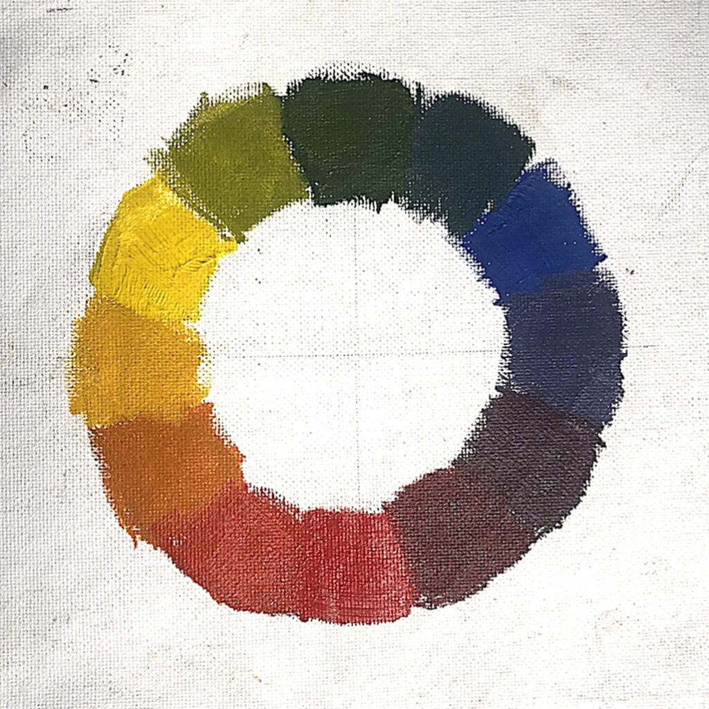
As artists, we choose color that evokes a particular mood; sometimes the degree of chromatic intensity determines a state of emotion.  Relationships among the intense and the diluted can determine harmony.  Color harmony refers to “the property that certain aesthetically pleasing color combinations have.”  These combinations include both the opposing and the compatible on the color wheel, the sum of which creates an agreeable accordance, like a set of satisfying musical chords in harmony.  But the way humans respond both emotionally and perceptively to color and mood is not objective; it may be subject to age, gender, and personal preference for example.  Additionally, cultural and social-based differences affect how we learn about color.  

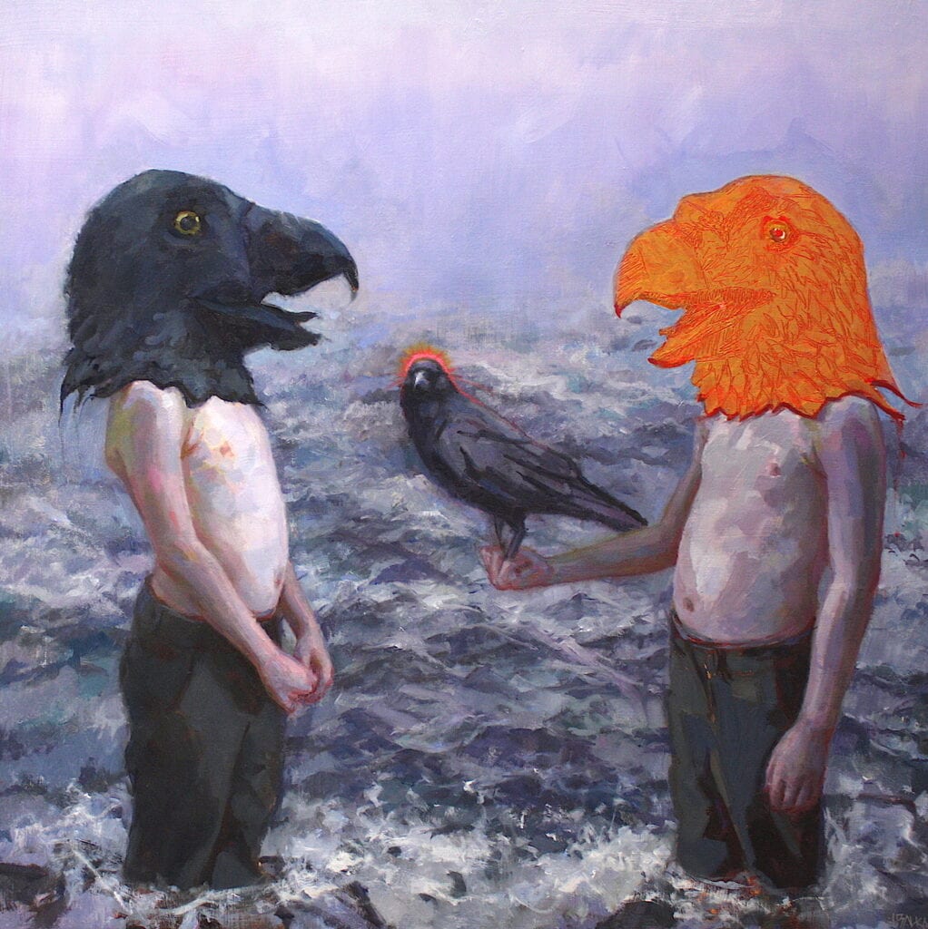
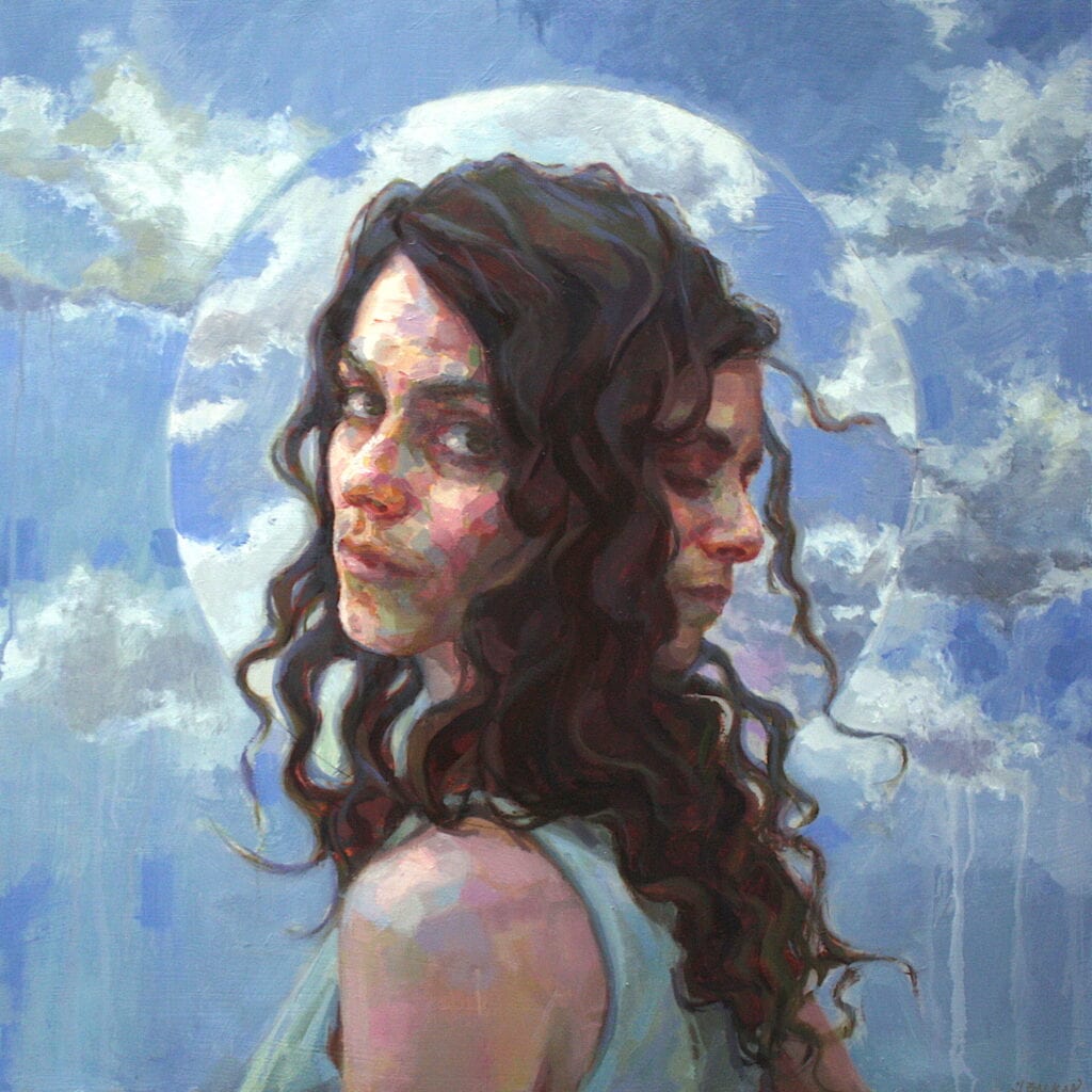
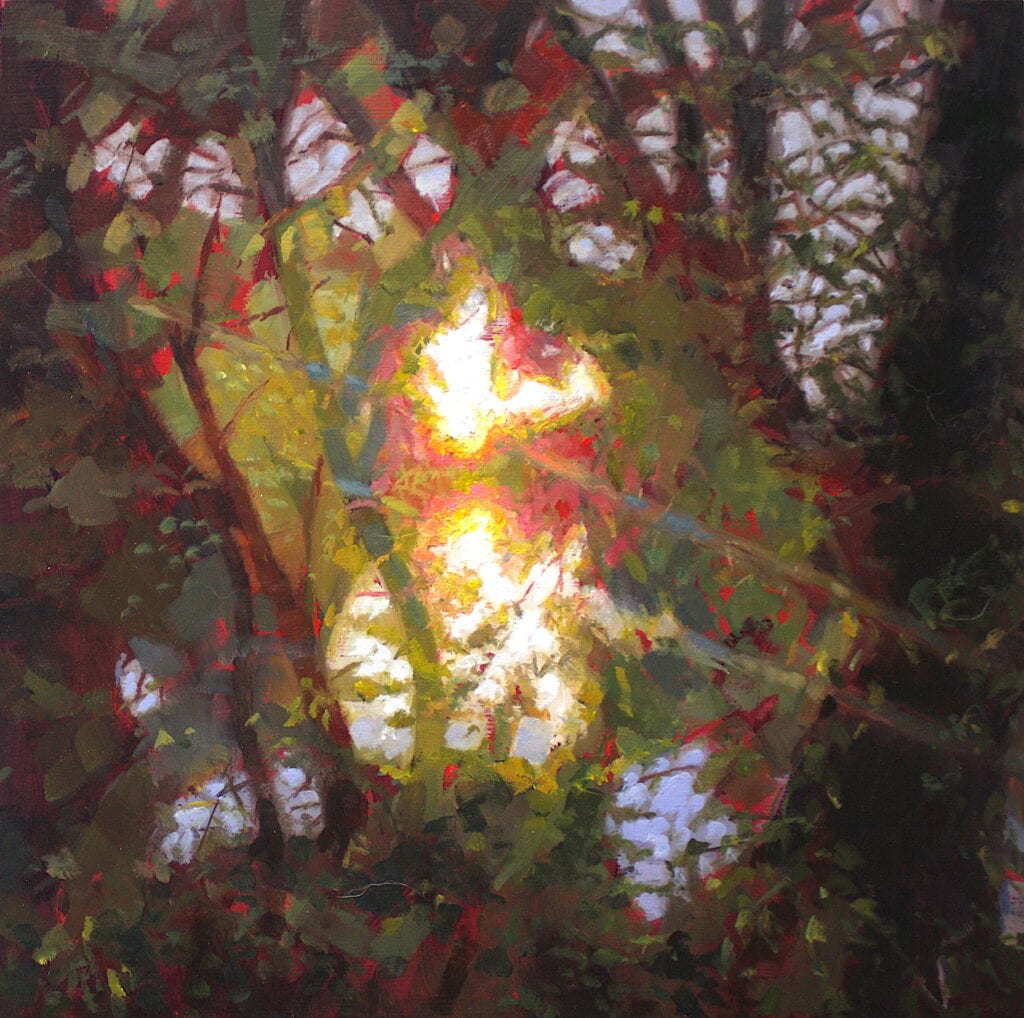
  • Temptation by Jennifer Balkan
    30″ x 30″, Oil on Panel
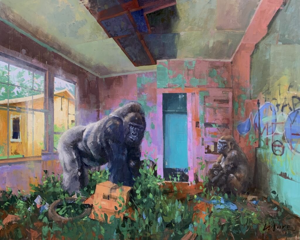
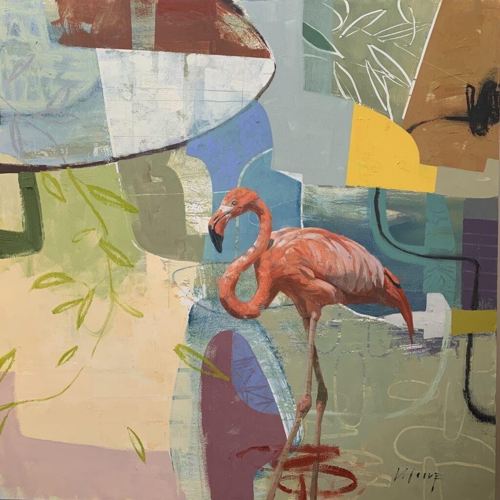
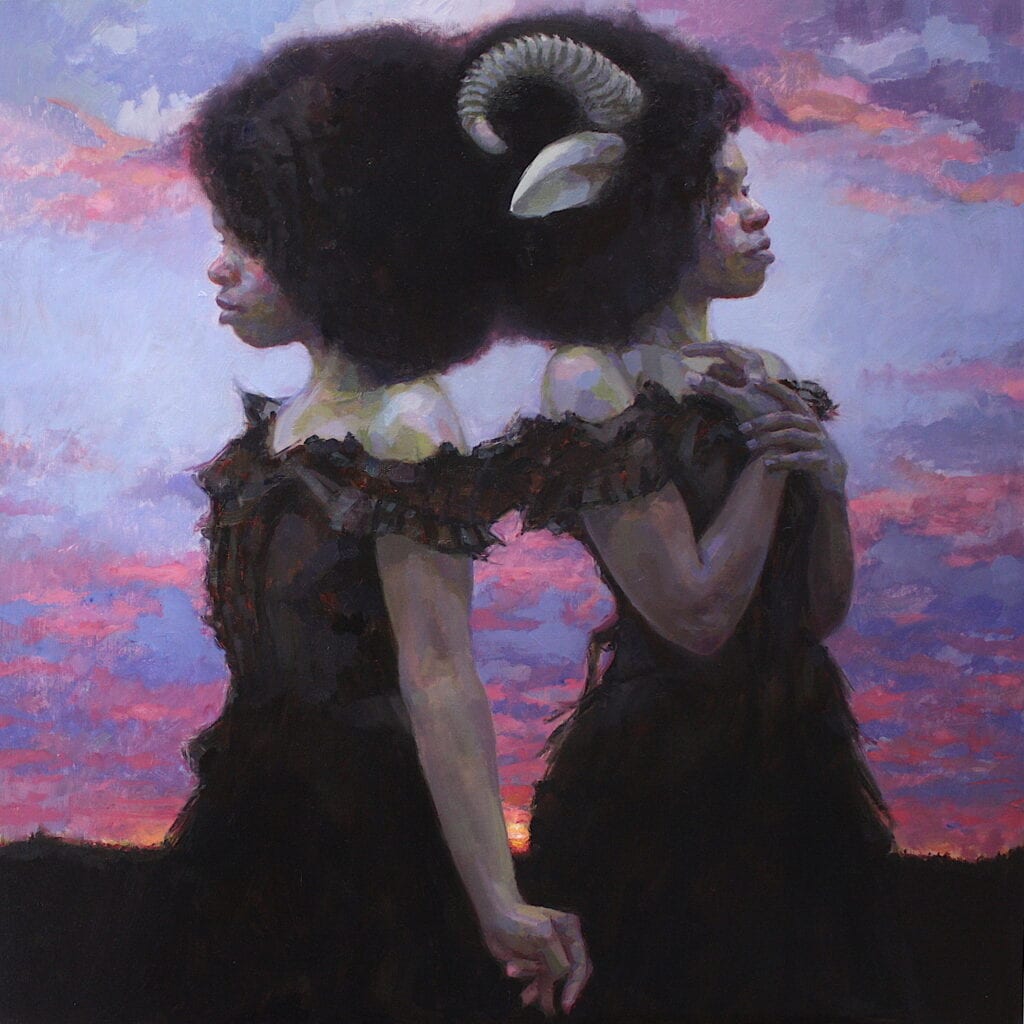
  • There are Two Sides to Every Story
    by Jennifer Balkan
    30″ x 30″, Oil on Panel

Describing form by varying color and value is one way to create the illusion of three-dimensionality on a flat surface.  Those of us with full color vision get to discern the subtleties in color variation.  Artists can shift hue or family of color according to temperature as well.  In the art world, painters have historically marveled at the optical illusions that artists have learned to impress upon their viewers.  One such illusion, employed by the Impressionists, involves adjusting color in alternating color temperatures while increasing or decreasing value.  This method makes use of applying color as contrast. This trick helps to create the illusion of three-dimensionality or three-dimensional form.  Furthermore, one might choose to increase or decrease saturation in these alternating swaths of color and value mixture.  Another significant aspect of this technique is that it implies broken color or optical mixing:  instead of blending values and paint mixes together, the artist lays down discrete strokes side by side and the optic nerve in the brain perceptually mixes the color.  

Two-Faced by Jennifer Balkan
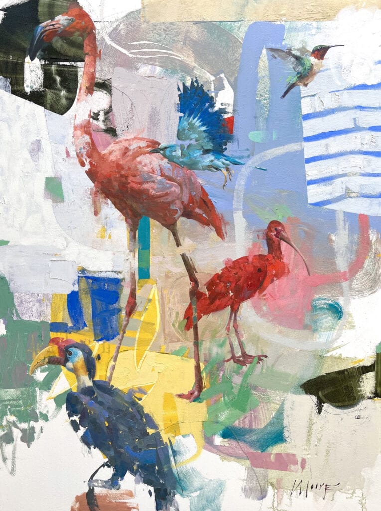
24″ x 24″, Oil on Panel

Contrasting color can be a way to draw the viewer into parts of the painting.  Manipulating the saturation level of a color in relation to its surrounding colors helps draw the viewer to a focal point.  For instance, raising saturation in one area, in relation to surrounding muted colors, will cause the saturated area to stand out or attract attention.  

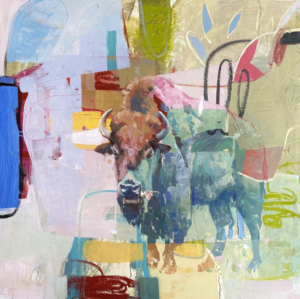
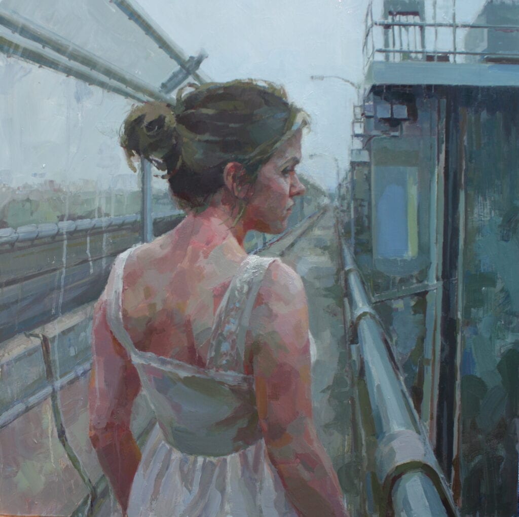
  • Across Forever by Jennifer Balkan
    30″ x 30″, Oil on Panel
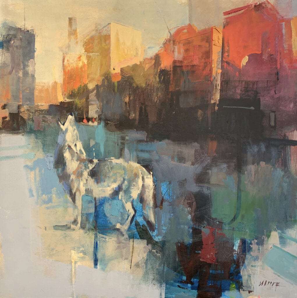
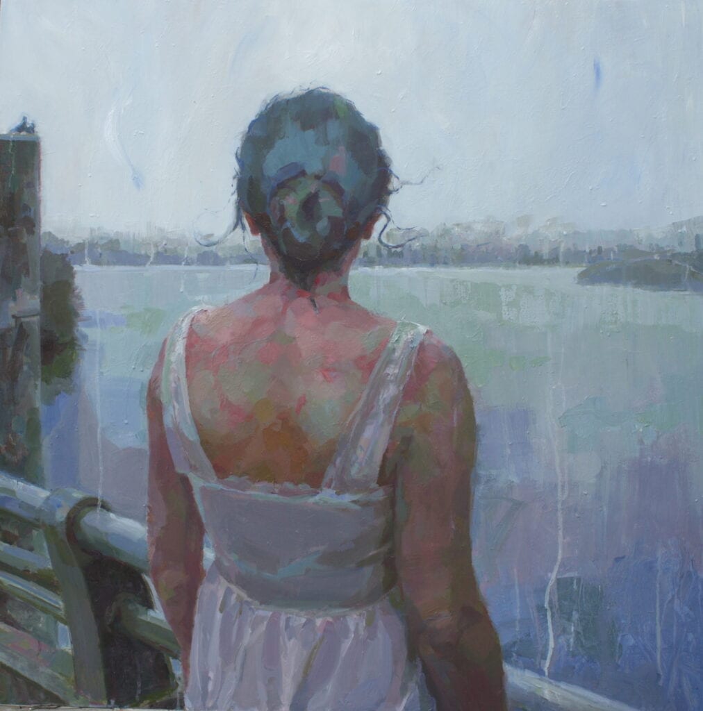
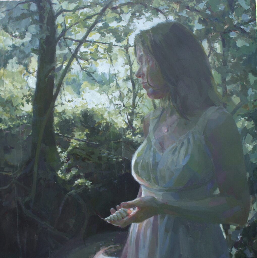
  • Bridge by Jennifer Balkan
    30″ x 30″, Oil on Panel

Though the science is questionable on color, my experience with museum work, art appreciation, and my perception of work being done by current artists, reveals certain patterns of color relationship that please.   An artist invites a viewer into their work and navigates them through a painting by creating focal points that attract the eye, like key points within a map.  These key points can be distinguished through sharp edge work, high contrast, and saturation of color. For me, it is through high contrast or the juxtaposition of disparate values coupled with elevated intensity of chroma where I find resonance in a painting.  And here, color can be used as light.  

  • Life Force by Jennifer Balkan
    18″ x 18″, Oil on Panel
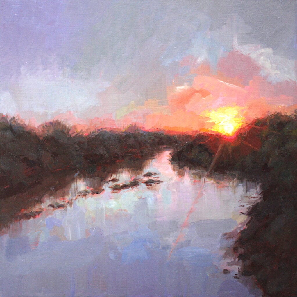
  • Primordial Soup by Jennifer Balkan
    18″ x 18″, Oil on Panel

Through navigating form through color, emphasizing and exaggerating light in color, contrasting temperature in color, using color as tone or value, and using color as form and creating color harmony, I make my visual statement through the element of color.  I deliberately craft focal points demonstrating these different usages of color.  There are often a few focal points or areas to rest on.  And it is through the manipulation of color choices that I guide my viewer through a painting.   I think of a painting as a geographic map: the eyes of the viewer are the explorer who bounces around from one significant point to the next, taking a road or river to the next stop.  The individual points are compelling enough to spend a little time in, but the next one beckons and the traveler moves on to explore the land mass in its entirety.  

Found in Yellow by Jennifer Balkan
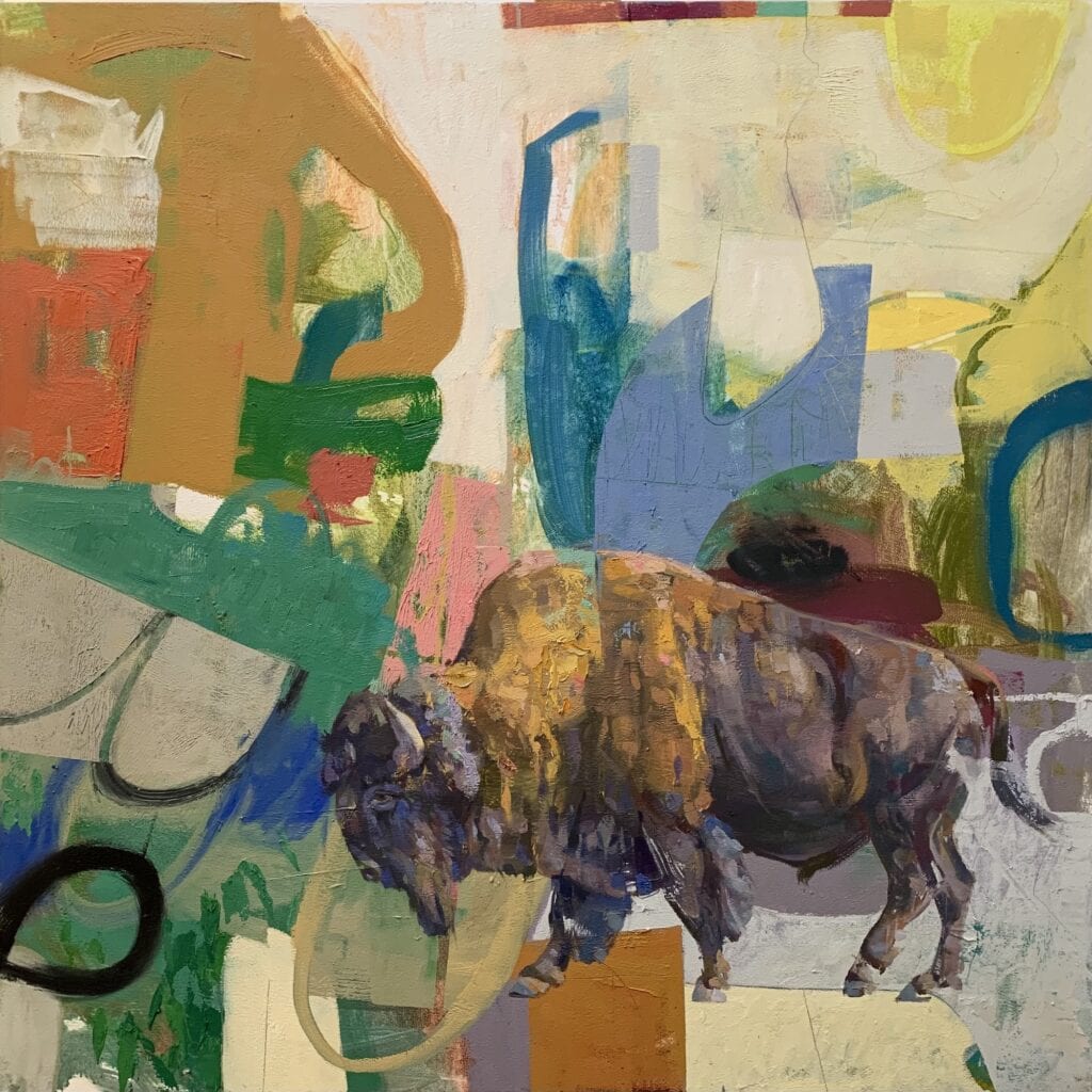
30″ x 30″ Oil on Panel

Becoming A Better Realist Painter Through Abstraction

Larry Moore · Jul 5, 2021 · Leave a Comment

Did you know that OPA has been sharing artists’ blog posts for over ten years?  We have an extensive collection available to the public on our website. This summer, OPA will be taking Deep Dives into our archives and sharing our favorite posts from years past. Please enjoy this Deep Dive by Larry Moore.

Family of Man by Larry Moore
48″ x 60″ – Oil on wood
The lessons I learn from abstract painting come into my representational work and vice versa. Hierarchy, eye flow, juxtaposition, edge, mark making, color and shape resonance, and variation, all apply to both methods of expression.

I have heard it said by more than a few realist artists that they have no connection to abstract art. It is not their thing, they do not get it, it is not real art, etc. Everyone is entitled to their opinion, but I believe that some of these artists are missing out on addressing a key component of individuality in painting: Trust. I teach abstract painting for this very reason.

The goal is not to convert realist painters into abstract ones, but to help artists think about what paint can do if they let it by employing dynamic symmetry, hierarchy, division of space, edge, paint handling and color relationships without basing it on a known source. Painting abstractly has helped my realist work grow in leaps and bounds. And to date, after 25 plus years of teaching, no one has jumped ship from their existing path, they expand their visual language and take the lessons to fold back into their process. 

Audubon Park by Larry Moore
48” x 36” – Oil on wood
My process starts with the abstract and then I figure out what and where the animals go. It’s the same as establishing a figure on the canvas and painting around it, just in reverse.

To build trust in one’s own process is to enable the unique voice of the artist. This voice is comprised of some combination of the key characteristics of painting: intent, drawing, value, color, edge, paint handling, mark making, composition, line, narrative and about 10 other devices in the painter’s tool kit. That is why there are so many wings at the Metropolitan Museum of Art — lots of unique voices in art equal lots of wings at the museums. And who do we go see when visiting such places? Those artists who exhibit that trust, that faith in their own vision, the pioneers, the masters of hand and medium. We seek those who are empowered by authenticity. 

I mean, let’s face it, if everyone painted the exact same way, it would be pretty dang boring.

Buffalo Spring Field by Larry Moore
40” x 40” – Oil on wood
In the past my work involved a lot of planning in the form of sketches and studies. Now I have no idea where they will go or even which animals I’ll be using, of if I’ll be using any at all. It makes each day exciting and I look forward to seeing what shows up.

The key to building trust is to venture out past the comfortable known areas of process and concept and hang out on the thin branches for a while. You would think it would be easy for artists to do this. What is the worst that could happen? But, surprisingly, it is not easy. The realist regimen incorporates a series of control measures to ensure a fair amount of accuracy: get your drawing right, get your values right, put something on the thirds cross-hairs, mix the paints just so… all to beautiful effect. Control on the front end.

Abstract painting is that process, only backwards. The control is on the back end. Which means higher risk and higher failure rates, and that can be uncomfortable. But the process of doing, even on a small scale, teaches an enormous amount about what paint can do independent of subject or content in a painting. This can be part of a healthy aesthetic training program, sort of like taking a day to do Argentine Tango if you are more of a Viennese waltz kind of a person. 

Past and Present by Larry Moore
40” x 40” – Oil on wood
These are part of a series I’ve been working on for the last 6 years called Intrusion. Originally the series had an animal or animals in a place, usually an interior, where they didn’t belong. Now the intrusion is in the form of realism in abstraction. 

I could rattle off a ton of realist deities whose work dances with the abstract: N. Fechin, C. Anderson, J. Sorolla, C. Monet, J. Twachtman, E.C. Fortune, G. Klimt, E. Dickenson, T. H. Benton, T. Thompson, B. Dugarzhapov and so on. If you put realist painting on the same spectrum as abstract painting, some of these artists are just a little closer to one end than the other. 

So, what is to be gained from this kind of exploration?

• You get unstuck in a hurry.
• You get more paint handling ideas.
• You get a better understanding of what the components of painting can do.
• You get more adventurous compositional ideas.
• Your creative thinking skills get a workout.
• Your critical thinking skills get a workout.
• Your significant other will find you more attractive.
• You will loosen up just a little bit.
• Your back won’t hurt as much.

You may not experience all of those, but I promise at least a few will happen. 

Flamingo Mambo by Larry Moore
40” x 40” oil on wood
These just make me happy

Let’s say that you are at least moderately intrigued. What next? How does one do this kind of playful study? The doing it part is pretty easy, it is the brain that you have to deal with. There are several secrets to getting your brain to go along with the plan. We are creatures of habit and change is not always easy.

• Give yourself permission to play.
• Spend a few hours making shapes on canvas with a brush and one color. Make compositional shape ideas.
• Change your approach. Change your materials, your brushes, tape canvases into quarters to disable the perfectionist feature.
• Work out from a reference source (see ink and wash sketches), put the reference source away and paint from the sketches. Repeat.
• Mix up some large piles of color that you love and just start moving it around. Come back in an hour or two and work on refining the paint into interesting compositions.
• Hide them away for a while. Be like Dr. Frankenstein and keep your creations in the cellar.

If you ever feel a little stuck or bored with yourself, this is as good a cure as I have found. And don’t worry, you will not suddenly start wearing a rainbow wig or anything weird. Trust me, you will learn something new about yourself, and may even grow as an artist.

New in Town by Larry Moore
48” x 48”- Oil on canvas
Occasionally the backgrounds are more representational than abstract for a reason. We’ve now been invaded by coyotes here in Charleston, SC and this piece is in reference to that.

Footer

  • Home
  • About
    • Mission, Policies & Bylaws
    • Board of Directors
    • Presidential History
    • Frequently Asked Questions
    • History
    • OPA Staff
    • Contact Us
  • Membership Services
    • Member Login
    • Membership Information
    • State & Province Distribution For Regionals
    • Update Member Information
    • Membership Directory
    • Contact Membership Department
  • Events
    • Exhibitions
    • Online Showcase
    • Lunch and Learn
    • Virtual Museum Road Trip
    • Paint Outs
  • Resources
    • Brushstrokes Newsletters
    • Ship and Insure Info
    • Lunch & Learn Video Archives
    • Museum Road Trip Video Archives
  • Services
    • Sponsorship Opportunities
    • Scholarships
    • Critique Services
    • Workshops
    • Have A HeART Humanitarian Award
  • Online Store
  • Awardees
  • Blog
    • OPA Guest Bloggers
    • Blogger’s Agreement (PDF)
    • Comment Policy
    • Advertisement Opportunities

© 2025 OPA - Oil Painters of America · Design by Steck Insights Web Design Logo