• Skip to primary navigation
  • Skip to main content
  • Skip to footer
  • Help Desk
  • My Account

OPA - Oil Painters of America

Dedicated to the preservation of representational art

  • Home
  • About
    • Mission, Policies & Bylaws
    • Board of Directors
    • Presidential History
    • Frequently Asked Questions
    • History
    • OPA Staff
    • Contact Us
  • Membership Services
    • Member Login
    • Membership Information
    • State & Province Distribution For Regionals
    • Update Member Information
    • Membership Directory
    • Contact Membership Department
  • Events
    • Exhibitions
    • Online Showcase
    • Lunch and Learn
    • Virtual Museum Road Trip
    • Paint Outs
  • Resources
    • Brushstrokes Newsletters
    • Ship and Insure Info
    • Lunch & Learn Video Archives
    • Museum Road Trip Video Archives
  • Services
    • Sponsorship Opportunities
    • Scholarships
    • Critique Services
    • Workshops
    • Have A HeART Humanitarian Award
  • Online Store
  • Awardees
  • Blog
    • OPA Guest Bloggers
    • Blogger’s Agreement (PDF)
    • Comment Policy
    • Advertisement Opportunities
  • Show Search
Hide Search

Archives for January 2021

The Gypsy Life in a Pandemic

Ms. Hilarie Lambert · Jan 25, 2021 · Leave a Comment

Maiden Voyage

I’ve always had a gypsy soul, climbing high in the trees, wandering the fields and exploring the Finger Lakes where I grew up. The youngest of three girls, no one really paid attention as long as you were home by dinnertime. Our house looked over the Genesee Valley and I would sit on the back porch facing west, and look at the patterns of fields, hills and river. I remember even back then I was fascinated by the blues and greens of the landscape. (I think the landscape work of Wayne Thiebaud speaks so strongly to me for that reason.) This wanderlust has been a great asset for a plein air painter. 

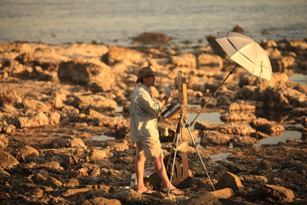
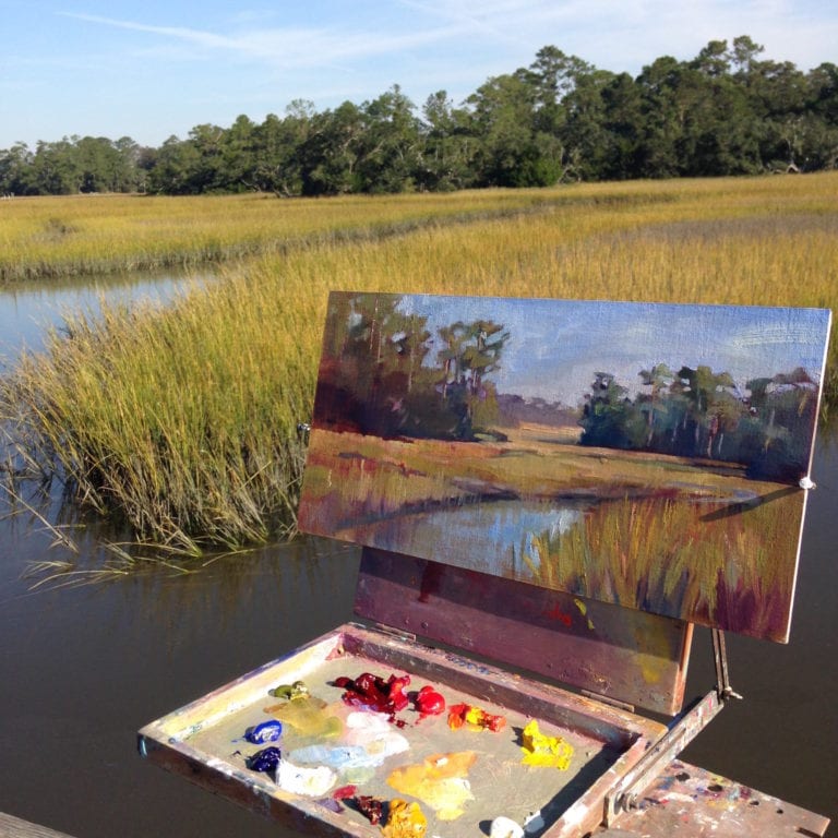
While raising two children I became a graphic designer and illustrator in Rochester for a major corporation. It was a great career as I got to explore all types of mediums, create some interesting work and learn the marketing end of business. After moving to Charleston, SC, I took up oil painting. I began to paint with others artists and followed them around as they showed me the city, the marsh and the coast. I discovered the beauty of the Lowcountry, painting outside with friends or by myself, then teaching workshops en plein air. 

Traveling to teach and paint has been just one of the great benefits of the career I have chosen (or did it choose me?)  I was fortunate to start teaching workshops in Italy, France, Argentina, and on the eastern coast of the US. Traveling and painting with other talented, dedicated people, who also don’t mind getting up at the crack of dawn to “catch” the light, has brought me great joy and inspiration. 

I also have a daughter and two grandchildren in Paris whom I visit once a year. In 2016 I rented an apartment and explored and babysat for 3 months — a baguette and painting on the Seine is “the life!”  I took my 9 year old granddaughter out to sketch in the streets, and she turned to me and said “This is the best time I’ve ever had!” Another convert.

But it all changed in March 2020. I was in Paris painting, ready to travel to Provence with other painters, when Covid hit. Museums were closing, there was talk of shutdowns, and the writing was on the wall, so I reluctantly came home. After two weeks, the borders closed in the US, and knew I was going to have to adapt to this new confinement. 

Going into the studio was hard the first few months and I knew I needed to find something to inspire me. I am a true believer in the “process” of painting and think we all need a purpose in our lives, and I was not sure what that was at the time. I knew I couldn’t travel to Europe anytime soon. Since I couldn’t travel outside the country, I decided I would travel within. So I started researching campers, which was something I had always wanted. Social distancing is easy with a camper, and it would allow me to explore places in my own country.

Meeting at Low Tide by Hilarie Lambert

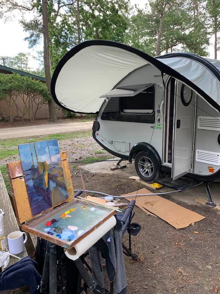
“ChaChing,” (like a boat, you’re always spending money on it) my T@B Nucamp320 has been the perfect solution. Queen size bed, bathroom, sink, two burner stove, frig and A/C all in a 13ft by 6ft space. Amazing engineering. 

All my paint supplies pack neatly into the back of the car. Since I have a limited palette (Alizarin, Ultramarine blue, Cad yellow, Cad red medium and cobalt – with blue black occasionally) and use only a few other pieces of equipment (primed panels, and an Open M box and tripod, paper towels and Gamsol) there is plenty of space. 

The challenge was learning all the technical and manual things that go along with owning a camper. I had been married for a long time and never read manuals, so here I was with the daunting task of managing this tear-drop shaped trailer in my driveway. I approached it with the “How to Eat an Elephant” strategy – one bite at a time. Perseverance and YouTube has gotten me through.

Whites by Hilarie Lambert

My maiden voyage was to Greenville, North Carolina for a show at the City Art Gallery. I packed the camper with paintings, dropped them off at the gallery, went to the first campsite, set the camper up, and attended the show. I then explored the eastern coast, learning and painting along the way (Lesson #1 – Always make sure the pin is in the hitch!)  

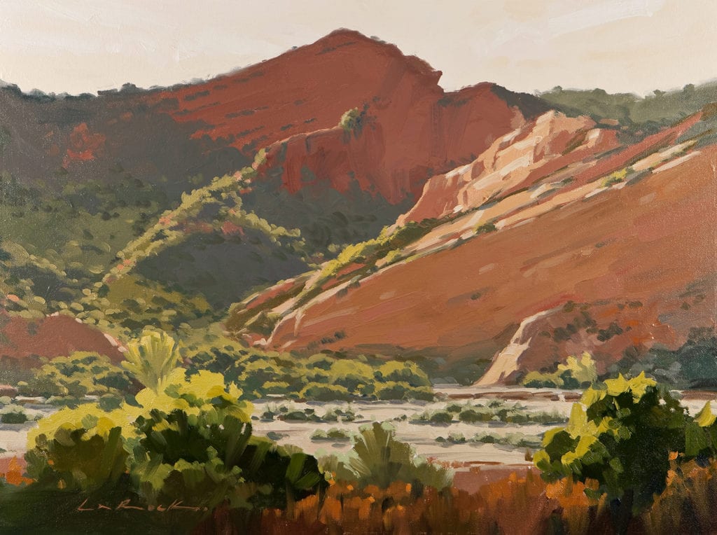
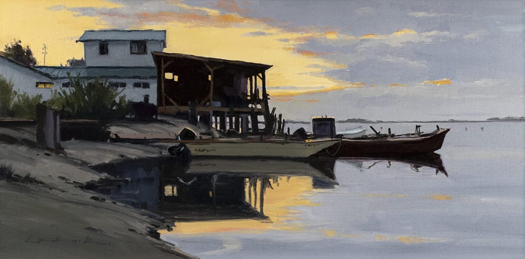
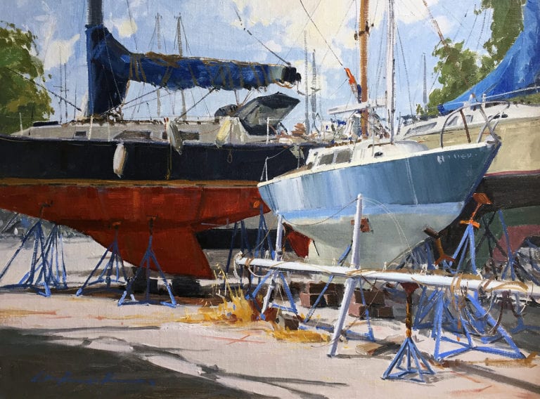
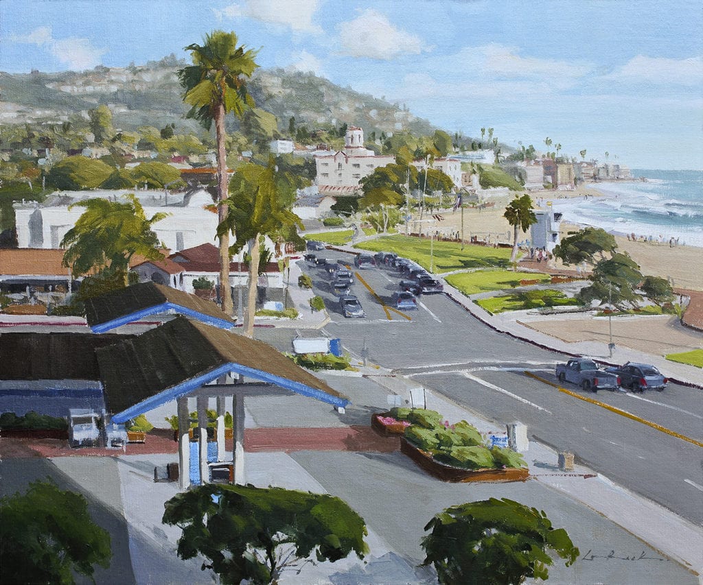
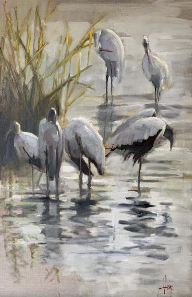
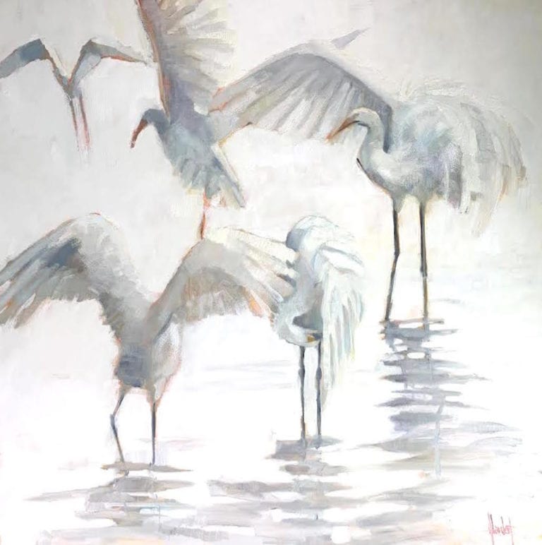
Staying in one place for a few days has given me the benefit of time spent on researching and photographing the birds in each area – egrets, ibis, woodstorks, and Rosetta Spoonbills, if I’m lucky. I try to get out as early as possible to sit and sketch and take photos to use back in the studio. Sunlight through bird wings, ripples in water, the sun coming up or going down — these are all things I strive to capture. Since I paint in series, mostly of places where I’ve traveled (France for still lifes and street life, Colorado for horses and bison), birds have become a large part of what is on the easel these days. The Southeastern Wildlife Exposition is in February here in Charleston, and a large part of the show consists of paintings from the road.

North Carolina waterfalls

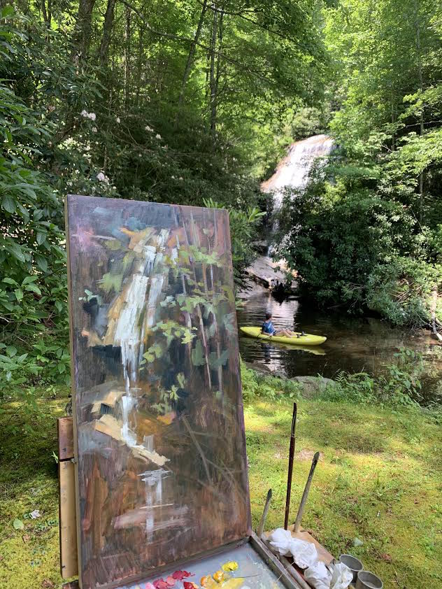
The next voyage was to the Cashiers Paint Out in the mountains of North Carolina. Camping with a friend who had brought her tent, we set out painting the hills, wildflowers, horses and waterfalls. In other years, the community hosts all of the painters, but this year I felt very comfortable staying distanced for my safety and theirs – cozy in my camper.

As plein air painters, we are accustomed to being by ourselves or out concentrating on our work as people chat with us, so it’s not that different. Painting the landscape was different though, as the greens and blues are very challenging coming from the lowcountry colors. I had never painted waterfalls before, so I had to remind myself “It’s just pieces. Put them down and they will form an image.” I think getting out there and pushing your boundaries can bring a freshness and depth to your work. The “process” of painting is what thrills me and tackling new palettes and subject matter is so rewarding. 

Painting the marshes

Cautionary warning: Do not trespass on people’s property in the mountains. They do not care if you want to paint their cows and barns! 

The rest of the summer and fall has included trips to Hunting Island, Huntington Beach, Hilton Head, the Cartersville Museum of Western Art in Georgia, and Edisto Island.  

I’m back home and packed up now until the end of February. We’ll see how the vaccines are going, but I’m planning a trip through the Appalachians to the Finger Lakes. Maybe a trip out West. Let me know if you want to meet up for a camping and plein air adventure.

Happy painting.

My Friend Greg LaRock OPA—How One Artist Influenced Many, for the Good

Rick Delanty · Jan 18, 2021 · Leave a Comment

“Make it your ambition to lead a quiet life and attend to your own business and work with your hands…so that you may behave properly toward outsiders and not be in any need.”  

 –1 Thessalonians 4:11-12

Greg painting in Laguna Beach

This is a most fitting description of a dear friend of mine and the kind of life he led. You may know that OPA Signature member Greg LaRock passed away Sunday October 11, as the result of a traumatic head injury. I was heartbroken by the news. The following is a paragraph I posted on Facebook later that week.

LPAPA INVITATIONAL mentors—Left to right, Greg, Rick Delanty, Jeff Sewell

“I could not let this evening go by without sending out a tribute to the memory of my friend Greg LaRock. I am still in disbelief that he has passed away this past Sunday. Though I cannot comprehend it, or push back my sorrow, I can celebrate the times we spent together: painting the figure at Art Supply, painting together at the Laguna Invitational, teaching painting to young elementary students with Jeff Sewell and the Plein Air Project, exhibiting paintings together at the Festival of Arts and in Maui, talking about painting, planning for painting, and dreaming about painting. Greg was a “painter’s painter,” with a highly-developed work ethic and well-considered sense of design, an empathetic and effective instructor, a good listener, and lover of artists and people younger and older, novices and professional. He was compassionate, and I felt his heart when we talked–and whenever I saw his work. In this world today, we need great men who lead with wisdom, energy, and love for their fellow men. Greg was one: a great man. God bless you, Greg, for all you have given. Laurie, my prayers for comfort and strength are with you, and with everyone who will miss this man. 

May we spread the love like Greg did, that everyone may show or receive the kind of compassion that he so generously shared.”

Big Red by Greg LaRock
Oil

You might have read the “In Memoriam” article written about Greg in the December 2020 issue of Plein Air Magazine, entitled “Greg LaRock (1965-2020).” There is mention of his perspective concerning “the day-to-day issues of being a professional artist.” But what made Greg the professional artist that he was, I believe, was the kind of man that he was. Over the years I knew him—I met him in 2008 at the Laguna Invitational—he was consistently positive, empathetic, giving, and transparent. His love of painting inspired that same love in others. He was known across the nation as a knowledgeable and effective instructor. At plein air events he focused on comradeship, not competition. In our life-drawing sessions, Greg dedicated himself to his work, and at breaks was happy to answer questions and take comments from fellow artists. When we mentored elementary school students for the Plein Air Project, he would talk with them about their progress, not down to them. When recognized for awards, he was supremely humble, often deflecting praise onto other artists who were also being recognized. And through it all, he was always learning: he told me that no matter what, there was always more to know. 

That, I believe, is what contributed to the quality of the work he produced. As an eternal student, he was consistently progressing, to the point that many of his peers recognized him as a master.

Early Sunday by Greg LaRock
Oil

Lori Basheda, in her article for the LA Times, described Greg’s impact on the art world: 

“What a legacy of spectacular paintings he left to the world,” said Mary Platt, director of the Hilbert Museum of California Art at Chapman University. “Greg stood firmly in the great tradition of the California Scene-painters —icons such as Millard Sheets and Emil Kosa, Jr. —who portrayed everyday life in the Golden State with such affection, understanding and finesse. His work deserves to be beside them.”

Juxtaposition by Greg LaRock
Oil

Jean Stern, Director Emeritus of the Irvine Museum, had this to say about Greg: 

“He was a superb artist, and he also was a gentle, caring and sincere man…always cheerful, courteous and open with his time.  He was a popular and well-liked teacher.  As an artist, Greg was one of the best I had gotten to know.  I often watched him paint.  He would carefully and accurately draw a sharp, detailed sketch which reminded me of drawings by Leonardo da Vinci, as they were so detailed.  Then he would proceed to cover it up with bold and elegant applications of paint.  He won numerous awards, some at art competitions that I judged.  The art community will miss him in so many ways.”

Off Broadway by Greg LaRock
Oil

I am honored to have known Greg as a friend, and privileged that I could stand beside him on several occasions to see for myself what his passion, purpose, and sympathetic presence could do for a student, a collector, a colleague and even a stranger. He inspired me and many, many others. As artists, we look in all kinds of places for inspiration. Greg led an inspiring life because he found it everywhere, and inspired others to find it for themselves.

In the Gallery: left to right, Jeff Sewell, Rick Delanty, Greg LaRock

Racing in the Dark

LYN BOYER · Jan 11, 2021 · Leave a Comment

The Bird Watcher by © Lyn Boyer
9″ x 12″ – Oil on linen
Oil Painters of America National Wet Paint Competition 2020 – Award of Merit

Meet Bean, a diminutive black rescue dog with a randomly crooked smile. Bat Dog impersonator, she races the wind cape flying – when she’s wearing one, and in her mind, I’m sure of it, when she’s not. Bean races. In the dark.

As artists, we may on occasion run headlong into a period of personal darkness. Creativity slips through our fingers, we instinctively tighten our grip and plunge over an emotional cliff, watching the last vestige of inspiration fade like smoke. Darkness closes in.

THE DOOM WHISPERERS

What just happened? Our sextant failed us and we lost sight of our North Star. We lost trust in our instincts. We lost faith in the wind of our spirit and started believing the Doom Whisperers. They’re like orcs…small, truly ugly, and out to suck the joy out of you. Anything or anyone who makes you doubt yourself, including yourself, is brokering doom. If we fall for it we furl our sails, cling to the mast, and start playing defense.

WIN THE DAY

How do we win back the day? We have two choices. Wait it out. Or, learn the art of racing in the dark. I’m not into wasting life, so waiting it out seems like a less than optimal option. I’m opting for racing in the dark. So, how do we go about winning the day in the middle of a pitch-dark night. And I mean win the day literally. Win the return of light, creative inspiration, excitement, and forward motion.  The wisdom of a diminutive dog has taught me we can play offense even before the light returns. We can race in the dark.

LESSONS ON RACING IN THE DARK

During an Excellent Adventure at the mostly abandoned dog park, Amanda, Bean dog’s mom, donned a headlamp, clipped on Bean’s night beacon, and unclipped the leash. In the face of darkness, the beaconed Bean flew off into the night at top speed. Uphill, downhill, then circling like a drone creating sky art on the 4th of July. The Bat Dog impersonator then sped back to the safe harbor of Amanda’s headlamp before heading off to race in the darkness again.

That blow-out-the-carbs headlong dive into happiness, smack in the middle of darkness, suddenly seemed way more attractive than my own personal darkness, the creative malaise I’d been blindly stumbling around in. Either I needed to become a dog, or learn to approach life more like a dog. I set about to apply the lessons of how Bean, apparently a Yoda among dogs, transmuted darkness into light.

1. The Night is Your Friend

Our artistic careers will cycle through day and night. Success and Sabbatical. Get used to the nights. Night is a friend, not an enemy. We can learn to love night as well as day. The air is cool. The sky is full of stars. Night is mysterious and holds different possibilities than day. Night is not so crowded with other people’s thoughts and opinions. It gives us a chance to return to our own instincts. We can learn to trust our inner creative voice again.  We can find images floating at the boundaries of consciousness that want to be painted. Truly authentic creations, not images contrived to sell, win, or impress.

2. Count to Ten

If you feel like you’ve been plunged kicking and screaming into a creative night, give yourself a minute.  Take a breath. Count to ten. Grant permission to set your brushes aside temporarily while your inner eye adjusts to the darkness. It’s time for a bit of nuance. If we can overcome the paralysis and sense of dread being plunged into creative darkness brings we win the option of learning to race in the dark instead. Play in the dark even. Look up at your figurative night sky. Stars! Stars can guide us home. Use the nuance of your new night vision.

3. Rocks aren’t Bears

Use lessons you learned during your artistic daytime to help guide you during your artistic night. Bean learned while racing in the daylight that the rocks she would bound off racing in the dark were indeed rocks, not bears. When you are trying to navigate creative darkness, realize that something that appears to be a looming bear might just be a rock. It not only isn’t going to eat you, you might be able to turn the rock into a launching pad for an exciting new direction.

4. Find your Lighthouse

Part of Bean’s bravery came from knowing that there was a light to guide her home. The beacon of Amanda’s headlamp was the safe harbor to circle back to in the dark before launching out on yet another adventure.  It takes a bit more energy to race in the dark, so find your personal lighthouse. It will guide you into harbor.  Fill it with whatever things feed your soul and put wind in your sails. When a beacon lights your way, you won’t have to search for ideas. The ideas will find you.

May you find creative adventures and the fun of racing in the dark!

– Lyn

NEW RELEASE – Liliedahl Art Video | “No Fear Oil Painting”™ – A Guide to Creative Brush Handling | with Lyn Boyer – Music by Dave Curley

www.lynboyer.com
www.interplayartists.com

The Role of Color Temperature in Painting

M Kathryn Massey OPA · Jan 4, 2021 · Leave a Comment

When I wrote my book on painting with a concept, I listed five key elements for creating a  workable, harmonious painting: Values, Edges, Paint Quality (integrity of the paint), Agent  (you as the painter guiding the work), and finally, Color/Temperature. It’s the last element I’d like to explore here. 

When I began to paint, I saw local color first and foremost. It’s easier to see than values and edges. Beautiful reds, blues and yellows naturally draw the eye much like impasto  (opaque) paint will. Color, or the lack of color, has an inherent emotional feature. 

It’s generally accepted that color begins and ends with the Color Wheel. I never saw the relationship to the color wheel and the painting problems that were before me. Many teachers use it as an absolute truth to be rigidly followed. But, the color wheel is NOT an absolute truth. It only represents a theory. Theories are not absolute-they are grounded in principles but don’t contain the truth in an ultimate way.  

A theory merely points us in a direction.  

Included is an image of my palette used when I teach. To help students, I list below each color whether I view it as a warm color, or a cool color. To me, the neutrals, including Naples Yellow, are all cool; the yellows are warm with the exception of Lemon Yellow, which appears cool because it has less warmth than the other yellows on my palette. Likewise, Cadmium Red Light is the only red that appears warm. Alizarin and the other Cad Reds appear cool.  

Cadmium Red Light mixed with black and white (both neutrals)  Notice the neutrals achieve two things: the value of the Cad Red Light, a warm red, is changed and the temperature. (The temperature of the red is made cooler.)

The Blues are all cool with the exception of Ultramarine Blue. It’s the warmest Blue in the family of blues meaning it reads warmer than the others because of its mixture when produced and those materials used to create the paint Ultramarine Blue.  

Think about Cerulean, Thalo, Cobalt, King’s Blue…..they are very cool when used next to UM Blue. In a warm set up or composition, I would use UM Blue to complement the other components of a warm set up. 

Yellow Ocher is an interesting color. I paint with it to warm a background or turn an edge (cool).  It seems to absorb whatever temperature is placed near it. It’s an opaque paint so it has the quality of a neutral or cool hue. But, if painting a white cup, you could mix some yellow ocher to develop a shadow plane. It won’t drop the value too much but can assist the shadow in anchoring the object. Painting with black as a shadow for white objects is too abrupt or harsh. To me it reads “dead on arrival.” 

Two Pears by M Kathryn Massey OPA 
9″ x 12″ – Oil

As we grow as painters, we begin to develop our own language and that language includes color choices. We become more sensitive to how temperature plays a role in our work. For me, I reach for a color based on its temperature and what is needed by the painting. What do I  mean? 

Let’s say you are painting a portrait. The subject is Caucasian and fair. Most of the flesh you paint will be colorless. But, there are moments on the face you want to come forward and show the topography of that particular fair model. Conversely, there are moments in the picture that will need to recede, or turn back. 

Cad Red LT is warm and it will read closer to the viewer. Cad Red Med/Cad Red Dark will recede more than Cad Red LT. Why? Because the Medium and Dark have more blue in them when they are produced as a color. Blue is a color which recedes. 

The principle here: Warm colors appear to advance; Cool colors appear to recede and give the painting a sense of air space and time. You must decide on the color structure of your painting EACH TIME you go to the easel.

A Word About Neutrals. 

Commissioned work in progress.  
Cosmo by M Kathryn Massey OPA
14″ x 11″ – Oil
Notice how little color is seen thus far in the painting with the dog being black and white; both cool, neutral colors.  

Neutrals are used to change both the value and the temperature of a color. In principle, Black,  White, Grey, and Naples Yellow are used to cool down a color OR, to change its value.  Because they are cool, when mixed with any other color they will immediately cool that color  AND change its value. This is why I view color and temperature as married. I don’t understand them as being separate. Temperature changes are paramount to good painting.  

We don’t know these more advanced ideas when we begin to paint. How can we?  In closing, a few thoughts on color: 

-If you are having trouble incorporating a color into your work, take it off your palette for a  month or so. See if you can achieve what you need without it. 

-Each family of reds, blues, greens, yellow, blacks, etc., are warmer or cooler within the family of that color. Determine for yourself which is warmer and which is cooler within the family of color. 

-Using both cool and warm temperatures in the same painting will make more color disharmony and tension. (Think Vuillard) 

-A still life up, a model, an interior, etc., will be either warm or cool as a concept. Use the paints that will depict your concept. 

-Use a neutral to turn an object away from the viewer so the illusion of dimension is realized.  Do not use pink, red, yellow, orange for instance to turn an object as it goes into shadow. The illusion won’t work. Use cool grey, blue, or violet to help with your conceptual illusion. 

-If you break any principle in painting, know why you are breaking the principle.

-There are no mistakes…..only better choices.

Melon with Grapes by M Kathryn Massey OPA
20″ x 16″ – Oil

Footer

  • Home
  • About
    • Mission, Policies & Bylaws
    • Board of Directors
    • Presidential History
    • Frequently Asked Questions
    • History
    • OPA Staff
    • Contact Us
  • Membership Services
    • Member Login
    • Membership Information
    • State & Province Distribution For Regionals
    • Update Member Information
    • Membership Directory
    • Contact Membership Department
  • Events
    • Exhibitions
    • Online Showcase
    • Lunch and Learn
    • Virtual Museum Road Trip
    • Paint Outs
  • Resources
    • Brushstrokes Newsletters
    • Ship and Insure Info
    • Lunch & Learn Video Archives
    • Museum Road Trip Video Archives
  • Services
    • Sponsorship Opportunities
    • Scholarships
    • Critique Services
    • Workshops
    • Have A HeART Humanitarian Award
  • Online Store
  • Awardees
  • Blog
    • OPA Guest Bloggers
    • Blogger’s Agreement (PDF)
    • Comment Policy
    • Advertisement Opportunities

© 2025 OPA - Oil Painters of America · Design by Steck Insights Web Design Logo