“Plein Air Painting has a language all its own.”
–Mark Kerckhoff
Moment, Place, and Feeling
“Capturing the moment” is certainly a worthwhile endeavor in plein air landscape painting—sometimes it seems almost impossible. Changing light, atmosphere, and weather, not to mention windy conditions, insects and onlookers make it a challenge to create that perfect masterpiece that succinctly describes in paint your chosen moment.
But then, that’s what life is made of: subsequent precious moments, none of which will be repeated. That’s why the artist should try to describe the transient and the temporary. Sunsets, shadows, that glimpse of the deer in the grove: here one instant, gone the next. It’s precisely that unique ephemeral quality that gives the plein air painting its charm and power, like setting the rarest diamond in its most appropriate setting. In brushstrokes and imagination of the artist, we see the superiority of the plein air painting over the analytical photograph, which freezes the moment rather than expressing its innermost character. As Andrew Wyeth confided, “It’s a moment I am after–a fleeting moment, but not a frozen moment.” In my plein air work, I would like the viewer to glimpse the precious and sacred essence of that painted moment.
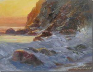
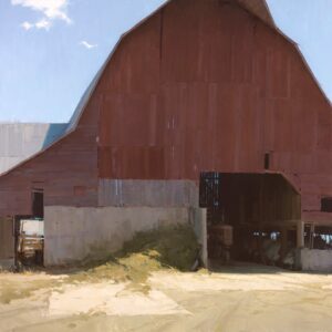
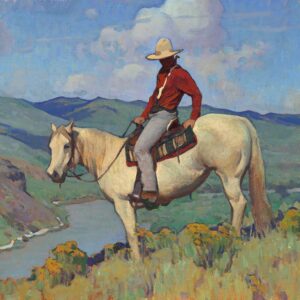
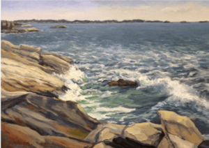
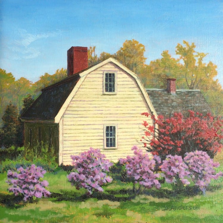
9″ x 12″ – plein air
Secondly, imbuing my plein air painting with a “sense of place” is significant for me. It’s not that important that my subject be a landmark, a hallmark, or a benchmark of some kind that everyone would recognize. It is more that the design I create would be true to the “spirit” of the place that is before me.
I believe that “artistic license” is a certificate that I should have to earn, after having already attempted to paint every tree, every trunk and every leaf in the forest. My ultimate goal is to express the natural in a simplified form, that the viewer would feel the place even more than see it in my painting. I have heard many workshop instructors say, that of all the problems students may be having, simplification would resolve most of them. Although all styles have their unique places in the arts, my intention for my own work is that I may paint a bit more like Hemingway, and a bit less like Faulkner.
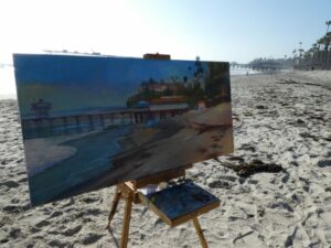
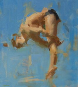
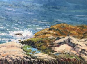
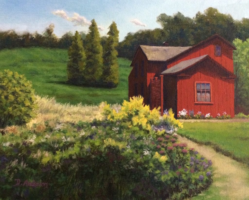
24″ x 48″ – plein air
Finally (perhaps I should say “last but not least”), I desire that my plein air work would have passion and feeling as its foundation. In the works of Sorolla, Sargent, Quang Ho, Jill Carver, Jill Basham, Patrick Saunders, Jason Sacran, Shelby Keefe, Marcia Burtt, Kyle Ma, Morgan Samuel Price, Randall Sexton, and many other plein air artists who have painted and are painting with confidence and conviction, one senses the impact not only of their brushes on the canvas but of nature on their own hearts. Surely that confidence can be gained only through working, and working consistently without doubt or fear. Perhaps the greatest advice I have heard to date concerning how to start a painting is that from Jim McVicker: “Just dive in!” I have never seen any diver do so tentatively.
What are some things I can do to be sure to incorporate each of these three important ingredients in my plein air work?
- I create rapid compositional value sketches of my chosen scene and take reference photos before painting to preserve the “moment” of my setting-up. I always try to have my camera and sketchbook with me whenever I go out to paint.
- To try to achieve that “sense of place”, I do a simple block-in in acrylic, looking up frequently to observe the shapes in front of me. As I paint over the block-in in oil, I am looking for atmosphere and subtleties that photographs can’t capture, including other details, such as texture, birds, figures, clouds, etc..
- Finally, I try to preserve the energy and “passion” of my under-painting as I guide the work through its middle and final stages. I study complementary shapes, the balance of warm and cool colors, gestures, brushstrokes, color choices, relative values, then the placement of final details. Everything in the painting should contribute to the expression of my idea, and to the feeling that inspired me to begin painting.
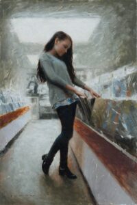
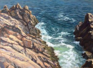
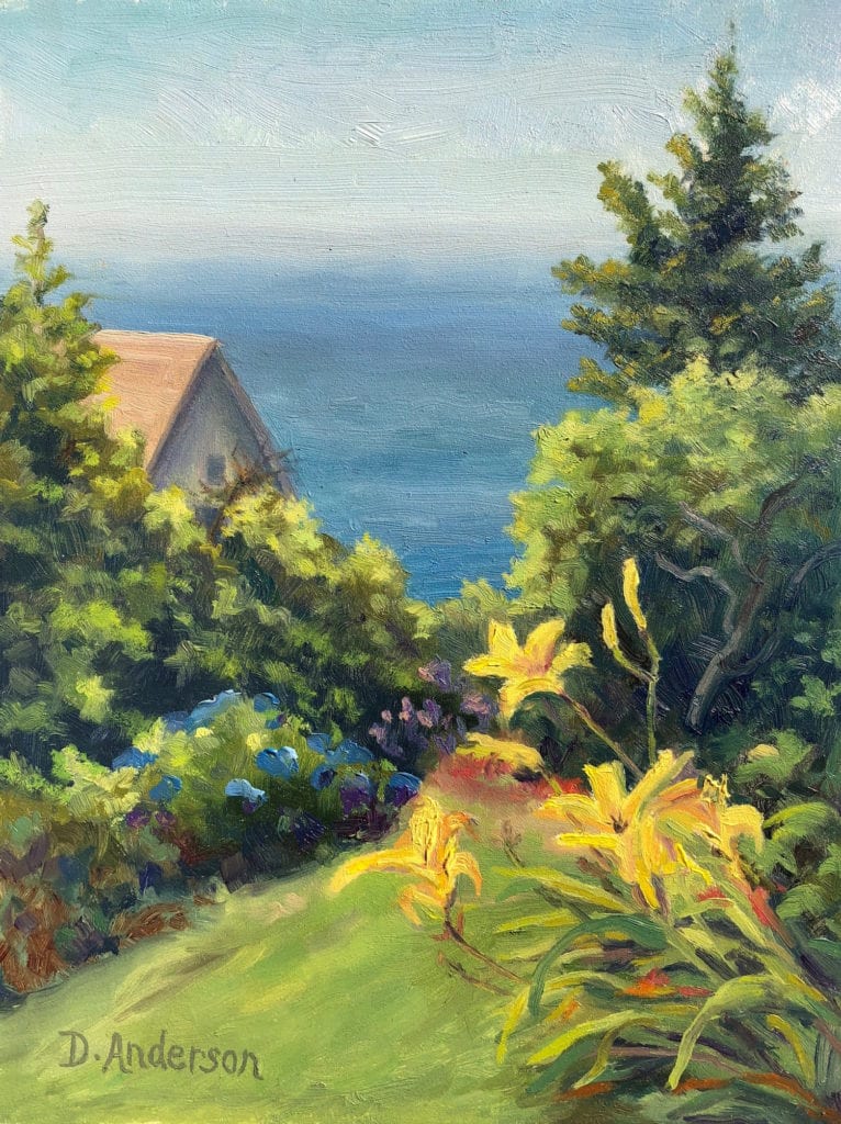
11″ x 14″
As I leave any plein air painting site, I remind myself that whether I am painting outdoors or working in the studio, that a great painting is a great painting, no matter where it’s done, and no matter what references are used. To me, any landscape painting created with passion, that inspires a sense of place, and that elevates the precious quality of each moment we are given, is worthy of consideration and praise.
by Rick J. Delanty
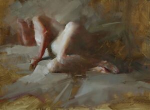
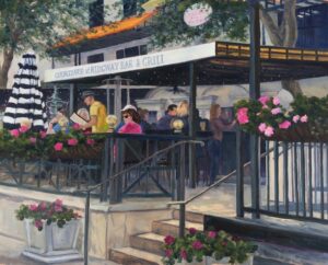
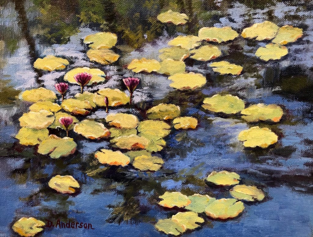
11″ x 14″ – Acrylic