My name is Suzie Baker. I am one of your OPA Board members. One of the ways I serve is to organize this blog. I’m kicking off a new, regularly occurring, feature to our blog called, “My Favorite Thing/s.” It will be a short, sweet and to-the-point paragraph or two from various OPA artists. They will share their favorite things. Most are finding it hard to narrow it down to just one thing. In the coming months, you will hear from Thomas Jefferson Kitts, Lori Putnam, and Ann Kraft Walker, to name just a few.
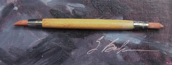
I’m going to start us off with a few of my favorite things. There are a few items in my collection of tools that I find indispensable. I use them for my signature in different circumstances. (Isn’t it crazy that we can do a great painting and then get intimidated when it comes to our signature).
Wipe Off Tool: I use this tool to sign my name directly into wet paint, it wipes off the paint down to the tone of the canvas. Great for Plein Air work. This tool can be found at almost any art supply store.
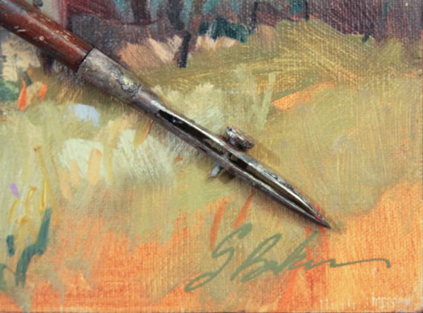
Ruling Pen: This is an oldie but a goodie. I’ve had this same ruling pen since I was in my 20’s. I’d panic if I lost it. On mostly dry paintings, I sign my name by thinning down my oil paint with Gamsol or similar. I deposit it into the opening of the nib with the side of a loaded brush and then write it on my canvas holding the pen vertically. Ruling pens can be found in protractor sets or online. Oh, how I love my old ruling pen!
Do you have a favorite thing to share? I’d love to hear about it. Please email me at suzie@suziebakerart.com or just comment here. I’ll watch the comments and maybe do a compilation in the future.
www.suziebaker.com
Archives for May 2015
Top 10 Qualities of Successful Artists
For years, I have known and worked with many artists who range from struggling to very successful. Although there is no exact formula for success, I have noticed several common qualities that most successful artists possess. How many of these following success traits do you have?
- Passion: Art is at the core of their lives and they love what they do. Yes successful artists want to make money, but they are motivated by their passion, rather than by external rewards. If it were all about the money, they would run out of ideas.
- Courage: Successful artists have the courage to pursue their passion and their dreams. They are willing to take calculated risks. They have courage and understand that a comfort zone is a beautiful place, but nothing ever grows there.
- Entrepreneurial: Successful artists understand how the art business world works. They work hard and know how to manage their time and how to delegate menial tasks. These artists understand the value of networking with galleries and their fellow artists. Successful artists also use branding, and social media to enhance their business and marketing plan. They recognize that money is a by-product of the value they offer. They follow their dream.
- Focused: Successful artists can concentrate. They keep their eye on the mark, and are goal oriented. When their tasks are complete, they continue to come up with fresh ideas.
- Evolve: With fresh ideas comes evolution. Success artists continue to grow, learn, and test themselves as artists.
- Resilient: They push themselves and know that success requires hard work. They learn from their mistakes and celebrate their achievements. Instead of giving up, they learn and better themselves from the rejection they often receive. Successful artists are problem solvers who find solutions. They are persistent.
- Support System: Successful artists surround themselves with likeminded people and those who are supportive of their art career. They do not allow naysayers or unsupportive people to block their path to success.
- Excellence: No matter what they pursue, they strive to do their best.
- Givers: Most successful artists are willing to share. They understand that the more you give, the more you will receive. They enjoy helping their fellow artist and are open in sharing their expertise with others.
- Manifestors: Successful artists view creativity as an abundant source. They are able to manifest their artistic visions onto canvas and their professional dreams into reality.
To succeed takes hard work, but it can be a learned behavior. It’s basically a matter of your attitude, and how you approach your art business and creative tasks. If you want to achieve your life’s dream of becoming a successful artist, hang out with successful artists and model yourself after them.
Kathy Anderson Class
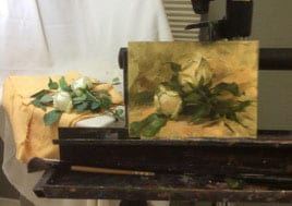
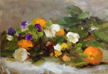
Through the generosity of the OPA’s Shirl Smithson Scholarship, I attended Kathy Anderson’s flower painting class at the Scottsdale Artists’ School. While I’d loved Kathy’s work for many years, it was once I’d met her, and subsequently watched her DVD, that it became obvious that she was as skilled an instructor as she is a painter – particularly important to me because I take very few workshops, and have learned along the way that an artist’s excellence at the easel has absolutely nothing to do with whether he or she is a talented teacher.
Having approached the workshop with some specific goals in mind, I’d like to share how they were met from my own perspective as a commissioned portrait artist – things that were different, those that were similar, and how I experienced addressing the challenges. My goals in taking the workshop:
- To understand the disciplined use of transparent and opaque pigments and the use of washes to get desired results;
- To achieve the clean color for which Kathy’s work is so widely recognized; and
- To manage edges in a more cohesive and creative fashion.
Set-up
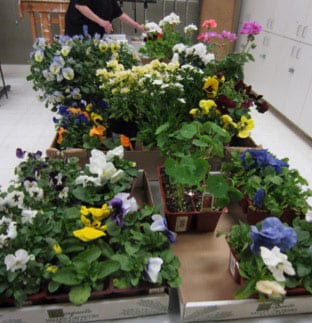
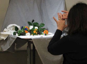
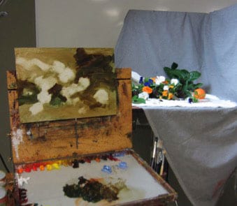
Unlike some other workshop situations, Kathy had us each select our flowers from a huge variety of fresh planted flowers from a nursery, encouraging students to choose flowers that we thought were beautiful. Although it took more time up front (compared to Kathy setting up our compositions for us in advance), it accomplished several things right away: we each could choose to paint subject matter that was individually exciting to us; it gave us time to examine and explore the structure of each different flower in our set-ups; and it forced us to consider a design that had movement and areas of both energy and rest, compositional elements that she stressed throughout each demonstration.
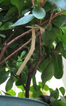
Kathy stressed the importance of having a design that works as well as possible, from the beginning, commenting that her plein-air kit contains (among other things) clips and bungee cords to move stuff that needs to be adjusted. I found this micro-solution for my azalea branch in one of the drawers in the student lounge.
Lighting
The taborets were lit by daylight-corrected bulbs – probably about 5000-5500 degrees K, lending warmth to the shadowed areas. This color temperature seems to be prevalent an Kathy’s floral and still life paintings, and is what one would expect in a garden from life, in conditions other than strong direct sunlight where lighting is subject to rapid change resulting from time and climate conditions.
Materials selection
The Demonstrations
Kathy’s daily demonstrations were thorough and varied. They focused on alla-prima approaches to painting the floral still life, always emphasizing the importance of a lyric design, variety of color, shapes and angles, and the joy that has to precede doing them (well, anything actually) really well. As the composition developed Kathy described Nancy Guzik’s approach to finding places to paint “little triangles”, serving as directional arrows though their dark values and the crisp edges they create.
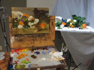
However, Kathy also demonstrated continuing to work on the painting from life during a second day, as well as taking photos at the first session in order to be sure to preserve the things that are most exciting- flowers, just like humans, can tend to droop after too much time on stage ☺
Also extremely valuable was her demo on how to go back into a painting that is dry to make adjustments or to complete the piece. The only reason – and I completely concur with this- artists can paint successfully from a photograph is because they have had extensive experience painting from life. Photographs lie to artists in the ways we most desperately need truth: color, value and edges. I firmly believe that learning has to be done from life – regardless of whether portrait, landscape, or floral subjects- and only after many, many canvases, can photos be interpreted in the best, most convincing manner.
The Opening
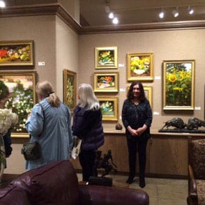 On Thursday night, Scottsdale’s Legacy Gallery hosted a two –person show with works by Kathy Anderson and Mark Boedges (spectacular landscape painter). Although I wasn’t able to attend, fellow student Josi Callan shared photos from the opening. Legacy’s Scott Jones dropped in several times during the week, and couldn’t have been a better ambassador/advocate for artists everywhere. (Look for future information on Scott and his insights into gallery-artist relationships).
Because I am fortunate to live only a few minutes from Legacy Gallery, I had the chance to visit on a quiet day after the opening and to spend as much time as I wanted drinking in Kathy’s fabulous paintings, each of which offered a silent, retrospective review of all that she’d taught the previous week.
In Summary
Yes, you should take the opportunity to study with Kathy Anderson. If you like learning from DVDs, buy hers. Kathy is as generous and warm as she is on her video. I don’t think there is ever a time when an artist should stop being challenged, stop studying or stop trying new things. Choose your instructors with care. Show up to class with the right materials and most importantly, the right attitude. Your time is too valuable to waste.
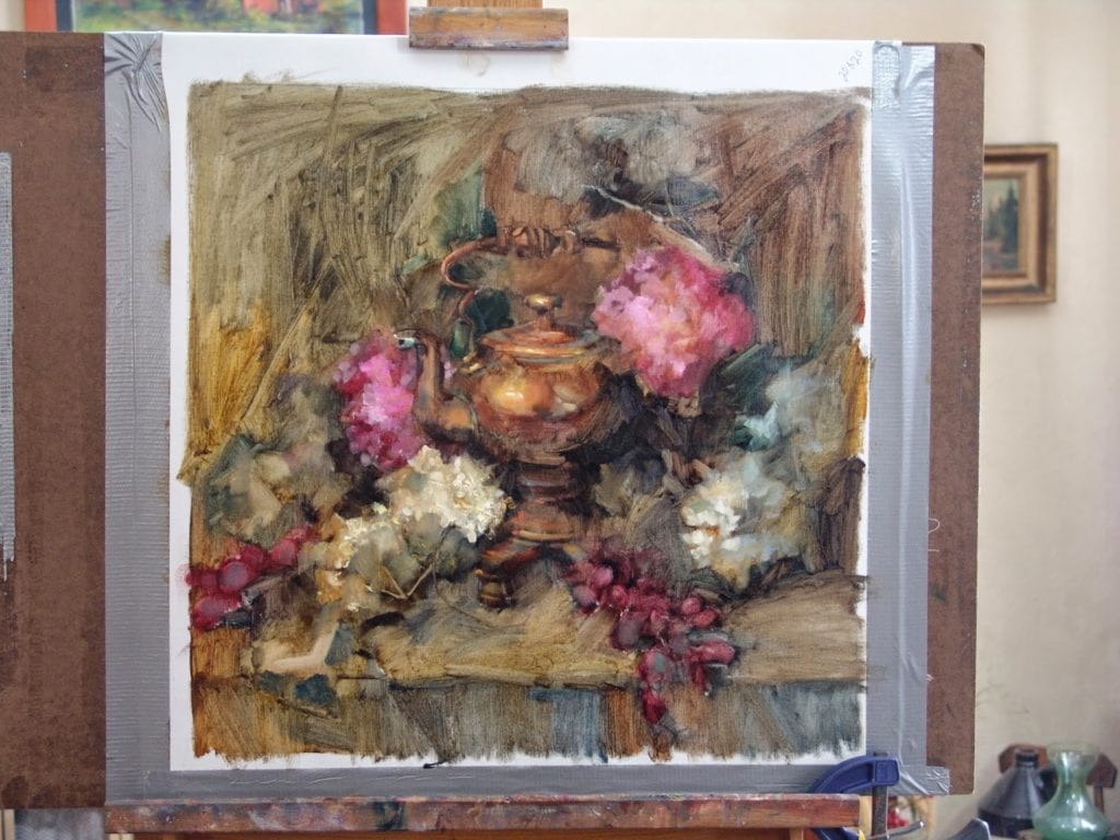
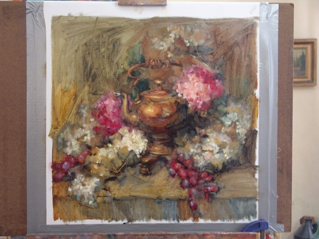
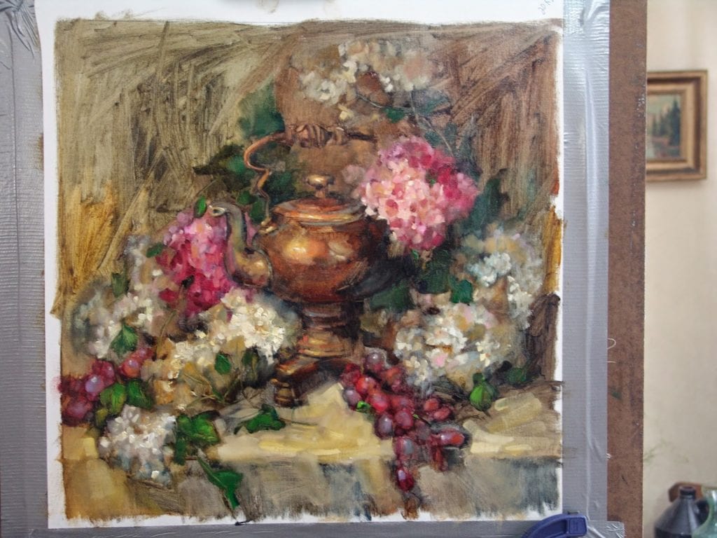
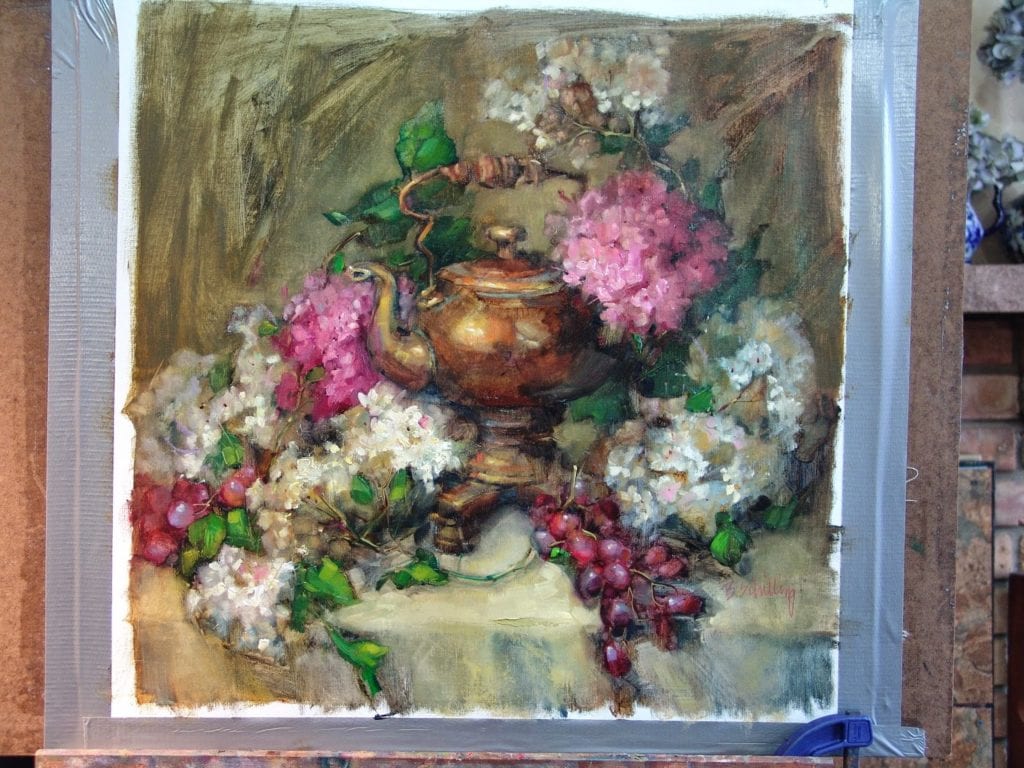
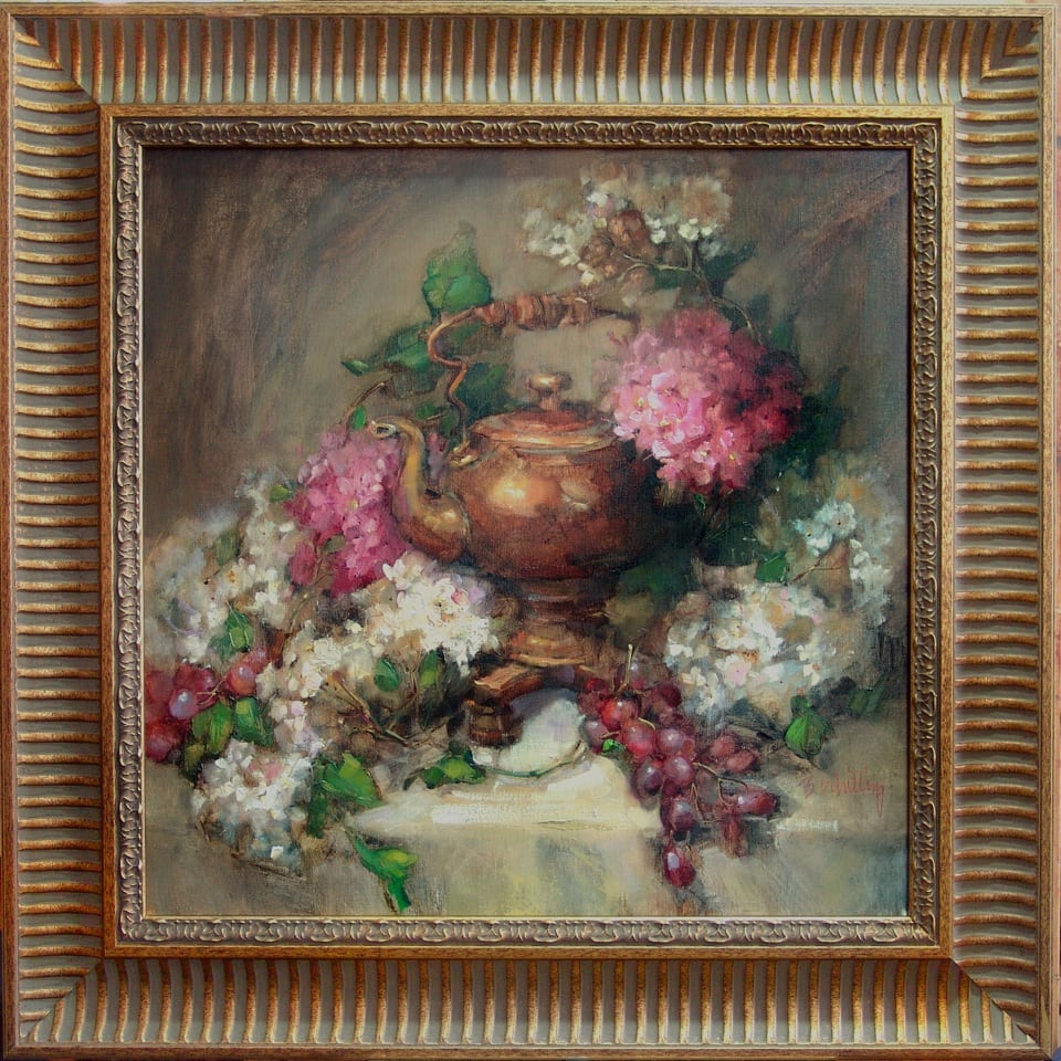
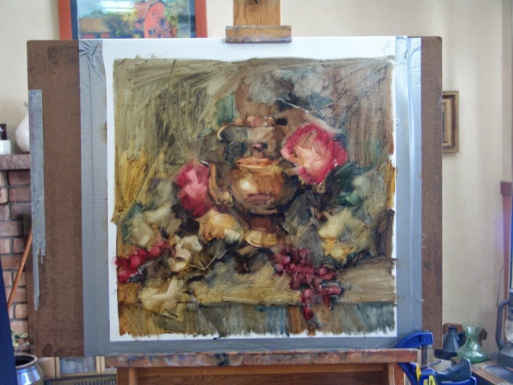
Fireside Teakettle
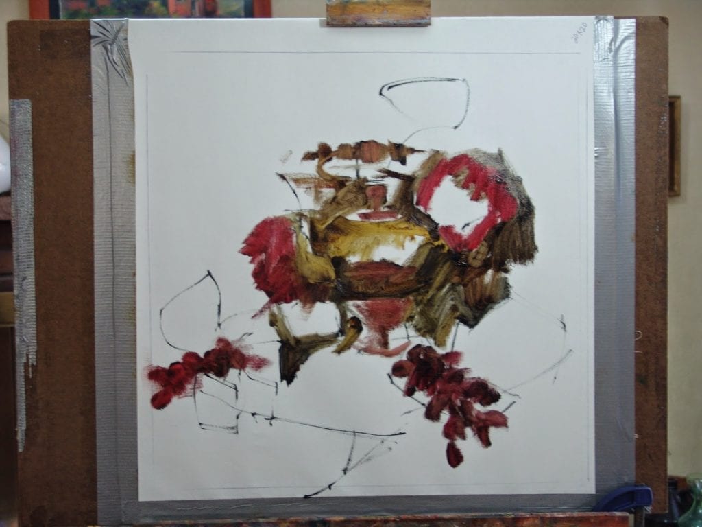
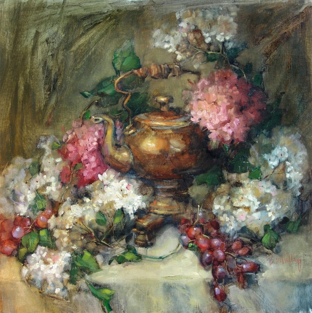 I’ve had some requests to post some of my processes so I am going to do a step-by-step of this painting. The teakettle is an antique given to me by an old friend…I wish I knew the story of it, I’ve never seen another one like it. I hope you enjoy the information on my technique(s)!
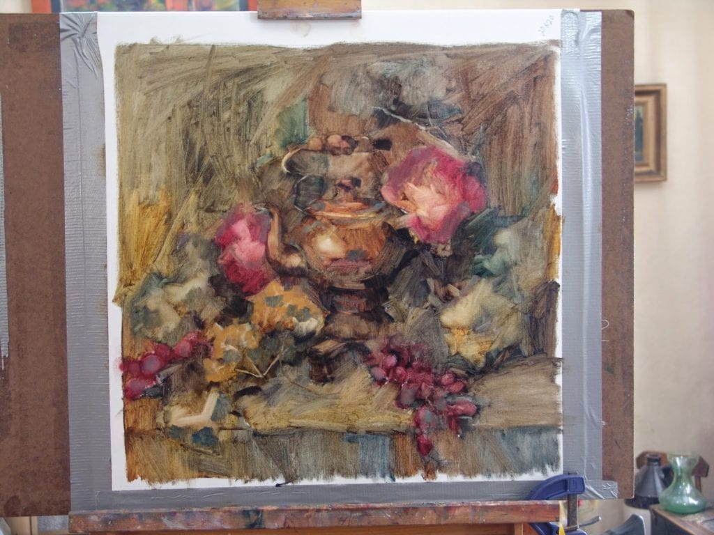
No two paintings are ever approached or completed in exactly the same way. I think it is very important to allow the energy to flow naturally and sometimes that may take a course during a painting that you didn’t originally plan. I think that is not only ok..I think that is necessary if your painting is going to find life. While the “rules” to painting are absolutely necessary to learning how to create a pleasant and believable work of art, it is with practice that you can learn to bend and remake some of those rules. That is when an artist truly begins to find their own voice. That is an evolution that must take place or the artist is simply mimicking that which has already been said.
There are as many visions for a painting as there are artists to paint it. The following process is simply my vision.
Let me begin with my palette. The colors I choose are very important for the technique I use. I love the combination of transparent and opaque and there are two things you must have to get that effect:
- Oil primed linen (I use Centurion oil primed. I stretch my own canvases so I purchase it by the roll. It is also available prestretched. I find that Jerry’s Artarama has some reasonable prices)
- Transparent Pigments. I have certain colors and certain brands that I cannot paint without.
Most of my colors are Rembrandt unless otherwise specified (The brand is important because colors and transparency can vary a lot from one to another)
Rembrandt transparent pigments;
- transparent oxide red
- transparent oxide yellow
- transparent yellow light
- olive green
- transparent oxide brown
other “must have” transparent colors that I do not have a preferred brand:
- alizarin crimson permanent (make sure you are getting one that is permanent, the older alizarin crimsons would fade with time)
- ultramarine blue
- quinacridone rose
- viridian green
These are my initial layout and block-in colors. I do not use any opaque pigments at this point.
I do not use all these colors for every painting it depends on the color harmony or local color of the objects for each painting.
Opaque pigments;
- Titanium white (I prefer Rembrandt, but use others too) Any time you add white to a color it starts becoming more opaque…the more white the more opaque.
- cadmium lemon yellow
- cadmium yellow medium
- cadmium red light
- yellow ochre
- cobalt blue
- dioxazine purple (sometimes)
- burnt sienna
Mineral spirits is my primary brush rinse and thinner although I may use some liquin as I progress to the final stages of the painting.
I like to keep my brushes sharp (chisel edged). I use almost all Silver Bristlon Brights or angled (these are a little harder to find) I like a semi-stiff bristle. If I want to “scrub out” a larger area I will use a natural bristle bright as they are stiffer and tend to be more durable for that rough treatment.
It is hard to keep brushes sharp for long and I do replace them every couple of months.
I learned a technique from Daniel Keys for putting a folded cardstock over the tip and securing with a bulldog clip. It does help but you have to do it carefully or you can really mess up the bristles!
Ok..lets start painting!!
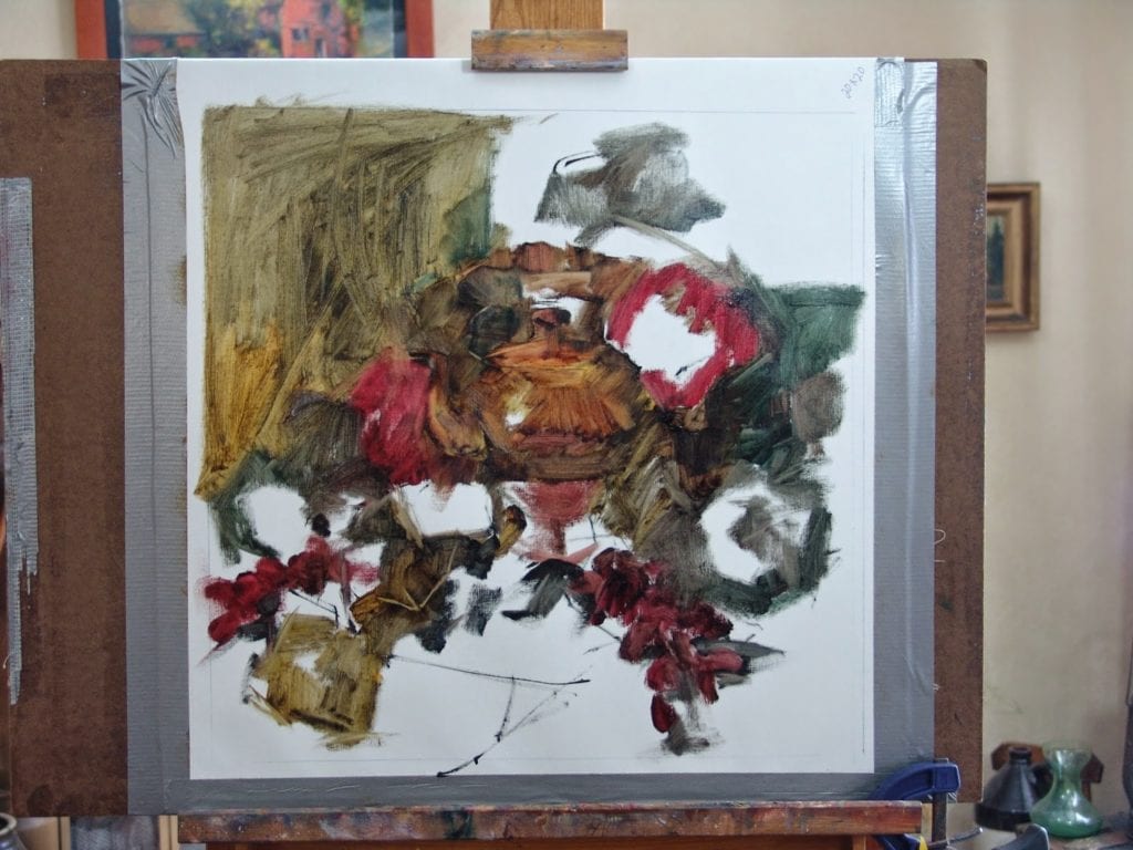
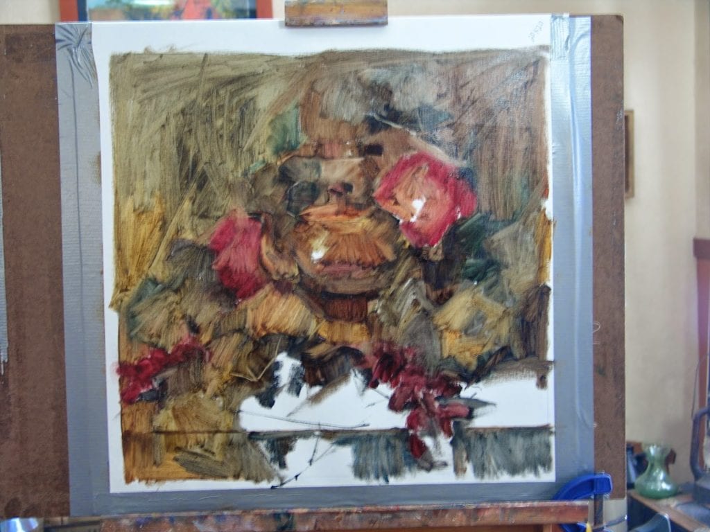
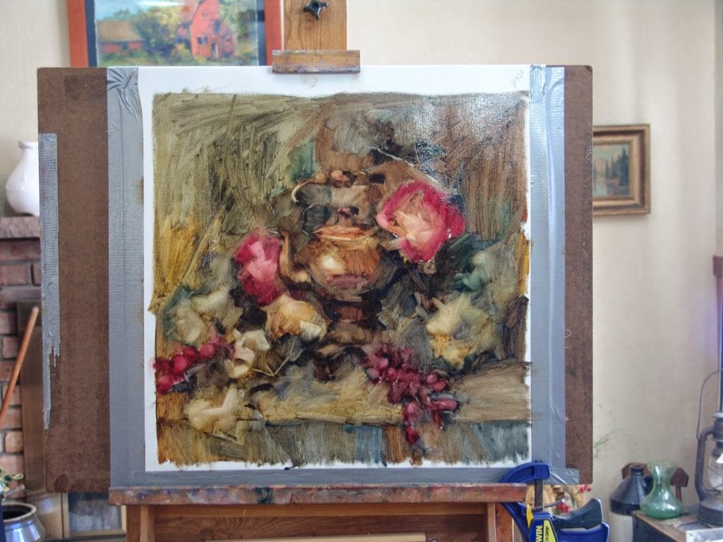
My opaque areas are also where I usually apply my thickest paint. sometimes putting it on so thickly that I can almost sculpt with it to create form. I only do this where I want the most important parts of my painting to be. The point of interest.