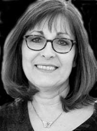
 Debra Groesser is a signature member of the American Impressionist Society, American Plains Artists, and Plein Air Artists Colorado. She’s an associate member of the Oil Painters of America, and American Women Artists…and she’s on the Board of PAAC.
This folks is your current president of the American Impressionist Society…one busy lady to say the least.
It took several months to finally complete this interview, but I believe you’ll find it worth the wait. I first met Debra a couple of years ago in the Flint Hills of Kansas during a plein air event organized by Kim Casebeer. I found Debra to be a delightful person.
There is more to this interview than shown here, so I will include some of her other comments in future blog topics I have planned. I hope you enjoy the interview.
What’s the correct pronunciation of your name?
Grow-sir.
How did you first become interested in art and what led you to becoming a professional?
I just remember always being interested in drawing. My favorite thing to do as a child was to copy the illustrations out of my story books. I also copied the words and by doing that, taught myself to read at age four. My favorite book was “Barbie Goes to a Party”. I would love to find a copy of it! Back in the days of Romper Room (giving away my age here), they would put pictures up on the TV screen for kids to draw and mail in to the TV station. My mother sent one of mine in when I was three and they put it on TV…I don’t remember it but I guess you could say that was the start.
In my coloring books I always put light and shadow on everything. It was never just flat coloring. I had a friend in 5th grade when we moved to Nebraska who was also very artistic. Instead of playing the usual games that kids played, we would draw for hours. We set up tennis shoes, still life’s, drew the trees in the yard…anything we could find. I just loved it. From there, I took every art class I could in high school and then earned my BFA degree in college (studio art/painting).
After graduating, I married my first husband, and began working as a graphic artist for a local bank. I tried to do a little painting when I could find time. My husand decided to start a home building company in 1980. We had two children, and when they were almost two and four, I left my graphics job to stay home. For the next couple of years, I did the bookkeeping for my husband’s business, painted and did freelance graphics work when the kids napped and at night after they went to bed. That lasted a couple of years until it became necessary to get my real estate license so I could help my husband’s business by selling his homes. Ironically, the week that I was waiting for the results of my real estate test, Denise Burns, founder of Plein Air Painters of America, was in our town to teach an oil painting workshop, which I attended. She really inspired me and encouraged me to pursue my art (the painting I did in that workshop still hangs in my studio next to my easel).
I passed the real estate test and, reluctantly, ended up having to put my art career on hold. With two small children, the demands and time commitment of a real estate career and still doing the bookkeeping for the home building business, there was no time for art (other than drawing architectural renderings to advertise the homes we built). Three years later, we divorced.
Throughout my time in real estate, I never lost sight of the goal of returning to my art career someday. I always considered myself an artist first, and real estate was just temporary.
In late 1991 I married my husband Don, with whose love and support I was able to return to my art career. By this time I was doing architectural illustrations for several home builders and little pen and ink drawings (sometimes with watercolor added) of people’s homes to give as closing gifts. I also did note cards printed from my pen and ink drawings of homes. Soon, other realtors started ordering my drawings and cards for their own clients. Eventually I got to the point that I was earning almost as much from the “house portraits” as I was from selling real estate.
I started painting again a couple of years later. When Don saw my paintings and how happy it made me to be painting, he encouraged me to let go of the real estate career and get back to creating my art full time. We remodeled our basement into a small classroom where I taught art classes for children. I painted, and continued doing the house portraits, renderings and graphic work. Eventually, my art took over the spare bedroom, the basement, the office and then the dining room. At that point, in 1996, we bought a small building in our little downtown area and remodeled it to house my studio, a large classroom, a frame shop and a gallery…and I let my real estate license go. That freed up my days for art and my evenings and weekends for family time. Each year we analyzed which areas of my art business were profitable for the amount of time and money being spent, and reviewed and set new goals. I closed the gallery after four years to spend more time producing my own work, and eventually stopped doing commercial framing for the same reason. Next, I let go of the renderings and graphics work, and started scaling back on the house portraits (which were all deadline oriented and not as enjoyable as painting) so I could concentrate just on painting.
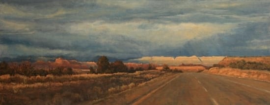
Also in 1996, the same year we opened the downtown studio, I began taking one painting workshop a year to help improve my painting skills. The first one was with Tom Browning in 1996. In 1999, my first plein air workshop was with Kevin Macpherson in Bermuda…AND I FOUND MY PASSION. I went on to study with Kevin several more times as well as Kenn Backhaus, John Cosby, Kim English and Scott Christensen. Other than traveling to workshops, I stayed pretty close to home until my children graduated from high school. I began entering juried shows and competitions, first locally, then regionally, and finally nationally. Being accepted into several, and winning a few awards, brought attention from some gallery owners and resulted in representation by three of the four galleries who currently represent me. Although I’d been a full time artist (which included painting too) for about ten years, my goal was to be a full time painter. I made that transition about seven years ago.These days, I try to paint during the day and do my marketing in the afternoons and evenings. Some weeks I’ll set aside a couple of days just for marketing. I spend probably about as much time on the business side of art as I do actually producing art.
What is your role as president of the American Impressionist Society?
I’m still very much in the learning process since I’ve only been in this position since the end of January of this year. Communication and coordination best describe the biggest roles I have at this point, and working with the board, the founders and the officers. The first priority was to get to work on our 14th Annual National Juried Exhibition with our Show Chair, Suzanne Morris, who had already been working hard on the show for a few weeks. The show will be held at M Gallery in Charleston SC in October. I’ve worked on things like writing the show prospectus, arranging for the workshop in conjunction with the show, communicating with our web designer, recruiting volunteers to help with various aspects of the show, updating the AIS Facebook page as needed, and writing communication for the membership. Now that the online entry system for the national show is active, I’m fielding questions from members and helping however I can. I’m actively seeking ideas and suggestions for new opportunities and ways to serve our membership so we can continue to build on what is already a great organization. We already have one exciting thing in the works…but as nothing is finalized yet, you’ll have to stay tuned for more information as it progresses.
There are so many art groups today that differentiate themselves according to medium, subject matter, style, region of the country, or even gender…what are your feelings about that?
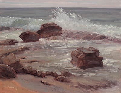
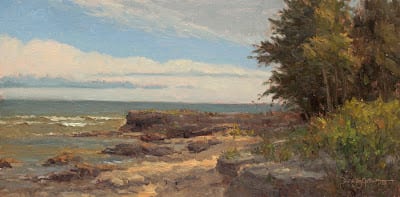
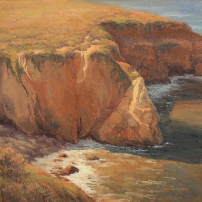
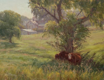
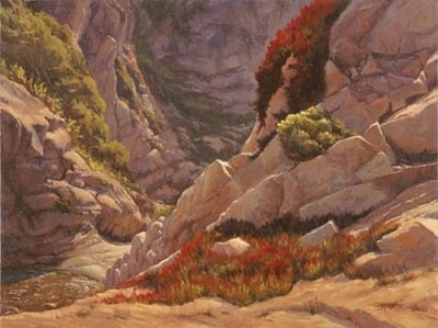
There really are a lot of them. I think that many of these groups do give artists a place where they feel their art fits in (style, medium, subject matter), as well as opportunities to meet other artists, network, paint together, take part in workshops and, often, group exhibitions. The main thing I’ve done is research what they offer and decide which of the groups fit my needs, my goals and my work. My style of painting is more impressionistic and I do a lot of plein air painting, so I’ve done well with AIS and plein air groups, such as Laguna Plein Air Painters and Plein Air Artists Colorado, as opposed to other groups who, for example, favor tighter realism. There are not a lot of artists in the area where I live, but through one fairly new group, the Missouri Valley Impressionist Society, I’ve been able to connect with many artists who live in about a three hour radius of me. Through MVIS I can participate in paint outs and exhibits closer to home that I otherwise would not have known about. I paint landscapes, but I also do portraits and figurative pieces, so I’ve been encouraged to join the Portrait Society of America, which I’m now seriously considering. In my experience, there are a lot of benefits to be gained from being a member of a group or groups.
Several contemporary art movements seem to have a pretty fuzzy definition as to what fits into their “movement”…What is your definition of Impressionism? Is it merely surface appearance, intention, a philosophy…or is there more to it?
Impressionism is more about spontaneously capturing a moment in time, an “impression” of the subject, by carefully observing and quickly rendering the effects of light on the subject, the colors, the atmosphere, movement. Impressionist paintings are representational with visible brushstrokes but without a great amount of detail (think plein air paintings as the most obvious example). Tightly rendered pieces with a lot of detail and smooth surfaces wouldn’t fit into that definition. The American Impressionist Society, Inc. defines American Impressionism as “the concern for light on form, color, and brushstrokes. It allows equal latitude between these attributes, and recognizes not a single definitive element, but several factors – including high key light and hue, visual breakdown of detail, concern for contemporary life, and cultivation of direct and spontaneous approaches to a subject”.
What proportion of your work is done en plein air?
Probably about 70 to 75%.
What qualifies as a plein air painting?
There are so many different opinions on this subject. To me, if the majority of the piece is painted outdoors, on locatoin, from direct observation, from life, it qualifies as plein air. Now “majority” can mean different things to different people. I think some touch ups in the studio are permissible for it to still be considered plein air. I have a couple of pieces I did in Zion National Park that need tweeking, but probably 85-90% of these pieces were completed on location. Just because I will finish them in the studio, the overwhelming majority of each was plein air. In my opinion, they will still qualify as plein air. I’ve had to paint from inside my car during rain and thunderstorms, and because I’m painting it from life, on location, from the actual observation of the scene in front of me, I consider that plein air as well.
What are the major problems encountered when translating a field study to a large studio painting?
The major problem is to translate that freshness and immediacy that you achieve in the field on to the canvas in the studio…it’s very, very difficult. So much of that freshness is achieved because the time is limited in the field…the conditions are changing so rapidly that to capture the scene, you have to paint quickly and more intuitively. In the studio, there are no time constraints. The light isn’t going away. The shadows aren’t moving. There is much more time to think about what you’re doing and that in itself takes away from that original feel of the field study. I no longer try to make the studio pieces be an enlarged ‘copy’ of the field studies. Instead I use the studies as color reference and inspiration. It frees me up to play with composition, color, mood, etc, in the larger paintings and is much more fun.
What advice do you have for a first-time plein air painter?
Keep it simple! Pack as lightly and as compact as you can when it comes to your gear. There are a lot of options out there for equipment. Be sure to have a hat with a good brim, sunscreen, bug spray and plenty of water to drink. Avoid wearing bright colors when you paint outdoors as they will reflect onto your canvas and skew the color in your painting. Keep your canvas and palette out of the direct sunlight…even if it means having your subject behind you. Keep your compositions simple. Block in your shadows first and commit to them. Avoid ‘chasing the light’ (changing your painting as the light changes). Work quickly.
What are your artistic goals for 2013?
To stay organized, to successfully serve and lead AIS and find new opportunities for our members, to produce another 20 paintings for the solo exhibition this fall with historical works by artist Abby Williams Hill, to have a successful National Juried Exhibition for Plein Air Artists Colorado (I serve on the PAAC board and am the show chair this year), be more consistent with my blog, to get out and paint on location locally as much as possible, and to create a new body of seascape paintings from the plein air studies and reference photos from a recent trip to California. I will be traveling and painting for a month this fall as well.
Thanks Debra for your time, for your active participation in so many art organizations…and for your boundless energy. From your resume, it’s pretty obvious…you’re not done yet.
 Here’s how you prepare your canvas: It’s easier to work on a tabletop for this than using an easel. Tape the canvas to a board to allow yourself freedom to spin the chart around as you fill the squares. Measure out a quarter of an inch for the width of the tape, then an inch for each square, and repeat for every color. Make tic marks with your pencil, rather than lines, to indicate placement. Put the quarter-inch tape between the marks and leave a tag hanging off the end for you to pull when you’re done. Place all vertical tapes first, followed by all horizontal tapes. You will carefully remove the tape as soon as you are done with each chart (don’t wait till later!); it is easy to pull the horizontals off first, then the verticals. Now write the initials of the colors you will be charting. For example, the colors I use for the limited palette are Transparent Oxide Brown, Ultramarine Blue, Cadmium Red, and Cadmium Yellow Pale: TOB, U, CR, and CY. The Transparent Oxide Brown chart will have these headings on the columns: TOB, TOB/U, TOB/CR, and TOB/CY. Note that the size of your chart/canvas will be determined by the numbers of colors and values you want to explore. For the limited palette, I chose four colors and five value steps, so I will have four across and five down, plus some space between each chart. Measure it out accordingly.
 Here’s how you create your chart: Understand that this is an exercise for your eyes, mind, body, and soul. It will demand your full involvement in a most personal way as you begin a real dialog with your colors. Give yourself lots of latitude, grace, and hours.
 When you have your first and last colors laid in, you will mix the value that is right in the middle of those two. Mix it and hold it on your knife over the two color values on your chart and ask yourself which it favors more, the pure color or the lightest tint. This is when your colors really start talking to you. When you finally mix a color value that favors neither, you have your middle square. The last two colors are halfway between each of these: one is halfway between pure color and middle color value, the other is between middle color value and lightest possible value.
 It’s easy to see how your mind and eyes are challenged by the creation of color charts, as all the measuring is intellectual and visual. If you try to literally measure part-for-part, you will not have an accurate chart because every pigment has a different saturating power. So, your mind and eyes are about to get smarter. You will not find how it challenges your body until you start the process. You will then be amazed at how physically demanding this assignment is. This isn’t for sissies. And as for the soul… ultimately your choices, as objective as this process seems, will be determined by how you feel. It can’t be taught. You will only get it when you do it. This is why charts must be done and not just seen. It’s also why the color charts vary between different artists, and why Richard Schmid can say that he learns something new every time he makes a new set. He is still making new charts for himself! And since he’s been painting longer than a lot of us have been breathing, perhaps it really is a worthwhile thing to try.