• Skip to primary navigation
  • Skip to main content
  • Skip to footer
  • Help Desk
  • My Account

OPA - Oil Painters of America

Dedicated to the preservation of representational art

  • Home
  • About
    • Mission, Policies & Bylaws
    • Board of Directors
    • Presidential History
    • Frequently Asked Questions
    • History
    • OPA Staff
    • Contact Us
  • Membership Services
    • Member Login
    • Membership Information
    • State & Province Distribution For Regionals
    • Update Member Information
    • Membership Directory
    • Contact Membership Department
  • Events
    • Exhibitions
    • Online Showcase
    • Lunch and Learn
    • Virtual Museum Road Trip
    • Paint Outs
  • Resources
    • Brushstrokes Newsletters
    • Ship and Insure Info
    • Lunch & Learn Video Archives
    • Museum Road Trip Video Archives
  • Services
    • Sponsorship Opportunities
    • Scholarships
    • Critique Services
    • Workshops
    • Have A HeART Humanitarian Award
  • Online Store
  • Awardees
  • Blog
    • OPA Guest Bloggers
    • Blogger’s Agreement (PDF)
    • Comment Policy
    • Advertisement Opportunities
  • Show Search
Hide Search

Archives for February 2014

A Venetian Methods Oil Painter

Susan E Budash · Feb 25, 2014 · 1 Comment

Susan Budash

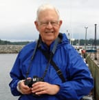
As a visual artist I’ve created images in Silkscreen, Intaglio, Lithography, Mixed Media, Watercolor, Acrylics and Oils and in a variety of methods, primarily Direct Painting (Alla Prima) and genre, but I always felt drawn to the visual degree of depth and luminosity present within the magnificent oil painting created by Master Artisans of the Renaissance to the Romantic Periods. The knowledge in creating paintings with similar attributes always eluded me. Little did I know that in order to achieve this luminous depth I had to learn an entirely new method in oil painting and with pigments with which I’d never been familiar with. Regardless of my persistent inquiries, the answers I sought would not be forthcoming for decades and when I learned in 1999 that the key word in opening this ancient volume of knowledge would lie with the word, Indirect Oil Painting.

Budash-Susan-APearDressedForDesert

My first introduction to creating art began at the age of nine and with an emphasis on drawing from life, as well as copying from books featuring paintings in major museums. My instructor, the late Jack Simmerling, a Chicago watercolorist, who gained acclaim for his renderings of historical Chicago landmark architecture, stressed the importance in developing one’s drawing skills. “If you can meet the challenges in perspective, value, composition and spatial relationships, then your paintings will be successful.” His words have lived with me for all 50 plus years I’ve been painting.

A Basket Of Verses

In so much that I have enjoyed and successfully rendered paintings created in the painterly Direct, Alla Prima Painting Methods, I have felt this method never fully met what I have been hoping to achieve in my paintings. And unfortunately, Virgil Elliott’s book, Traditional Oil Painting, wasn’t released until 2007, so with my PC I independently researched and was introduced to Eastern and Western European Flemish oil painting artists, who generously shared their knowledge and expertise, along with links to museum conservationists, who further enlightened me to the beneficial and not so beneficial pigments and mediums available. Putting this knowledge into hands-on practice led me through some humorous and not so humorous trial and errors, one of which I will share in the course of this blog. Unbeknownst to me at the onset was that not all oil painting from Renaissance to the 19th Century was created in the Flemish Methods, but that there was a second school within Indirect Painting known as the Venetian School and their methods differed in several ways from that of Flemish artists. The Venetian Method, believed to have been initiated by Giorgione, Titian and other Venetian oil painters, introduced creating their drawings on a mid-tone ground and then followed with an opaque gray layer, known as a Grisaille, creating a gray pallet with Lead-Based White paint, also known as Stack White. When I learned about the artist’s use of Lead White in their pallet, I knew instinctively that Lead White was a key component in their achieving the luminosity within their paintings.

Umber Under Painting

Without a demonstration of the Venetian Methods, initiated with the grisaille, tints and scumbles, I had ventured into uncharted territory and therein I learned by my hits and misses. One such early “miss”, which I share with all my student’s is the humorous and decidedly nonsensical approach in removing the first several excessively oily glazed layers. The pigmented glazes were collecting in patches and not forming a thin layer over the composition. My frustration peaked when I couldn’t remove the under-layers of previously dried oily pigments with a solvent. My solution, purchase Formby’s Finisher Remover. After applying a thin layer of Formby’s, to my relief it removed the upper layers of glazes, but it didn’t stop there, it continued to eat away the grisaille, the under drawing and culminated in eating a hole right through my Belgian linen! I learned the Fat Over Lean premise is one fell swoop!

Budash-Susan-ABasketOfVerses

Since those early self-taught days in painting in Venetian methods, I am by no means 100% spot on, but I am continuing to learn with each still-life or figurative painting I create. This process is not for those who wish to witness immediate results, as a painting can take months to complete. At any one time, I have a dozen or more paintings in various states of completion, thus allowing the natural course of glazes setting-up. Of equal importance is learning which pigments are opaque, semi opaque and scumble worthy and which are considered lean and those that are fat. What and when is critical in the application of pigments.

This educational journey has been so rewarding and while I always loved oil painting, nothing has brought me more satisfaction and joy than painting in the Venetian Methods, especially when it comes time when I can begin the color layer. I call it, “Turning on the Lights” thus witnessing the luminous glow reveal itself in the painting’s final stages.

Photographing Your Artwork

Tom Schmidt · Feb 17, 2014 · 6 Comments

These notes were presented by Tom Schmidt at the 2009 OPA National Meeting in Santa Fe, NM.

Tom SPhotographing your artwork is fairly simple if the proper procedures are followed and it is done under the proper conditions. With the advent of digital photography, good results can be obtained even by someone not deeply into photography. However some care must still be taken. One should not just point a camera at the painting and shoot. Further, in 2003 and 2004 a major revolution occurred in photography, and that is the switch from film to digital imaging. At that point, film photography became essentially obsolete. A few purists still use it especially in the larger formats, but everyone else has switched. It is now difficult often to get film processed even if one can find it to purchase. That being the case, this talk will largely cover digital photography, although some notes on the use of film will be included.

BettyS4
Headed Home
By Betty Schmidt
Oil on Canvas
16″ x 20″

  1. First consideration: What do you want to do with your photographs?
    1. Keep a record of your work after it is sold
      1. A digital record can be kept on:
        1. A computer hard drive
        2. A compact disk or DVD
        3. a flash drive or camera memory card
      2. A print on paper or canvas
      3. A film slide or transparency

  2. Enter contests, competitions or shows.
    1. Entries usually must be in digital form in a format and size specified by the organization soliciting the entry.
    2.  Some organizations may also request a print since digital images may vary between various computer monitors.
    3.  A few still require slides

  3. Make a portfolio to show your work to galleries or other interested parties.
    1. Regular photographic prints can be pasted in a scrap book
    2.  Computer prints can be made directly on pages to be inserted in a bound book. Such pages can contain explanatory data if desired
    3. A web site can serve as a digital portfolio
    4.  A CD or DVD can also be used.

  4. Make Giclée prints for sale
  5. Submit for publication in a magazine or other high end printed material.

  • Second consideration: What type of camera to use?
    BettyS5
    Sailing st Sunset
    By Betty Schmidt
    Oil
    22″ x 28″

    1. For most purposes a standard digital camera with a resolution of 5 mega pixels or better is sufficient.
      1.  Most paintings do not contain extreme detail as found in regular photographs so high resolution is not necessary
      2.  A zoom lens is a great convenience since this removes the need to move the camera back and forth to fill the frame.
      3.  A digital single lens reflex is usually not necessary since digital cameras have a liquid crystal display on the back which shows exactly what the camera will see and this allows exact framing.

    2. If you plan to make large prints and your painting is larger than 20” by 24”, you will want a higher resolution camera. At least 10 mega pixels resolution is required.
    3.  For really big paintings to be printed full size, a view camera with a scanning back is needed. These are very expensive and usually only owned by professionals.
    4. If you will use film:
      1.  At least a 35 mm single lens reflex is required. The view finder of other types is offset from the lens so it does not see exactly what the lens covers and one cannot accurately frame the picture.
      2.  For extreme detail, a medium format reflex or a large format (4 x 5 or larger) view camera is needed. However, most publishers no longer require such images.

    5. Regardless of the camera used, a tripod of other firm support is needed. Exact framing and focus cannot be retained without such equipment.
    6. Even with a tripod in use it is wise to use a remote or cable release or the camera self timer to prevent any camera movement.
    7. Do not use a wide angle lens since many wide angle lenses show barrel distortion. This makes the straight edges of a painting bulge out. Probably the widest angle lens which should be used is the equivalent of a 35 mm lens on a 35 mm camera.

BettyS6
Afternoon Shadows II
By betty Schmidt
Oil
16″ x 20″


  • Lighting. Entire painting must be evenly lighted. Whatever source is used, it must evenly illuminate the painting. Uneven lighting produces bright or dim areas.


  1. Many people like outdoor lighting
    1.  It is usually even and diffuse, minimizing unevenness and glare spots.
    2.  It can give natural color
    3.  It is usually bright enough to produce a good exposure without pushing the sensitivity of the camera
    4.  However, it can vary greatly in color
      1. Normal sunlight is fairly neutral in color, and “daylight” film is balanced for this light.
      2. Cloudy sky or shade or “north light” are blue and will produce bluish photos.
      3. Early morning or late afternoon light is orange and will produce reddish photos.
    5. Outdoor photography is always at the mercy of the weather.
      1. Extreme heat or cold may be problems
      2. Precipitation can ruin any photo shoot.

  2. Artificial light has many advantages.
    1.  Since it is usually used indoors, weather is no problem
    2.  It is uniform in color and can be color and intensity controlled.
    3. However, it may be uneven, depending on the source and any reflections.

  3. There are several types of artificial light
  4.  The most common is incandescent, as from a normal light bulb.
    1. This light covers a broad spectrum with no peaks or valleys.
    2. It is usually yellow orange in color and produces orange photos unless corrected.
    3. Halogen lights are incandescent but produce whiter light than normal incandescent lights. I prefer this type of light.
    4. These lights produce a lot of heat which could damage paintings if left on too long
  5.  The second type of artificial light used in photography is electronic flash.
      1. Electronic flash produces white light similar to daylight but often somewhat bluer.

    BettyS7
    Clipper at the Rock
    By Betty Schmidt
    Oil
    24 x 24

     
  6. Never use on camera flash to photograph a painting
  7.  
        1. A hot spot will be produced in the center of the painting by light reflected directly back into the camera.
        2. Any glare spots in the painting (as from glazing or varnish) will show up as bright dots.

  • The third type of lighting to be considered is fluorescent lighting
    1. Fluorescent lamps, particularly tubular types, produce even light, are cool, and can be had in various colors.
    2. Fluorescent lamps do not produce even amounts of light throughout the spectrum. This can make accurate color rendition impossible.
    3. With custom white balance settings, a digital camera may give an acceptable but not good color rendition.
    4. With film cameras, color correcting filters are available for fluorescent sources but they do not do an acceptable job.
  • Lighting placement- The prime consideration is avoiding reflections and glare.
    1.  In an outdoor situation, avoid shadows and dark areas.
    2.  The best indoor arrangement is a brightly lighted room with white walls and ceiling. This avoids direct lighting, its reflections and shadows.
      1. If you can, bounce the lights off the walls or ceiling
      2. If you bounce off the ceiling only, the bottom part of the painting may not get as much light as the top, causing uneven exposure.
      3. Any color in the walls or ceiling will change the color of the reflected light and the apparent color of the picture.
      4. If you must use direct lighting such as from photo-flood lamps in a reflector, use two lamps placed at a nearly 45 degree angle to the painting.
      5. I you must use flash, use two remote or slave units placed at 45 degree angles to the painting, or placed to bounce the light off the walls and ceiling.
    3.  If the painting is varnished or glazed, some small spots may be reflectors aimed directly at the camera. These will show up as bright dots in the picture. These are often a big problem.
      1. A very diffuse light source will minimize this problem.
        1. If using flash illumination, double polarizing the light may help. Here, one polarizer is placed over the camera and another set at 90 degrees to the first is placed over the light sources. These polarizers absorb a lot of light so getting enough for a god exposure may be a problem.
        2. If objectionable spots still remain, the only remedy is to greatly enlarge the image in an editing program and individually remove them by cloning or blurring them out.


BettyS8
Conestoga
By Betty Schmidt
Oil
12 x 16


  • Color (white) balance. As previously mentioned, every light source has a different color. This color affects the appearance of the painting.


  1. The brain corrects for this appearance change to some degree particularly if there is no reference color in view.
  2. The camera cannot automatically correct for light source color changes so we must tell it how to compensate.
    1.  With film cameras, the film manufacturers include this compensation in the film. You buy indoor or outdoor film as needed.
      1. Indoor film is designed for use with incandescent light. If used outdoors, the photos are very blue. Indoor film is now very hard to get and quite expensive.
      2. Outdoor film is designed for use in bright sunlight.
        1. If used in incandescent light the photos are very orange.
        2. If used under cloudy or shady conditions, the photos will be somewhat blue. To get proper color, a pink filter must be used.
        3. If you wish to use outdoor film under incandescent light, use halogen lights with a  #80A and a #82A filter. This will reduce the film sensitivity by 2 stops, so you will need a lot of light.

    2.  With digital cameras, a number of settings are placed in the menus which allow one to make the necessary corrections electronically. These are called white balance settings. Here, the camera changes color sensitivity to make white look white under the light at hand.
    3.  Digital cameras usually have a number of possible white balance settings.
      1. The most common is “automatic” white balance. Here the camera calculates its own white balance. For ordinary outdoor photography, this is the setting most often used, and it usually gives fairly good color rendition even with electronic flash.
      2. A second useful setting is “incandescent. This corrects for the orange color of this light source. If used outdoors, it produces blue photos.
      3. A third setting is “cloudy” or “shade”. This corrects for the bluish light found under these conditions. It will produce a reddish tint under normal conditions.
      4. The camera may have one or more settings for fluorescent light. These often are specific for certain types of bulb, knowledge you may not have. If you want to use these, experimentation will be necessary.
      5. The best color rendition is obtained using a setting called “custom” or “preset” white balance. Here, you use the camera to actually measure the color of the light source in use. Each camera type has its own procedure for doing this, so you must read the manual. Generally the camera is set to a “measure” setting and then aimed at a white or neutral gray surface and activated. This setting is retained as long as the camera is on, but may then be lost. The custom white balance setting gives the best possible rendition of all colors under the lighting conditions under which it was set. I recommend this setting whenever paintings are to be photographed.

  • Background.
    BettyS9
    Bond Falls II
    By Betty Schmidt
    Oil
    24 x 36

    1. The background which shows in the photo must be plain and neutral.


  1.  If you can manipulate the photo digitally, crop it to show only the picture, or if permitted, the picture and its frame.
  2.  If you cannot crop, use a neutral solid color backdrop of some kind.
  3.  A grey or black background is best
    1. A dark background is best because shadows from the frame or stretcher bars will not show on the edges of the picture. With light backgrounds such shadows are a problem.
    2. For film photographs where only cropping in the camera is possible, a black background should be used because when projected, only the picture and not the background will show.


BettySchmidt10
Afternoon Snack
By Betty Schmidt
Oil
16 x 20


  • Hang your painting with a concealed support such as a nail in a wall. Do not place it on an easel where the support shows. It is then wise to level the painting using the spirit level/
  • Do not try to lay the painting flat on the floor and shoot from above since it is almost impossible to exactly center the camera over the painting. If the painting is not


  • Camera position. The camera must be level and centered on the picture.
    BettySchmit14
    Lakeside Birches
    By Betty Schmidt
    Oil
    14 x 10

    1. First, the picture must be hung vertically and level from side to side. A small spirit level should be used to assure this alignment.
    2. Second, the camera on the tripod should be centered on the picture
    3. Third, the camera should be leveled side to side on the tripod, again using a level. This is done with a ball head mount or by adjusting the length of the tripod legs.
    4. Fourth, tilt the camera up or down to a level position, placing the spirit level against the front of the lens.
    5. Fifth, open the zoom lens so that slightly more than the picture area is included and raise or lower the level camera until the picture is centered in the viewer.
    6. Finally, zoom to include the desired coverage, and shoot.
      1. For a picture 12 inches in the smallest dimension or larger, crop to the edges of the picture.
      2.  For a smaller picture, you may want to show some background. A small picture viewed too closely may show certain undesired features such as:
        1. the grain of the canvas
        2. areas not completely covered with paint
        3. small unwanted brush strokes


BEttySchmidt11
Watering Can
By Betty Schmidt
Oil
12 x 9


  • Adjusting the photo. Unless you are shooting slides. The photo will probably require some adjustment.


  1. Slides usually cannot be adjusted once exposed. If you know your exposure is slightly wrong, the photofinisher may be able to slightly “push” the whole roll if you request this. However, generally you get what you shoot. Therefore unless you are very confident of your technique, it is wise to bracket your exposures with slides.
  2. If using print film, your photofinisher will normally adjust color and brightness to what he thinks is right. Since he cannot see the original, this adjustment is often not to close to reality/
  3. With commercially processed digital photos, again the processor will usually adjust the photos as he wishes. Some photofinishers have in store adjusting stations where you can make some adjustments (typically cropping and brightness) which will be incorporated in the final photos. If you do not process your own photos, these processors are highly recommended.
  4. If you have a computer, you will probably want to adjust your own photos.
    BettySchmidt12
    Bailey’s Harbor Range Light
    By Betty Schmidt
    Oil
    20 x 16

    1.  There are many photo editing programs available, some simple, some complex.
    2.  You should choose one early on and become very familiar with its use.
    3.  In most cases, shooting the photo is only half of the picture. Adjusting it is the other half.
    4.  Proper adjustment makes the difference between an average photo and an excellent one.
    5.  I never print a photo without some adjustment.

  • Adobe Photoshop is the premier editing program in use today.
    1. It comes in two levels.
      1.  the full version (CS 3, CS 4 or higher)
      2.  Photoshop Elements which is somewhat simplified but still very good particularly for the nonprofessional.

    2. The full version is so complicated that no one ever completely masters it. However it is almost without limit in what it will do. It costs about $600.
    3. Photoshop Elements contains most of the commonly used features of the full version plus an organizer which allows one to sort and rearrange photos into groups and classifications. This program costs $100 or less. It is the program I use, so I will detail some of the procedures for its use.
      1. Elements contains two versions of editing program, “Quick Fix” and “Standard Edit” One often starts the adjustment process in “quick fix” then switches to “standard edit” when needed, even on the same picture.
      2. Both allow
        1. A common top tool bar
        2. rotating and cropping,
        3. zooming with the mouse wheel or a tool
        4. automatic or manual brightness and contrast adjustment
        5. color adjustment
        6. use of layers
        7. undoing undesired adjustments
        8. size and resolution adjustment
        9. Changing aspect ratio to stretch or compress a photo to fit a frame shape.
        10. saving in a variety of formats

      3.  “Quick Fix” has fewer tools available but some of those included are not present in the “Standard Edit” version.
        1. Quick fix uses sliders for most adjustments, allowing faster adjustment.
        2. It allows one to see the picture both before and after changes are made

      4. The “Standard Edit” version has a lot of tools, many of which are necessary for a quality adjustment. Included are:
        1. Cloning (transferring pixels from one area to another, thus replacing the first area
        2. Burning and dodging to lighten or darken areas
        3. Incremental rotation to straighten a picture
        4. Perspective adjustment
        5. Selective blurring, sharpening and smudging.

      5. Photoshop can do very extensive modification of pictures. When photographing art work, the object is to make the photo look as much like the original as possible. If you make the picture different from the original, you may be deceiving the customer and this might be classed as fraud.


BettySchmidt13
Icycles
By Betty Schmidt
Oil
16 x 18


  • Printing. If you want to make prints of your painting, there are number of ways to do this. The method chosen will depend on many factors.


  1. If you want just a few prints not larger than 8 x 10 and don’t want to invest in equipment, a commercial photo finisher is the method of choice.
    1.  You submit a camera memory card or a CD containing the image
    2.  Make or request any desired adjustments
    3.  Receive your prints, often within an hour.
    4.  The prints are done on photosensitive paper using the wet chemical process which has long been in use.
    5.  Prints usually done on glossy paper and are quite light and age stable.
    6.  Cost may be as low as 16 cents each for a 4 x 6 print
    7.  For large photo type prints, professional photo labs can produce large high quality prints at reasonable but not low cost..

  2. If you want a lot of prints (100 duplicates or more) or brochures, a commercial offset printer or a copier service may be the answer.
    1.  Copier quality may be mediocre but cost per copy may be as low as 39 cents each. Copies must be made from a printed original
    2.  Commercial printers usually want large jobs but quality can be good or excellent. Costs per copy for small runs can be high but larger volumes greatly lower the per copy cost. All commercial prints today are made from digital originals.

  3. If you want only a few prints and can invest in some equipment, many good computer printers are now available.
    1.  Be sure the printer you choose is designed for photo printing. Many office printers are designed for speed or economy and may not produce high quality photo prints.
    2.  There are 3 types of computer printers available, ink jet, laser and dye sublimation.
      1. Today the ink jet type is the most commonly used for art prints.
        1. It is actually a carefully controlled mini spray gun.
        2. Older types used clear dye solutions as inks.
        3. Newer types often use pigmented inks containing small solid particles of colored material

      2. A second type is the laser printer which is often used in offices.
        1. Laser printers use toners which are small colored particles attracted to an internal drum by electrostatic force. The particles are then transferred to the paper and fused onto it by heat from a laser.
        2. Laser printers are fast particularly when using a single color, and produce stable prints.
        3. Laser printers are not as good at reproducing color as ink jets.

      3. A third type of printer is the dye sublimation printer. These are slow and expensive to use, and no longer often found.
    3.  Printers using pigmented inks are best for photo printing because these inks are much more light and age stable. Older dyed inks are not light and age stable, and usually do not produce as vivid or accurate colors.
    4. Lower level printers use 4 ink colors and can produce quite good copies.
    5.  Higher level printers use 7 to 9 ink colors and produce excellent copies.
    6.  Printers capable of 8.5 x 11 prints using pigmented inks are available for less than $100.
    7.  Larger and professional printers can run from $500 to over $5000
    8. Professional printers usually produce at least 13 x 19 prints and some can produce prints up to 6o inches wide and long.
    9. Professional level printers often can print on a variety of substrates including canvas, hence can produce Giclée prints.
    10.  The best photo printers are those made by Canon, Epson, or Hewlett Packard.
    11.  Any printer used for serious color printing should be calibrated, as should the monitor that indicates the colors it will be fed.
      BettySchmidt15
      Botanic Garden
      By Betty Schmidt
      Oil
      9 x 12

      1. Monitor calibrators can be obtained from Pantone Color Vision and others. These include a colorimeter which measures the screen colors and software which will correct the screen.
      2. Printer calibrators which cause a test object to be printed and then scanned are also available.
      3. When a calibrated monitor is in use, one can adjust a test photo to closely duplicate the subject photographed, then print test prints, adjusting the printer controls until a good print is obtained.
      4. Every paper or substrate prints differently so individual calibration is necessary.
        1. Computer drivers for each substrate can usually be obtained from the printer or substrate manufacturer. The computer must then be set for the substrate in use before printing.
        2. Even with the proper driver in place, the printer must be calibrated with each substrate in use

  4. Giclée  printing. A Giclée is the term commonly used for a high quality ink jet print, often on canvas.
    1.  Giclée prints are the most common quality reproductions of artwork used today.
    2.  The prints are so good they are often mistaken for originals by unsophisticated viewers.
    3.  With today’s inks, Giclées are stable for many years and under some light exposure.
    4.  Giclées  can be produced quickly in small quantities, eliminating the need for large inventories necessary with other quality printing methods.
    5.  Giclée  size can be readily changed without reprocessing.
    6.  A digital image is used as the master for a giclee` print.

  5. A printing method often used in the past for art prints is the serigraph.
    1.  A serigraph is a high quality screen print. Here, the inks are forced through a fine mesh screen with a squeegee.  Areas not to be printed are masked by a plastic which fills those openings.
    2.  New screens are required for any size change.
    3.  For color paints, 4 masks are needed, one each for the cyan, yellow,  magenta, and black ink. Since four separate screenings are required, accurate registration of the screens on the work is required.
    4.  The main advantage of the serigraph over other large volume printing processes is that the screens are much less expensive to make than regular or lithograph plates.
    5.  Masked printing screens have a limited life, often only a few hundred prints.
    6.  Screen printing screens are made from film negatives, not digitals.
    7. Serigraph prints have been almost completely replaced by giclee`s.

  6. Another print method often used in the past for art prints is the lithograph.
    1. Lithograph prints are made with masters of stone which is etched with acid to remove areas not to be printed. Ink is then transferred from a flat surface which touches only unetched high spots on the stone. The inked stone is then pressed against the paper to print.
    2.  Colored lithographs require four printings as with the serigraph, so exact registration in necessary.
    3.  Lithograph plates are made from film negatives, not digitals.
    4.  Lithograph plates are expensive and last a long time, hence require long print runs for any degree of economy.
    5.  Lithography has largely been replaced by giclee printing for small lots or offset printing for large lots.


On Growing As a Painter

M Kathryn Massey OPA · Feb 10, 2014 · 15 Comments

It’s never too late to be who you might have been.
—George Eliot

Book Cover
Excerpted from: “Beyond Paint: A Guide to Conceptual Painting,” by M Kathryn Massey, OPA, DPS, AA

By now you understand the act of painting is considered, intentional and best undertaken with a concept each time you go to the easel. Many of us were lead to believe that painting is only about such things as self-expression, lucrative portrait commissions, copying exactly what is seen on the model stand, or selling painting after painting in a gallery. These are the goals of some painters; some painters measure their success and self worth by these kinds of benchmarks. It is not my place to argue for or against these personal goals.
This final chapter will speak to maturing as a painter. It won’t address gallery sales, winning show awards, how much of your teacher’s work is seen in your final paintings; or, how accurately you copy the minutiae of a subject. To my way of thinking, these do very little for your growth as a painter.
How do we grow as painters?

gestures fiveFirst, I can say, it’s a solitary path. What do I mean? I mean, we are alone in our work as painters. It’s a private journey, that can’t escape its source from within. The source is who we are. We must be mindful to this fact. It is where we find ourselves at any given time. This is the beginning of our work to grow as painters.
Painting is undertaken in isolation–with thoughts, feelings, memories, impulses, history and present day all contributing to our response in paint. No real work of creativity is achieved in a vacuum. So in that sense, we are not unique. We all have a history that went before us. We can’t escape who we are completely.
And yet, our very growth as a person and painter depends on knowing our limits, our strengths; and perhaps, setting aside much of our subjective interests for the good of the work. This speaks to letting the art come through us as much as by us in its final form.
Are there practical habits that can help us grow?
This may be the best place to begin. What can you do to mature as a painter in a practical sense?
Practice drawing from a live model as often as you can- weekly if possible. Test out your mettle by using charcoal, pen and wash, watercolors or paint. Stretch yourself and challenge yourself to sit in front of the model — find one or two things you want to improve upon in each session. Use the session to practice, to see, to understand what is before you and then, make art from that. Don’t just do what you know. Do more. Try more. Do what you don’t know how to do. This is practicing and stretching yourself. It isn’t enough to do what you know. You must do what you don’t know but want to do.threeposes
Go back and study old drawings and paintings you have worked on. See where you went wrong and note what is still working. The hallmark of Art is that it has the past, present and future all contained within. Therefore, it is outside the context of linear time. Your work can have this feature. This means it will be viewed as vital, compelling and “good” long after you are gone. Note where this is happening in your work and internalize it rather than guess at it when you next go to the easel.
Study the Old Masters. Understand their work, like yours, was created in the context of a culture and time. This doesn’t mean you must be time bound, or culture bound. This means you can’t escape your life and all of its constraints. Learn to lean beyond those constraints to create work that is outside any pinned down moment.
Having said this……
Is it not your goal or purpose to recreate the work of the Old Masters, any one philosophy or school; or, recreate the work of your teacher. These are benchmarks in your progress. To be Original, you must be Authentic, meaning your own. This takes time. Do your own work and not the work of any one teacher or school. If a teacher expects you to paint like them, run!!! They do you a disservice to copy their work no matter how original. They rob you of your own development and exacting voice that is yours alone. Remember, you must develop your own language through paint.
ultrmarineThis means you must hear your own voice through paint and the act of painting. You must, in being authentic, find your own way. Yes, it’s good to walk with a teacher for a while, but eventually, you walk the path alone gathering information old and new.
The act of maturing as a painter is, at times uncomfortable, and like walking a tightrope– without a net. Indeed, it must be so. If you are not discontent at some moment, you are not ready to go on. To grow, you must find moments and periods of real discontentment. These will catapult you to the next moments of discovery. It isn’t easy. It takes time.
Time. Learning to paint is not a linear process. It isn’t done by rote, by memorization of this or that. Each time you are at the easel, you must begin again. Fresh. You are different. You are new. The work will be also. Pay attention to the changes inside. These are what affect change outside. This is what your work becomes. Pay attention to your habits, your thoughts and feelings as you watch the painting unfold. Watch the painting….. It will show you what it needs and want to stretch with you. Let it be so.
pitcherQuestions. These are what make us stronger in our work. It isn’t enough to have an answer. You must be thinking about the next question. Painting is an organic process. You must begin again each time you paint. What worked in one painting may be completely wrong for the next. There is no end to the beginning…….cool, huh?
Sit with painters who are farther along than you are. If you admire there work, try and paint with them. It’s always a grand idea to paint with someone who is a bit beyond where you are. This helps you stretch and grow.
Painting, like dance, singing, or playing an instrument takes practice. You can’t paint once or twice a year in a workshop and expect to become a good painter. It’s just not possible. As with other art disciplines, you must practice over and over to understand yourself and the work. It can’t only be read about. Nor can it be absorbed through only looking at artwork in museums or galleries. It must be practiced and many choices made. Remember: there are no mistakes. Only better choices. You must make some bad choices to get to the better choices. It must be so. It’s difficult work. If you look at your choices as mistakes, your mindset is limited and closed.
Choices mean and have possibilities.
There are some painters who will disagree with this next statement. Paint from life. Is it “wrong” to copy photos? I don’t know if anything is wrong. But, you won’t learn as much by copying photos if you ‘re interested in learning to paint. I would add–painting from life is a richer, more rewarding experience.
teapotAlso a limitation to learning: projecting images such as a portrait onto the wall and tracing it onto a canvas. No one understands this as learning. Can you make money? I suppose. But is it learning? I don’t think it is. You have to do the work and put in the hours to become a confident painter. This is within you and does not live outside you. Know this. Painting comes from within.
This all points to one central idea: painting is bringing forth that which is in you; and, as you develop and sensitize yourself to painting from within, you develop more and more to the person and painter you are meant to be. Painting comes from the inside, the inner world. It does not originate in the outer world. If a critic, teacher or another painter criticizes your direction, only you know in your heart and mind’s eye if you are doing the real work that is yours. You must let these comments roll off your back. They are irrelevant to your sensibilities, your authority and your own unique sense of being a painter. Said another way, the private world, your private world is subject to being criticized publicly. You must believe in yourself and look for no validation about what it is you want to say through the language you develop. When you can do this, you will be working from a place of confidence that the work is your own and your voice is being heard. You are growing as a painter.
A word about being understood by others: throughout history, we know of painters who have used such a private language, that little of the world was able to hear or access that language. This might be said of those who caste off all reference to the past to create art void of any historical reference, context or understanding. Here’s an example, not to pick on Jackson Pollock. He dripped paint on a canvas lying on the floor. House paint. This was his contribution to the world of art; to smash any reference to narrative, time, or history by excluding these features in his work. I find his language so limited it borders on incoherent and babble—for me. Of course, it is only my opinion about surface art of this kind. There are those who would disagree. Pollock’s language and efforts were so private, I am left without any real connection to him or to his work. This is the danger in developing highly subjective language— or creating work that is shocking or offensive. No one may understand the work, or if so offensive to humanity, no one will care.

An Insight Into the Modernist Movement/Look to Children's Art

Susan E Budash · Feb 3, 2014 · 4 Comments

Childs Art
Not unlike the vast majority of OPA members, I displayed a talent in drawing and painting at a very young age. My earliest training comprised drawing from life, learning perspective, shading (value studies) and composition. All of which were based on fundamental principles necessary for artists who wish to depict the natural world. For almost four decades I painted the natural world in Alla Prima methods, however in the desire to broaden my knowledge and artistic skills, I enrolled at age 40 in a BFA program at the State University of New York. Once I was immersed into the studio program, I recognized that few of my fellow students had any comprehensive art training. More surprising was the realization that there were also art professors who lacked drawing skills and a fundamental ability in drawing from life. Painting, Printmaking, Sculpture, and Photography Departments echoed a familiar instructional refrain, “Be free to express yourself.” Instruction stressed conception, not perception. I modified my work in order to comply with their modern vision for art but the BFA program only served to raise more questions. Namely why Modernism elicited such a strong emotion against academic training and the premise on which this new art movement was inspired.
The answers were forthcoming when I became a Graduate Art History student. The culmination of this two year research program resulted in my thesis. It was entitled “CHILDREN’S ART; an Analysis its Relation to Creative Expression within Twentieth-Century Art”. The following is merely a broad over-view, but it may help to shed light on the logic behind Modern Art and its various movements.
During the centuries preceding the Impressionist Movement young apprentices developed their artistic talents in guilds under the rigorous instruction of a Master Artisan. Academies opened and attracted greater numbers of artistically talented people, primarily men. This mass enrollment resulted in a highly competitive and politically influenced atmosphere.The societal climate during the mid 19th Century was evolving from a two-class system based on monarchies. Those in the church and wealthy landowners comprised the upper class while the masses of the working class poor made up the lower class. The 1848 revolution began with the overthrow of the French monarchy. This eventually resulted in a mindset that the art academies were corrupt and complicit with the suppression of the lower class. Thus the art academies lacked relevance in this new socio- political environment. Furthermore, with the rise of the Industrial Revolution people could earn a living wage and pursue opportunities previously unavailable to them. These opportunities meant that those who desired to pursue a career in the visual arts could do so and without the influence or restrictions of the state, church, or an art academy.
Many factors have provided the stimulus for the various Modern Art Movements. These factors included African Tribal Art, Freud and Jungian Psychoanalysis, Asian Culture, Revolutions, and Wars. For the purpose of this article my focus sheds light on children’s art, specifically from age two until the reasoning age of seven. At the start of the 20th Europe and America, educators were curious and explored the developmental processes of children, specifically why children identify with making marks vertically; due to their upright physical condition. Also why the circle is the first enclosed form they make; it represents a wide range of objects from Century in their environment, i.e. Sun, faces, and bodies.

The Modernists were not intent on copying children’s art. Rather to adopt many of the insights that child psychologists – such as Jean Piaget, a Swiss psychologist and philosopher – had uncovered in their research. Paul Klee looked to his three year old son’s drawings to influence his paintings. Jean Dubuffet felt it was abnormal for an artist to devote too much time in studying an object for the sole purpose of representing that object in its exact proportions. Studying the drawings of children, he found inspiration for his own art. Mark Rothko taught children’s art classes and found inspiration in their primitive markings, which influenced his own paintings. However, there were much larger catalysts influencing these artists in adopting a child-like style, and those catalysts were the first and second World Wars. Having witnessed firsthand the horrors of these World Wars, early Century Modernists used their art as a protest platform. 20th Not only did their art reflect the horrors of war, but they also drew upon childlike innocence, reminding the human race of the innocence which remains deeply within us all.

The accompanying images were created by a supporting grant towards an exhibition, as well as my written thesis.
Want to know more about me? Please visit
susanbudash.com

Footer

  • Home
  • About
    • Mission, Policies & Bylaws
    • Board of Directors
    • Presidential History
    • Frequently Asked Questions
    • History
    • OPA Staff
    • Contact Us
  • Membership Services
    • Member Login
    • Membership Information
    • State & Province Distribution For Regionals
    • Update Member Information
    • Membership Directory
    • Contact Membership Department
  • Events
    • Exhibitions
    • Online Showcase
    • Lunch and Learn
    • Virtual Museum Road Trip
    • Paint Outs
  • Resources
    • Brushstrokes Newsletters
    • Ship and Insure Info
    • Lunch & Learn Video Archives
    • Museum Road Trip Video Archives
  • Services
    • Sponsorship Opportunities
    • Scholarships
    • Critique Services
    • Workshops
    • Have A HeART Humanitarian Award
  • Online Store
  • Awardees
  • Blog
    • OPA Guest Bloggers
    • Blogger’s Agreement (PDF)
    • Comment Policy
    • Advertisement Opportunities

© 2025 OPA - Oil Painters of America · Design by Steck Insights Web Design Logo