• Skip to primary navigation
  • Skip to main content
  • Skip to footer
  • Help Desk
  • My Account

OPA - Oil Painters of America

Dedicated to the preservation of representational art

  • Home
  • About
    • Mission, Policies & Bylaws
    • Board of Directors
    • Presidential History
    • Frequently Asked Questions
    • History
    • OPA Staff
    • Contact Us
  • Membership Services
    • Member Login
    • Membership Information
    • State & Province Distribution For Regionals
    • Update Member Information
    • Membership Directory
    • Contact Membership Department
  • Events
    • Exhibitions
    • Online Showcase
    • Lunch and Learn
    • Virtual Museum Road Trip
    • Paint Outs
  • Resources
    • Brushstrokes Newsletters
    • Ship and Insure Info
    • Lunch & Learn Video Archives
    • Museum Road Trip Video Archives
  • Services
    • Sponsorship Opportunities
    • Scholarships
    • Critique Services
    • Workshops
    • Have A HeART Humanitarian Award
  • Online Store
  • Awardees
  • Blog
    • OPA Guest Bloggers
    • Blogger’s Agreement (PDF)
    • Comment Policy
    • Advertisement Opportunities
  • Show Search
Hide Search

Archives for February 2013

Abstract vs. Realism

Julie Pollard · Feb 25, 2013 · 5 Comments

Hello, Painting Friends,
I’ve been getting questions regarding composition. I’m happy to be getting that question since composition is such an important consideration – it’s right up there at the top of the list! However, that spot at the top must be shared with the element of mood and excitement, the emotion & vision that is unique to each of us and that only YOU can bring to YOUR painting. The “Nuts and Bolts” of painting must be balanced with Individual Personality.
Regardless of whether you are a beginning or advanced painter, here is a practice of preliminary study that will advance your compositional skills AND infuse the element of emotional content into your paintings!
Abstract vs. REALISM
Julie Gilbert Pollard - Reference Picture
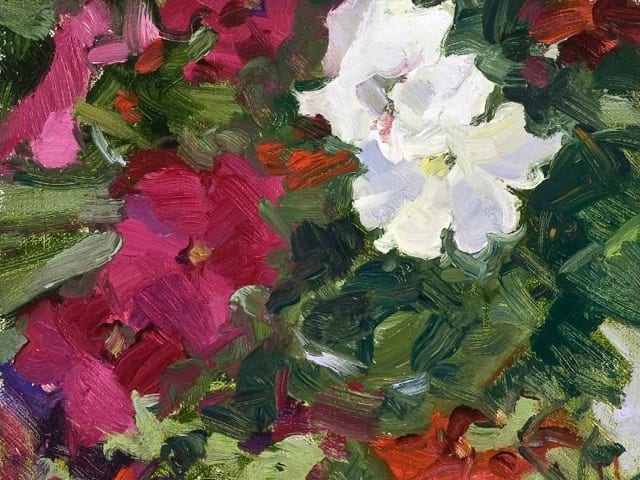
Here is my photo reference. The challenge is four-fold:

  1. Realistically represent the rocks, flowers, sun and shade.
  2. Convey feeling – the excitement of being surrounded by these glorious, golden flowers, the feel of the warm, spring sun and cool shade.
  3. Express the reality AND the illusory in my own personal painting style.
  4. Composition: maintain the first rule of composition & design which is asymmetry and create a value pattern.

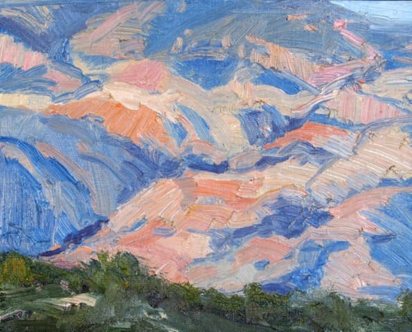
To get loosened up, I painted this little abstract study – what an advantage it gave me!
Julie Gilbert Pollard -Dutchman's Gold Study

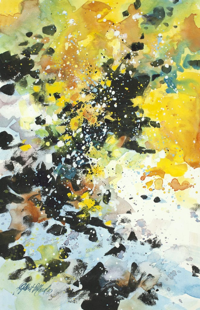
  1. I did not concern myself with portraying any parts of the picture realistically. I squinted my eyes and sloshed in the colors and dark value pattern, then splattered white gouache.
  2. Instinctively I set the bottom boulder at a slant rather than the horizontal direction in the photo, which improved the composition.
  3. The quick, intuitive paint application allowed me the freedom to explore without worry the explosive action of the flowers contrasted with cool, blue shade that wasn’t exactly like the photo but what I saw in my mind’s eye.
  4. While it prepared me for the “real” painting, it was fun!

"Dutchman’s Gold" by Julie Gilbert Pollard - Mixed Media - 14 x 11
“Dutchman’s Gold” by Julie Gilbert Pollard – Mixed Media – 14 x 11

Julie Gilbert Pollard - Dutchman's Gold - Black & White Cutout - The Photo
The Photo
Julie Gilbert Pollard - Dutchman's Gold Study - Black & White Cutout
The Abstract Study
Julie Gilbert Pollard - Dutchman's Gold Study - Black & White Cutout
The Realistic Painting

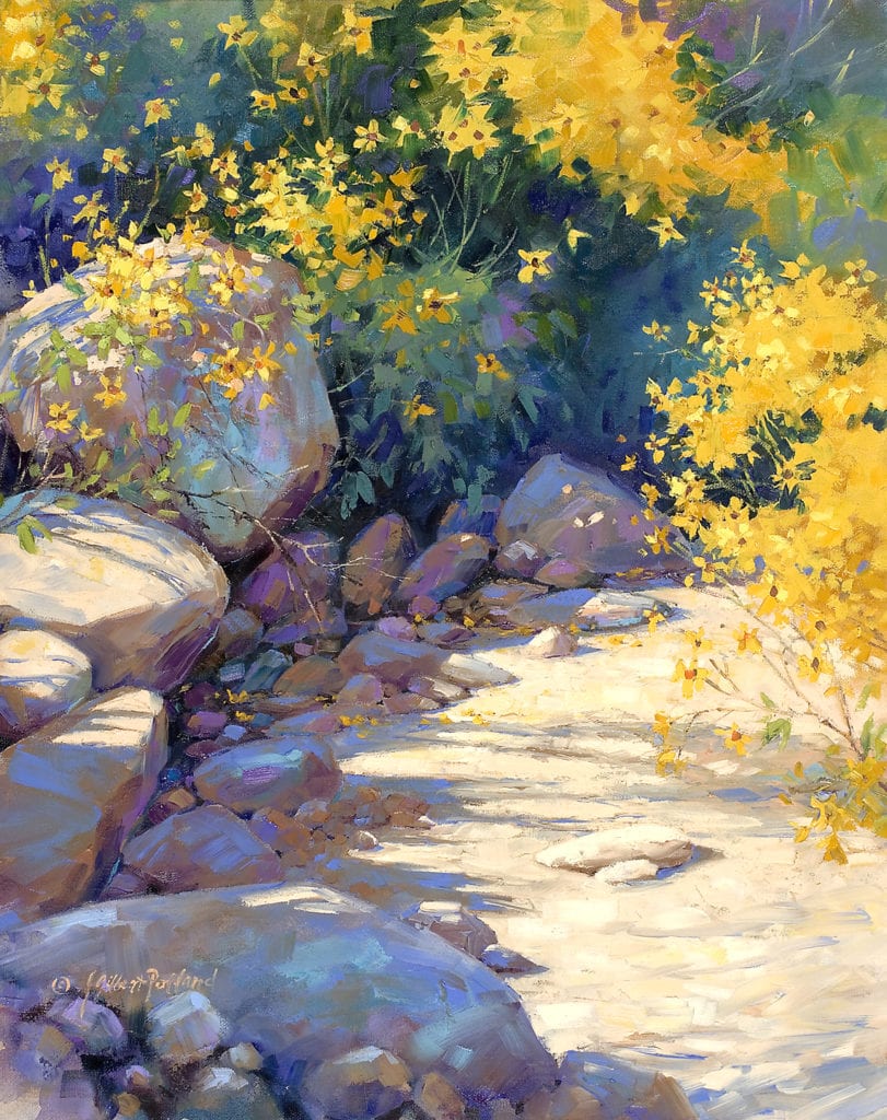
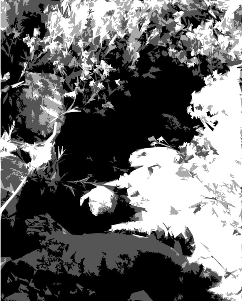
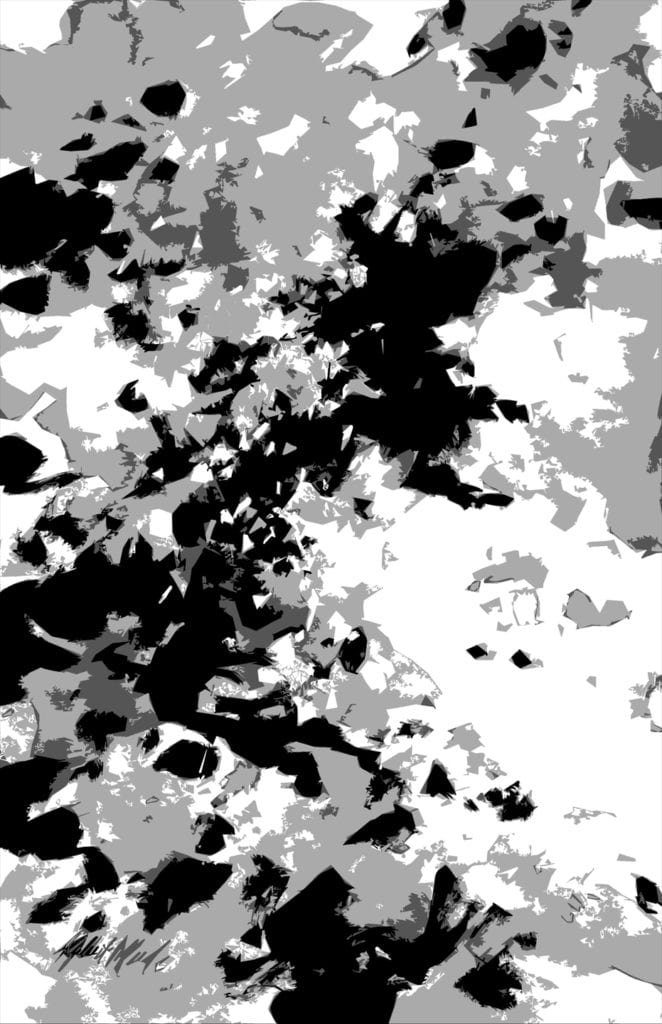
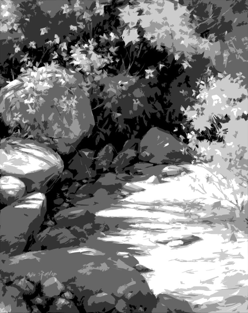
These three illustrations show the progression from photo-reference to abstract study to finished realistic painting. They have been “Photoshopped” so you don’t have to squint to see how the original value pattern has been carried through – but the darks also opened up to allow the viewer see into the shadows.
While I was using the abstract study to get in touch with the painting I had in mind on an emotional level, several extremely important Elements of Design were studied as well:

  • value pattern – see how the darkest value creates a solid foundation for the basic composition
  • asymmetry – asymmetrical design is achieved by placing shapes so that no shapes are centered nor equidistant
  • movement – the linkage of shapes and values lead the eye through the painting
  • repetition of similar shapes
  • variation of shape and size within the assembly of repeated shapes
  • color – color responsive to my emotional attachment to the location and memory of the day – and what I would call a “near-complement” color scheme

I consider this particular abstract study to be a finished painting in its own right. However, most of the studies of this nature I do are simply small sketch book studies. There are no rules except to relax and have fun with it. You simply must try it – it can make all the difference in the world!

How to Keep Track of Shows That You Want to Enter (and Not Miss the Deadlines)

Susan Blackwood OPA · Feb 18, 2013 · 13 Comments

In 1998 artist Howard Friedland and I were married. Right away we could see that keeping track of two artist’s deadlines could quickly get out of control. So I devised a simple system for both of us to keep track of our paperwork. Yes, we do use an art data computer program ( Working Artist ) but that is another story. As visual creatures, we needed to put all the paper work in a spot that was easy to find and not miss the deadlines. We have used this for 15 years now and are happy to pass this on to you. From now on, you won’t miss the deadlines!

Here is our system for keeping track of shows.

It uses just a few basic tools. You will need:

  • A ring binder notebook
  • Four tabbed dividers
  • Monthly tabbed dividers (January through December)
  • Plastic sleeves
  • Any Calendar that you use
1. One Ring Binder Notebook
Binder Closed
Binder Open
2. Four Dividers for the four sections
Dividers
3. Monthly Dividers
Monthly Dividers
4. Plastic Sleeves
Plastic Sleeves
5. Your Calendar of choice
Calendar of your choice
 

Step One:

Fill out the following dividers

  • To Enter
  • To Be Accepted
  • To Be Shipped
  • To Be Returned

6-Step One


Step Two:

Inside of the Section To Enter – Put the monthly dividers
7-Step Two


Step Three: How to use the system

Now you are ready to start using the system. Make sure that you have printed information on each show that you would like to enter, including computer printouts from the on line shows.
Each time you get the printed information on a show that you want to enter or are invited to enter, put the information into a clear plastic sleeve and file it under the month that the entry or images are due.
8-Start


Also, at this time, put the Entry Due Date on your calendar.
9-Tabs For example: The 2012 Oil Painters of America Western Regional Show Entry was due July 13. So I put the paperwork about the show into a plastic sleeve and filed it in July. Then I wrote that entry deadline date onto my calendar.
If the entry due date is close to the beginning of a month, I put the Information into the month before. That way I am not caught by surprise at the beginning of the month.


At this point, the paperwork on each show will start traveling through the notebook as each next stage is met.
10-To Be Accepted


After you enter the show, move that plastic sleeve, containing the paperwork about that show, to the next categorythe To Be Accepted section. This is the section for all entries and applications that you are waiting to find out the results (accepted or declined).
11-To Be Shipped


Once you find out that you are accepted in in the show, that plastic sleeve containing the paperwork about the show moves to the To Be Shipped section.
Mark your calendar for the date that you need to ship or deliver the painting.
If you knew from the beginning that you were invited to the show then skip the To Be Accepted section and put the plastic sleeve with the paperwork on the show immediately into To Be Shipped section.
12-To Be Returned
Once you ship your painting to a show, move the plastic sleeve containing the paperwork for the show into the Waiting to Be Returned section.
This is very important because we have had one or two shows that didn’t return the paintings for a long, long time!!
Once the painting is no longer at the show, you can clear out the plastic sleeve and file your info on the show, or throw it away.

That’s it!

This is a great and easy system. We only use one book for all of the paperwork that comes in on shows for both of us.
Use the comment section below to let me know if you have any questions and how it works for you!
Don’t miss those deadlines anymore!

“Always save your best work for the shows.”– Zhiwei Tu

Is There A Heaven For Paintings?

Ms. Jane Barton · Feb 11, 2013 · 10 Comments

Jane Barton - Santa Catalina Sunset
Santa Catalina Sunset (o/c) – Jane Barton
I’ve painted so many bad paintings. I know I’m not alone. Ned Jacobs once admitted in a lecture to a packed audience of admiring artists and collectors that he probably only saved ONE in FIFTY paintings or sketches. The crowd gasped in horror. I just wanted to know where he leaves his garbage for pick up. Matt Smith advised the artists in a class I was taking to be sure to destroy any paintings–slash, paint over or burn ‘em–before we threw them out so we wouldn’t see these dogs in a retrospective years later. I have a book of Manet still lifes that proves this to be true. Someone decided to include every floral still life they could find, regardless of the quality or finish. Manet would have been appalled to see what was in this collection because even he had paintings not worth finishing. Of course, I tell my students to keep their early paintings, even if they’re horrible, just to see how much better they are than when they started. Sometimes we all feel like we’re not making any progress at all and it’s always good to have visual proof that we’re improving, even if it’s only a little.
Petunias by Jane barton
Petunias (o/c) by Jane Barton
My problem is getting rid of anything. Ever. Sometimes I cut up canvases and give them to friends as bookmarks–the part is so much better than the whole. Recently, advised by a painter friend, I’ve started chopping up old paintings to find new ones, cropping out the unsuccessful parts and keeping the part that works. It’s surprising how freeing and fun this process is for me, and the result is often a painting I’m happy to hang. Then, of course, I hold onto the bad parts just in case those expert artist elves kindly sneak into my studio some night to fix them while I’m sleeping. Finally, there are many paintings that are so bad from edge to edge that I’ve started painting right over them–upside down so that I’m not distracted by the images–and that’s been a great exercise for me. There’s something about knowing I’ve already hit bottom that makes it easier to be fresh and confident on canvas. There’s nothing to lose. I’m recycling, which is always good, and I love the colors and ghosts that peak through the new painting, adding texture and interest. As Randy Nelson from Pixar University once said on learning and creativity, “…the core skill of an innovator is error recovery not failure avoidance.” I guess you could call this my recovery program for troubled paintings.
Who's Counting? - Jane Barton
Who’s Counting? (o/c) by Jane Barton
So, no, good paintings don’t go to art heaven and bad paintings don’t sink into hell, unless that’s what you call the back of your paint closet. Good paintings live wonderful lives on the brightly lit walls of collectors and museums. Bad paintings usually never see the light of day, but I’d like you to consider that they might have an afterlife in “recovery” or “re-discovery”. Try it, until you decide it’s just time to thank them for their service and lessons learned, give them a dignified burial, and send those bad boys to the afterlife, so they won’t come back to haunt you.

Dianne Massey Dunbar Interview

Mr. John Pototschnik · Feb 4, 2013 · 3 Comments

Diane Massey Dunbar Headshot

“I paint ordinary objects and scenes from everyday life. While I have the highest respect for artists who paint vistas and exquisite nudes and the like, I believe that there is a great deal of beauty in the world that often goes unnoticed. The amazing color in raindrops, the variety in fallen autumn leaves, the interesting greens one finds in a stack of French fries, there are endless opportunity for paintings. My hope is that people view the world just a little bit differently after seeing my paintings.”

"Red" by Diane Massey Dunbar OPA - 4x4 -Oil
“Red” by Diane Massey Dunbar OPA – 4×4 Oil
I’m a huge fan of Dianne Massey Dunbar. Her work is exciting and joyful. It reminds me somewhat of Wayne Thiebaud’s work, but I find Dunbar’s work every bit as exhilarating. Thiebaud speaks of painting as celebrating the joy of living, the thrill of experimentation and expectation, I think Dianne would fully agree with that. Her works ooze with enthusiasm and controlled recklessness.
What is so amazing to me is her fabulous ability to take the most mundane of objects and transform them into delectable treats. How can someone take a simple tube of lipstick, or plain glass bottles, or even raindrops on a windshield, and transform those things into objects of desire…paintings sought after and cherished? Dunbar does it and makes it look easy. How she does it is what this interview is about.
"Driving Through A Downpour" by Diane Massey Dunbar OPA - 12x16
“Driving Through A Downpour” by Diane Massey Dunbar OPA – 12×16

"Driving Through A Downpour (Detail of raindrops on windshield)" by Diane Massey Dunbar OPA - 12x16
“Driving Through A Downpour (Detail)” by Diane Massey Dunbar OPA – 12×16
Not only is Dianne extremely thorough, even fastidious in her preliminary work for each painting, but what is so admirable is her ability to take risks…to try new things. I talk to my students about not being afraid to fail, but Dianne lives in that world with every painting. Just examining a “simple” raindrop she has painted, I can only shake my head and ask, “How does she do it?” Each individual drop is not only a masterwork of texture but is also full of reflected color. Paralyzing fear must be thoroughly conquered when attempting a painting such as Driving Through a Downpour. Quite amazing.
Mark Smith, co-owner of the Greenhouse Gallery of Fine Art in San Antonio, said, “To view one of Dianne’s paintings is to experience complexity in its most artistic form. Most often, her choice of subject matter is quite complex, challenging and can be categorized as “crazy”. However, this type of complexity is the stage that most accurately reveals Dianne’s stunning sense of color and expert brushwork. Dianne is a master of articulating her inspiration and the “story” that she finds in the most mundane and overlooked objects and moments.”
"Gumdrops" by Diane Massey Dunbar OPA - 10x18
“Gumdrops” by Diane Massey Dunbar OPA – 10×18
I wondered how she went about selecting her subjects…”I try to remain open to what I consider interesting subject matter. If I am not interested in the subject before I paint it, I have found the resulting painting looks flat. I carry a small camera with me wherever I go, and when I see something that catches my eye. I photograph it. I may or may not decide to paint the subject matter, but at least I have a subject to consider. My still life’s are painted from the objects; the other material is painted from photos. When I take photos I don’t limit myself to one or two. I may take twenty or thirty of the same subject, from different angles, cropping them, expanding them and bracketing them. Once I have an idea that I like, I then take the photos or the objects and work on designing the painting. So, I would say the composition or design of the painting is very important when selecting a subject. If the shapes and composition are not strong to begin with, it will not matter how fancy the brushwork, or sophisticated the color scheme or values. The painting will not work.”
"Cans" - 12x12 - Diane Massey Dunbar OPA
“Cans” – 12×12 – Diane Massey Dunbar OPA
I will not be featuring Dianne’s complete interview here since it is quite lengthy. Her thoughtful answers have actually sparked topic ideas for future blogs, so you’ll be hearing more from her in the future.

Visit John Pototschnik’s Blog for more articles.


And now more from Dianne Massey Dunbar…

“I want to thank John Pototschnik, whose work I have been watching for some time now and greatly admire, for asking me to answer a few questions. I have tried to answer these questions honestly and openly and I truly hope that my comments are helpful.”

"Cityscape In Green" - 8x8 - Diane Massey Dunbar OPA
“Cityscape In Green” – 8×8 – Diane Massey Dunbar OPA
How would you define your role as an artist?  I think we all have an important place in the world at large and are equipped with unique skills and resources. Some of us are called to be doctors, others to be lawmakers or dancers or carpenters or electricians or teachers or florists. My world, my role, is to paint; to use my training and whatever talent I have to create images that are meaningful to me and hopefully have an impact on others. In a way it is like storytelling but my paintings are my voice. There are other aspects to the role of an artist beyond painting that may include encouraging fellow artists, leadership, teaching and involvement. Primarily through, I need to show up at the easel.
"Fire Engine" by Diane Massey Dunbar OPA - 5x7
“Fire Engine” by Diane Massey Dunbar OPA – 5×7
How much of your work is intellectual vs. emotional…and how would you define the difference?   I would define intellectual as rational, deliberate, thoughtful and thought out, planned and intentional. I believe it includes problem solving that in turn fuels creativity. I would define emotional as one’s personal likes and dislikes, opinions, sentimentality, excitement, spontaneity, responsiveness and our relational selves. As for those rare moments of inspiration, well I think they are largely emotional, but I also believe they result from an intellectual process. In my work, it takes both the intellectual and the emotional to create a painting.
For me, the intellectual part of painting is the process of designing the painting, the drawing involved, and the problem solving along the way. It is not sentimental and it frequently is not much fun. There is skill and experience that an artist draws on, and every painting, no matter how well it has been thought out, has an area somewhere that is troublesome. There are times when work is tedious or even boring. The emotional part of painting is for me what I like and don’t like, the subject matter that I paint, the thinness or thickness of paint, the “play” time I have with a painting, and the colors I may choose. And for good or for bad, I emotionally invest in my paintings.
Finding subject matter that is exciting is personal. I am drawn to simple common images: candy bars, cupcakes, rain on my windshield, jars, dishes, road crews, and reflections. After that, almost all of my preparation for each painting is intellectual and frankly a little tiresome. I study various compositions and value arrangements for my chosen subject matter long before I put brush to canvas. I tape the value studies upside down in my kitchen and study them to see if the design and the shapes are working. Once I have a design, only then do I begin painting. And for me, the beginning and early stages of a painting tend to be thoughtful and deliberate and even a little intimidating.
However, I absolutely love to play with paint, so when I have a painting far enough along, I can then begin to have fun with it. I might decide to smear paint, or flick it. I use any number of implements to play with paint, from the jagged edge of gum wrappers to torn pieces of paper towel rolls to palette knives to inexpensive brushes that I have cut gaps in. Today I experimented with my rubber kitchen spatula (I had fun but unfortunately was not happy with the result!).
I think non-artists have a notion that art is the result of “inspiration”. Well, there are times of inspiration, when instinct takes over and something happens on a canvas that I probably can never do again but I look at it in wonder. However, those times are few and far between for me. Being an artist is very much like other careers, there is leaning and thinking and hard work involved.
"From The Outside Looking In (Photo Reference)"
“From The Outside Looking In (Photo Reference)”

"From The Outside Looking In (Value Study)"
“From The Outside Looking In (Value Study)”

"From The Outside Looking In" by Diane Massey Dunbar OPA - 20x20
“From The Outside Looking In” by Diane Massey Dunbar OPA – 20×20

Describe your typical block-in technique, the thoroughness of your initial drawing, and the part photography plays in your work?  I have more than one process that I use, depending on my subject matter. If I am doing a relatively simple still life, between one and three objects, I will do one or two quick thumbnails on a piece of inexpensive canvas board, and if I am happy with the shapes, I will begin to sketch those shapes in on my canvas. On the canvas, I may do a very simple sketch, or a more complete sketch, either very lightly with pencil or with a small brush. I then paint, working from background to foreground, massing in the large areas of a single value without much regard to detail. Once I have the large value shapes in, I can begin to break them down into smaller shapes, etc. I try to work on gradation and edges as I go along.
On the more complex paintings, I generally use photographs and work with a grid system. I might start with 20 or more digital images that I study. I look at the overall design, and see what happens when I zoom in or crop the images. I narrow these down to maybe the top five and I have those printed at my local camera shop. Then I make black and white Xerox copies of the color photographs. After the copies are made, I use inexpensive poster paint in white, gray and black and paint directly on the copies exactly where I think I want the light value, the medium value and the dark value. For each photograph I might do two different value studies, to see what the resultant design is. I do this by hand instead of computer because I can make all kinds of decisions when I work by hand that might go unnoticed otherwise.
Value Study For A Possible Future Work

Every part of that image needs to fall into one of those three values (I have been known to work with four values, but that gets very complicated). I then tape them up in my condo and live with them for a day or two, turning them upside down and sideways to see if the design is satisfactory. It is tedious, but I have found this process works for me and I have more successful paintings. After I have a design I like, then I have that photograph enlarged. However, I keep the value study because that is my “roadmap” for the painting. So, I paint the image that I have chosen, using the values of my value study. If I am working on a square canvas, I might work from an 8″x 8″ photograph, and work on a 16″x 16″ canvas, or 20″x 20″ canvas or even a 24″ square canvas. The photograph is taped to lightweight cardboard and I use a sewing needle and thread to grid the photograph so that if necessary I can move the thread aside to see what’s underneath. I usually use 1″ squares on the photograph. I grid the canvas (the canvas must be the same proportion as the photo you are working from) with very light pencil lines, usually in two or three inch squares. I then paint each square, starting from the upper left hand corner and working to the right. After my canvas is painted, then I go back and make necessary corrections, work on edges, simplifying, etc.
"Late Afternoon" by Diane Massey Dunbar OPA - 24x18
“Late Afternoon” by Diane Massey Dunbar OPA – 24×18
What colors are most often found on your palette?  I love color! So, you would find a great many colors on my palette. My ‘stock’ colors are: Titanium White, Cadmium Lemon, Cadmium Yellow Light or Medium, Cadmium Orange, Cadmium Red Light, Alizarin Crimson (permanent), Dioxazine Purple, Cerulean Blue, Cobalt Blue, Ultramarine Blue Deep, Permanent Green Light, Cadmium Green, Sap Green (permanent), Phthalo Green, Yellow Ochre, Burnt Sienna, Burnt Umber, Torrit Grey (Gamblin).
I use other colors in different situations, especially Zinc or Transparent or Flake White Replacement. There are times I really need Indian Yellow. Caucasian Flesh is a very useful color in a number of situations. I also use Venetian Red or Naphol Red and a number of other greens, especially Emerald Green Nova. I mix my blacks, but I do have a tube of black that I use if needed.
Some of these are quite transparent in nature, and some opaque. An artist needs to know the tinting power of different colors and use the intense colors sparingly (Alizarin Crimson and the Phthalos immediately come to mind). However, a lot of wonderful effects can be achieved with a more limited palette, so you do not need all these colors to produce wonderful paintings. Indeed, if you are new to painting, you would probably be best served by using a more limited palette.
"Ten" by Diane Massey Dunbar OPA - 20x20
“Ten” by Diane Massey Dunbar OPA – 20×20

"Nancy" by Diane Massey Dunbar OPA - 27x23
“Nancy” by Diane Massey Dunbar OPA – 27×23

"Cups And Saucers" by Diane Massey Dunbar OPA - 10x10
“Cups And Saucers” by Diane Massey Dunbar OPA – 10×10

How do you decide on a dominating color key for a painting, and how do you maintain it?  I use the subject matter to guide this decision. If it is an overcast cloudy day, then much of my painting will be grayish. If I am painting toys, obviously the colors wil be much brighter. However, too much pure color is overwhelming. I mix almost all of my color. I reserve pure or intense color only for small splashes or small areas.
You have entered a number of significant art competitions. Why are art competitions important to you and how do you go about selecting the paintings for these shows?   I usually enter two to three art competitions per year. I started by entering local and state competitions, and when I was comfortable with those, I started entering regional and national competitions. There are two main reasons that I enter art competitions. The first one is to see how I stack up against other artists. Secondly, I enter competitions to hopefully have my work seen by other artists, collectors, galleries, and even magazines. There are other good reasons as well: meeting other artists, being inspired, and being challenged. Some art competitions have seminars that an artist can attend to learn and expand their knowledge on any number of topics. And, let’s face it, competitions can be fun! As far as selecting a painting, when I have what I feel is a good to exceptional painting and a deadline for a show that I want to enter is approaching, I will try to put the painting aside and keep it to enter in the show. Be aware that competitions can be expensive, there are entry fees, shipping and storage fees, and perhaps travel fees if you decide to attend the opening.
"Ketchup, Mustard and Relish" by Diane Massey Dunbar OPA - 11x14
“Ketchup, Mustard and Relish” by Diane Massey Dunbar OPA – 11×14
What advice do you have for a first-time collector?  Speaking as an artist, it is my hope that my paintings find homes where they are loved. So, I suggest that you buy a painting that you love and respond to. Also, trust your instincts. You will hopefully have it in your home for years; you will look at it over and over, perhaps seeing something different every time. So, before your worry about who the artist is, or how the colors might work in your home, look at the painting and see how you feel about it. Does the painting interest you? Do you want to get close to it and see all the beauty in the brush strokes and splashes of paint and even fingerprints? Do you find yourself thinking about a particular painting you have seen but have not yet purchased? You will know it when the right one comes along.
"City Sidewalk" -18x36 - Diane Massey Dunbar OPA
“City Sidewalk” -18×36 – Diane Massey Dunbar OPA
If you could spend the day with any three artists, past or present, whom would they be?  Every artist brings something different to the viewer. I admire so many artists, from Rembrandt to Wyeth, Monet to Van Gogh to Fechin. And, there are many current artists that I greatly esteem. I cannot begin to choose one over another, as they are each brilliant in their own individual way. However, I will state that for many years I struggled to appreciate the work of Vincent Van Gogh. Then, on a trip to New York, almost twenty years ago, I went to the Metropolitan Museum of Art. It was there that I saw my first Van Gogh in person. I could ‘feel’ the passion and the painting just by looking at it. I remember standing there for a very long time, with tears running down my face, finally getting it. I have never forgotten that experience. It was profound.
"Shopping Cart" by Diane Massey Dunbar OPA - 20x30
“Shopping Cart” by Diane Massey Dunbar OPA – 20×30

What do you think of that amazing interview, folks? Personally, I so appreciate Diane’s willingness to submit to this interview…and being so thorough in her answers. I hope you do also.

Here are important links to see more of OPA Signature Member Diane Massey Dunbar’s work:

  • Dianne Massey Dunbar website
  • Greenhouse Gallery of Fine Art
  • Gallery 1261

Click here to receive John Pototschnik’s monthly newsletter

Footer

  • Home
  • About
    • Mission, Policies & Bylaws
    • Board of Directors
    • Presidential History
    • Frequently Asked Questions
    • History
    • OPA Staff
    • Contact Us
  • Membership Services
    • Member Login
    • Membership Information
    • State & Province Distribution For Regionals
    • Update Member Information
    • Membership Directory
    • Contact Membership Department
  • Events
    • Exhibitions
    • Online Showcase
    • Lunch and Learn
    • Virtual Museum Road Trip
    • Paint Outs
  • Resources
    • Brushstrokes Newsletters
    • Ship and Insure Info
    • Lunch & Learn Video Archives
    • Museum Road Trip Video Archives
  • Services
    • Sponsorship Opportunities
    • Scholarships
    • Critique Services
    • Workshops
    • Have A HeART Humanitarian Award
  • Online Store
  • Awardees
  • Blog
    • OPA Guest Bloggers
    • Blogger’s Agreement (PDF)
    • Comment Policy
    • Advertisement Opportunities

© 2025 OPA - Oil Painters of America · Design by Steck Insights Web Design Logo