In a spring post, I spoke about the importance of drawing in the hierarchy of a painting’s success. Value was the second item listed:
1. Drawing
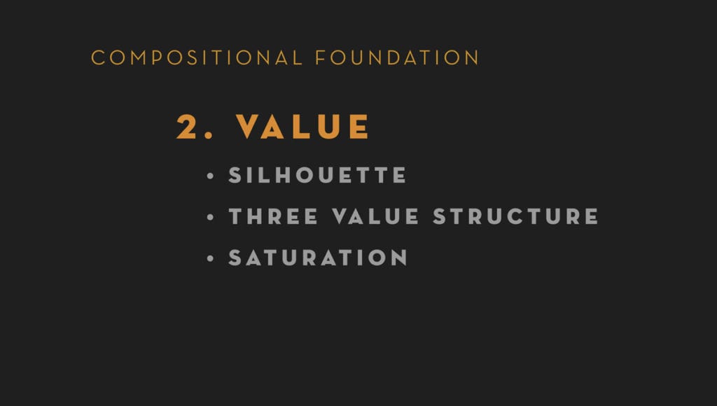
2. VALUE
3. Color
4. Edges
In this post I’ll mention a few items regarding the importance of value as a foundational principle of strong work.
Drawing alone can’t fix a piece, the values have to be working. I fully acknowledge that we all know that correct values are important in painting, but the level to which I see even experienced painters (myself included) struggle with this convinces me of the need for constant awareness. As with so many things in life, it is the seemingly simplest things that are the most profound and the most challenging to master.
I break value down into three ideas:
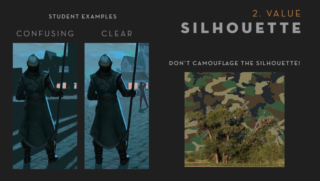
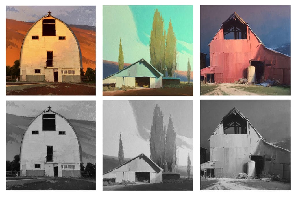
1. SILHOUETTE:
Basically, it comes down to camouflage. Camouflage works because it scatters contrast and breaks up the silhouette of shapes. This makes sense intellectually, but even being aware of the effect, it takes a conscious effort to avoid it happening in artwork. Use this to your advantage and keep things clear in your focal point and more compressed value-wise in other areas.
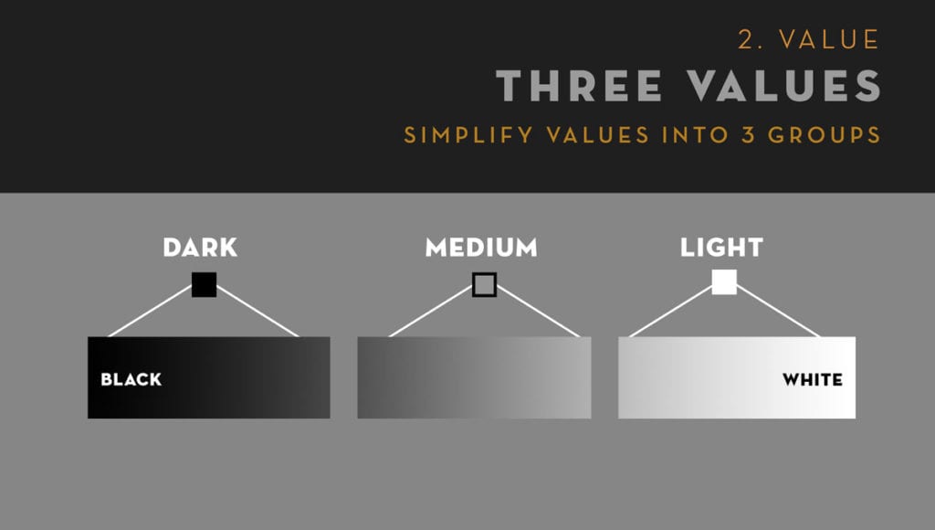
2. THREE-VALUE STRUCTURE:
I can guarantee that nearly any painting I am moved by has a simplified value structure. Compressing and simplifying values to Dark, Medium, and Light will help communicate more clearly and feel more ‘real’. Again, it is seemingly straightforward, but it is surprisingly hard to do well. Thinking of these three distinctions in terms of ‘value families’ instead of only one value option may help.
3. SATURATION:
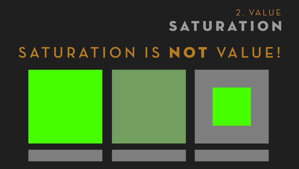
Saturation isn’t value, but we sure act like it is sometimes. We get sucked in by the color, and we get stupid. I do this all the time (ok, some of the time).
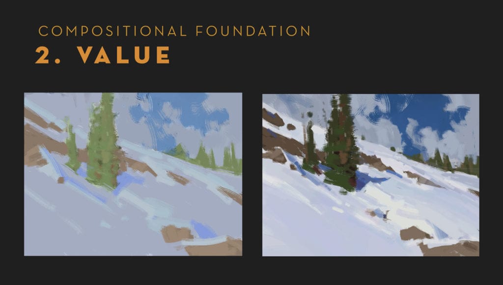
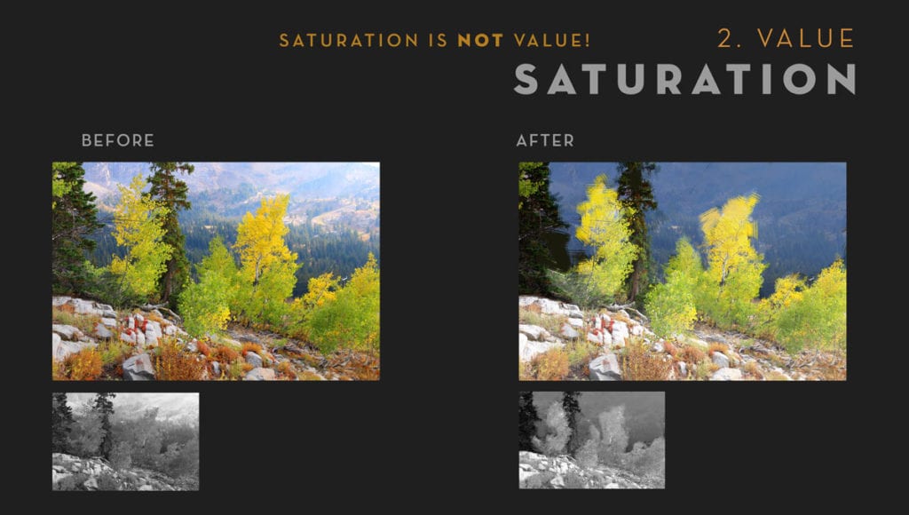
In this final example I’ve shown how I adjusted a piece of photo reference by pushing the surrounding value a little darker so as to read light-on-dark, as it was already leaning in that direction.
Usually, if a color is vibrating your eyes, you’ve got a value problem because the value and saturation are getting too close. This obviously can be used to your advantage in areas that you want to shimmer (such as a sky or mountain) by alternating temperatures slightly while keeping values close. But when you see this shimmer happening all around your main shapes you should pay attention to the alarm bells going off in your head because the shapes aren’t going to read well. Usually getting some distance from your canvas (i.e., across the room), and squinting is a good way to see what’s really going on.
Finally, to quote the great art teacher Leon Parson: “If there is a problem with your painting, it comes down to one of five things (Imagine him holding up a hand and counting down on fingers): value, value, value, value, or value.”
Happy Painting!