A pointed Q-Tip. A tip ( pun intended ) I learned from Casey Baugh. They are great to clean up an edge or shape when the brush gets out of control or for accidental blobs. I like the kind that is rounded on one end and pointed on the other. Both ends come in very handy.

annkraftwalker.com
Archives for September 2015
Stuff I Wish Someone Had Told Me
You probably already know the following things, which I have slowly picked up over the years, but just in case you missed some, here they are.
When painting, your results will reflect the opposite of the lighting conditions in which you are working. If you are in a bright space or outdoors without shade or an umbrella, your painting will be dark. If you paint indoors under cool artificial light, your painting will look warm in more normal situations. And so on. I believe that generally Old Masters had dimmer studios, perhaps with a small north light window. Then they got light and warmth ‘into’ their paintings. Our eyes are so amazing that they just adapt to all conditions when we work, and we may not consider where we are painting. Heck, painting is hard enough all by itself.
By the way, speaking of Old Masters, how come so few of us contemporary artists (meaning alive – a pet peeve) do representational work that is as good as the work done before there were cameras or even electricity? You got it – they worked from life.*
Because…
It’s not about a particular piece of art – it’s about the process. As I work, it’s not unusual go from thinking that a particular piece is a masterpiece, to thinking it is a disaster. And this seesaw can continue even after it’s done! Have you had the feeling of seeing an older piece and thinking “it’s not half bad”? Or even “I used to be better than I am now”! That hurts! Well after painting a lot for twenty plus years I believe that it’s about the process. Just do the work and let the evaluation take place whenever. Surely we all want to do great work so just lighten up. Just make sure the process is solid.
On a more practical level:
Egberts. Try ’em. They are all I use. They vary widely from soft (Rosemary) to stiff (Silver) to in-between (Robert Simmons and Richeson and many others). Egberts seem to be the number one thing folks take away from my workshops.
And by the way:
Stop cleaning your brushes! My friend Bart Lindstrom was painting in my studio, and at the end of the day I asked if he was going to clean his brushes. He said he just wipes them off after swishing in mineral spirits. What??? All the hours, the soap, the water…
Speaking of brushes, try using a larger brush than you are quite comfortable with.
Speaking of turp, I seem to be using far fewer brushes and a lot less turp and paper towels. The idea is to go from mixture to mixture. Sure, now and then you need to really get a clean brush, and mix a pristine mixture, but more often than not, you will get ‘unity’ by being less neurotic about paint, palette, turp, etc.
Speaking of unity, that’s actually the entire deal with all creative expression. We get so obsessed with craft and all that goes with it (which is good) that we forget what inspired us to be artists in the first place (not so good).
But wait, there’s more:
Freeze your paint. I put my palette in a box in the chest freezer. My wife is not enthralled, but I hardly throw out any paint at all.
Wipe paint off of yourself with oil, not mineral spirits.
Stand on a pad. Save your back! Standing is good because your point of view changes more. Keep your painting vertical and at eye level.
Take breaks! It is unfortunate that as we progress deeper into our work, we can get fatigued and not make good decisions. I always say a painting is just a million decisions. Always OBSERVE, MIX, AND LAY IT DOWN. I define fatigue as thinking that whatever mixture happens to be on your brush is the right one for everything all of a sudden.
Paint a good bit in standard sizes. I used to stretch all kinds of weird sizes. Now I do 11×14, 16×20, 20×24, 24×30, 30×40… you get the idea. I still do non-standard sizes when necessary, and sometimes in the field I’ll do something like paint two 10x24s on a 20×24 to get long narrow compositions. Then I have to cut them down, mount them, and order custom frames. That’s OK, but it’s nice to have a large supply of frames to interchange and help get things out the door and on the wall.
Loose painters want to be tighter, and tight painters want to be looser.
Be grateful for every day you get to make art.
I think that’s it.
*Hey, I’m as guilty as anyone of using the camera for portraits, but I learned working from life, and always try to have at least a weekly session to continue to work from life. All of my still life and landscape is from life, and I aspire do all work from life before I pass on.
Visit Rich Nelson’s website to learn more about this author.
richardchristiannelson.com
Notes: Painting Subjects in Motion
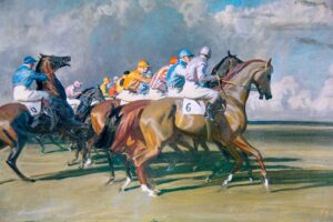
The success of American Pharaoh in this year’s Triple Crown recalled some lessons I learned years ago from the artists found around the paddocks at Churchill Downs, Saratoga, and Keeneland. Lessons that proved useful to me later in a wider range of subject matter.
Painting horses and riders, hunters and field dogs––in their environment––is a genre known as “Sporting Art” (as opposed to “Sports Art” which depicts human competition, primarily: football, tennis, NASCAR, NBA, etc). All art genres have fuzzy edges, and so do these two; my point being, due to its subject matter they present the artists with specific problems to solve: how to animate the living––and moving––subject.
First a little history:
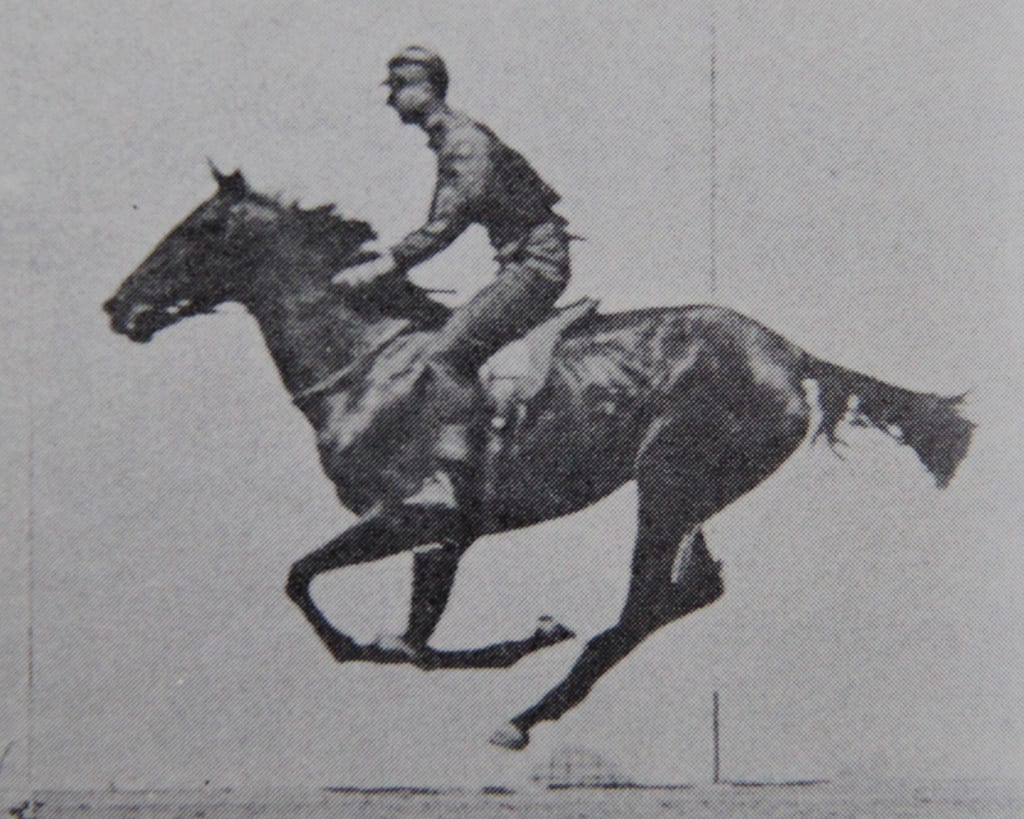
Before the advent of split-second photography, even the best efforts of the finest artists fell short when it came to rapid motion; errors made by DaVinci were still being made centuries later by Manet. A speeding animal moved too fast for the human eye to deconstruct. Invariably, a horse at gallop was depicted like a hobby horse: legs flying off in pairs––fore and aft. (Just so we are clear: that’s not how it works).
Enter Eadweard Muybridge, hired by California Governor Leland Stanford in 1872 to settle this question through methodical photographic evidence: “Does a horse, while moving at a trot, ever have all four legs suspended in the air?
To relieve your suspense––it does and they do
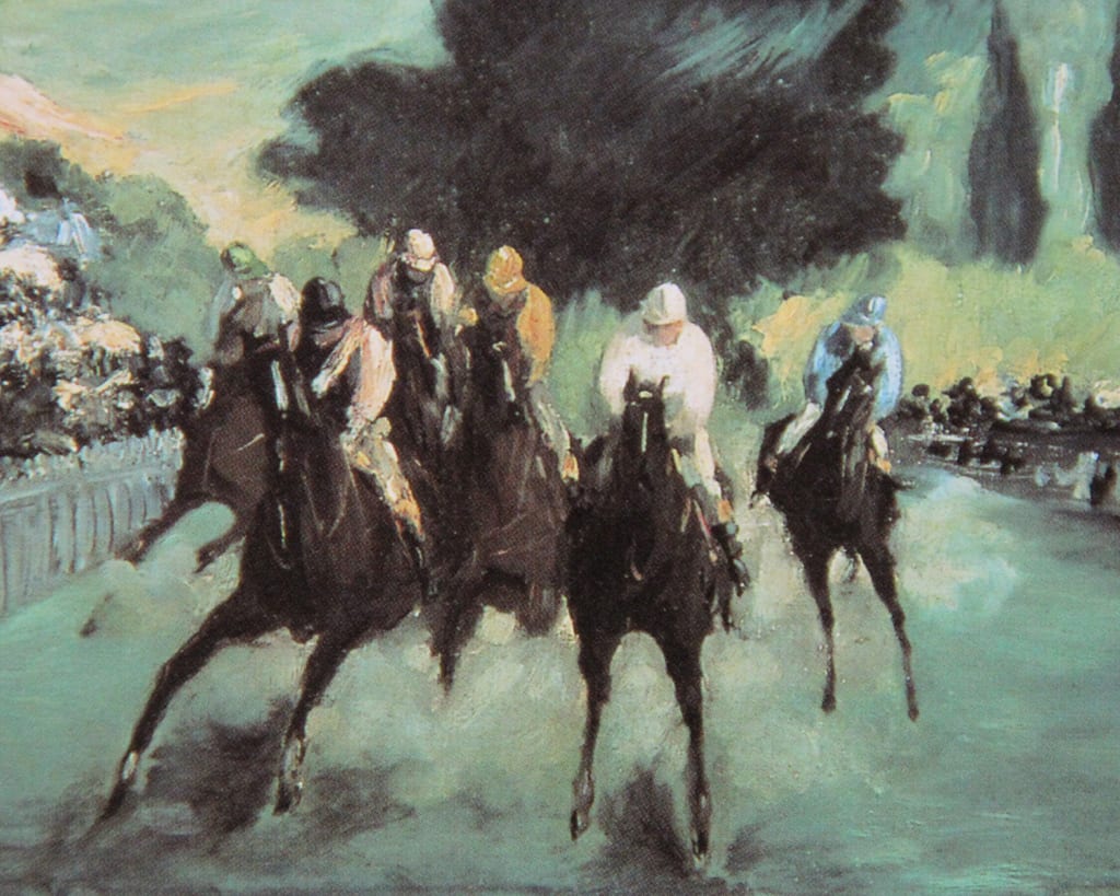
Remington did not rely on a particular Muybridge image so much as apply the knowledge he gained from the motion studies. Remington used a Kodak––extensively, for about one year––before coming back to the sketchpad. He later wrote: “The artist must know more than the camera…” He routinely altered anatomy and distorted action to attain a realistic effect of movement. For example, in Remington’s Stampede (above) not only is the action of the horse exaggerated, its rump curls unnaturally low, the rider leans forward (in perfect balance) with his horse, the brim of his hat is snapped back, the fleet gait of the horse juxtaposed against the lumbering, more static, action of the herd. The rain at their backs seems to hurry all the figures forward into the night.
Remington achieves what we all strive for: veracity without an overreliance on minutia. Something I should strive for in my writing.
The “secret” I picked up from the artists working the racetracks was to observe repeated motion––to let that be my starting point. There are patterns and rhythms in the most vigorous motion––“method in the madness” if you will.
The point is: observing the thing repeatedly––like watching waves come onto shore––until you understand it completely and can now begin to appreciate the nuances of action that make one horse/animal/dancer/wave different from another.Sir Alfred Munnings’ many “Racing Start” paintings (there are dozens) are wonderful examples. In one of the most famous of these Munnings employs the device of a clever title, one that invites the viewer to stand beside the artist as the horses are held in check a moment longer.
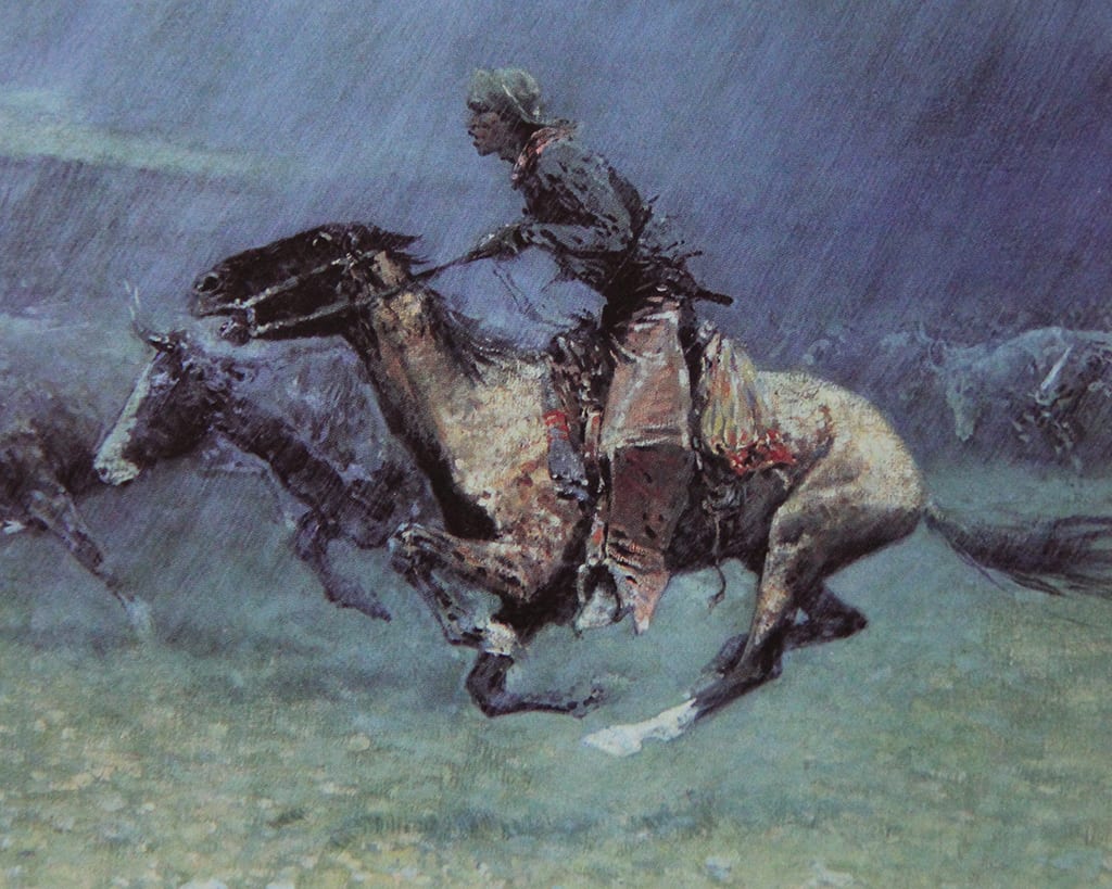
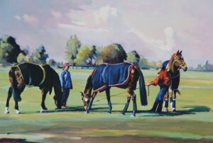
Below, is one of my efforts that (I think) illustrates motion does not need to be flagrant. Motion is implied by the tension on the lead shank of the middle horse––who is determined to reach some particulate of desire. The horse on the right is attracted by something “off-stage;” the light breeze of an English Spring indicated by the position of the tails and the sky, the handling of the background trees.
 Dance is a great opportunity to develop this skill. It is repetitious and (if you learn the choreography) it is predictable. I was led to an appreciation of dance, as subject matter, by a friend of mine––a horsewoman.
Purely as a favor (as I thought of it), I agreed to go down to our local dance studio and watch her teenage daughter prepare for that year’s Nutcracker.
I’ve been painting dance figures ever since. I immediately saw what Degas (who also painted horse racing) had seen…the appealing similarity in movement between horses and young dancers: speed, strength, focus.
I’ve been painting dance figures ever since. I immediately saw what Degas (who also painted horse racing) had seen…the appealing similarity in movement between horses and young dancers: speed, strength, focus.
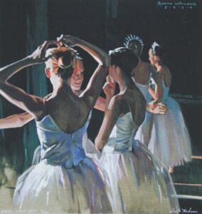 In painting dancers the challenge comes in not only depicting movement, but that movement occurring under challenging lighting. As with horses, you can’t just aim a camera, take a few (hundred) shots, and head back to your studio. You have to understand what you see to depict it accurately.
In the gloom of the wings––offstage––the dancers bend and stretch, twirl and practice, gossip; they fix their hair, wait for their cue––and do a thousand other things––many interesting moments that are gone in the blink of an eye. But my mind remembers what my camera never seems to, and the fun is to try and recreate that moment on my easel.
Today cameras fit in our shirt pockets and take better photographs than Muybridge ever dreamed. But when it comes to painting motion it still pays to “know more than the camera.”
Click here to visit Booth Malone’s Personal Website.
www.boothmalone.com
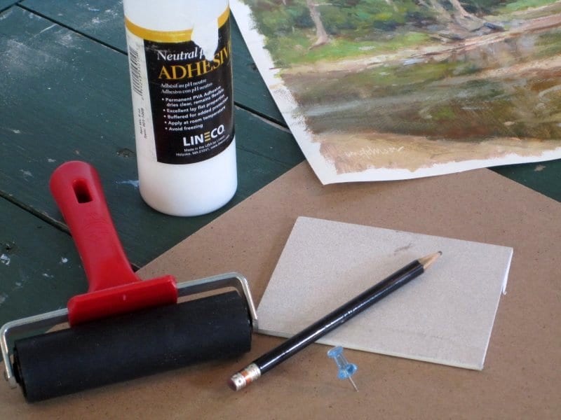
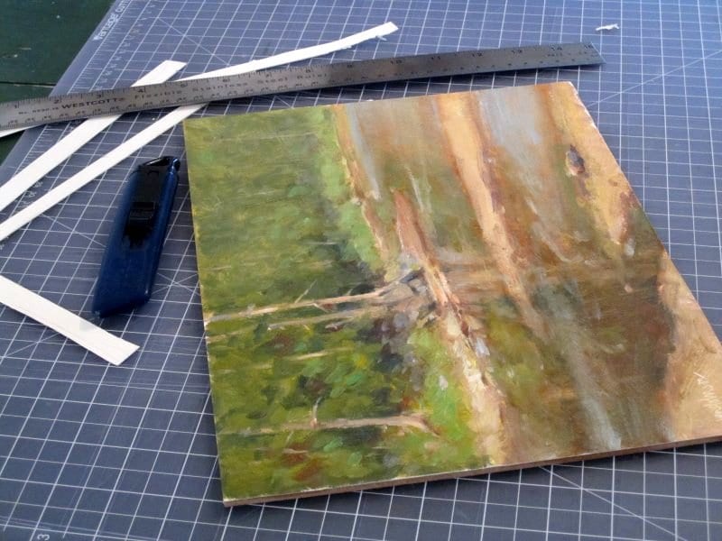
Mounting Finished Paintings on Paper (or Canvas) to Board
Lately, I’ve been experimenting with painting in oil on paper and unstretched canvas. These paintings are easier to travel with than panels or stretched canvas – you just stack them up like pancakes and interleave them with wax paper. But better yet, if you really love a piece, you can later mount it on board. Because the question of mounting has come up in my workshops, I thought I’d take a moment to describe my process.
By the way, it should go without saying, but I have to emphasize that the paper you use to paint on must be acid-free and archival. (I use etching or printmaking paper.) As a further safety step, seal the paper with PVA (Gamblin PVA or polyvinal acetate) before painting to prevent migration of linseed oil down into the paper. Best, however, would be to use canvas rather than paper. In the unlikely event you have to unmount a painting by reversing the glue, paper may be damaged in the process. Canvas should unmount without any problems.
Now, on to the process.
 Before painting, I draw a rectangle on my painting surface to indicate the boundary of the painting. (The sheet of paper or canvas is always cut at least an inch larger all the way around than what the mounted painting will be.) The rectangle helps with keeping the horizon level, which is very important in a landscape. This rectangle is the same size as the board I later will use for mounting. To create it, I just lay the board down on the surface and outline it with pencil. Although I may paint outside the line, I do make sure to keep my intended design wholly within the boundary.
Before starting the mounting process, I first check to make sure the painting is dry. Since I don’t use a lot of impasto, my paintings dry to the touch in a week or two. If I do have an area of thick paint, I press into it with my fingernail to see if it “gives.” I want to make sure it is solid enough to stand up to the pressure of a rubber brayer.
Next, I gather up my tools and materials. For mounting, I use untempered hardboard (sealed with PVA to prevent migration of acids and other chemicals up into the paper) and Lineco Neutral pH Adhesive. (The adhesive is reversible with water; another option is BEVA film, which is reversible with heat. See end of the article for details.) Additionally, I use a rubber brayer, a small square of 1/8″ hardboard, a pencil, a box cutter, a metal ruler and – here’s the key item – a pushpin.
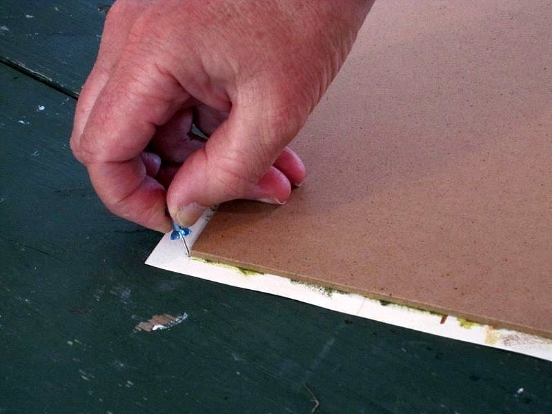
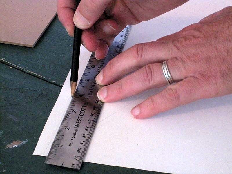
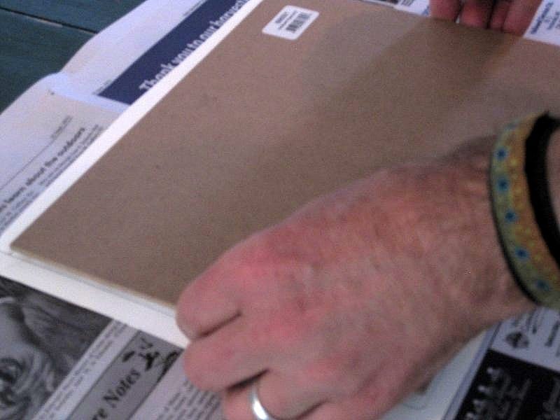
I lay the painting face-up. I position the board on it so it matches the pencilled board outline. Now, using the pushpin, I go to each of the board’s corners and make a pinprick in the paper or canvas. After removing the board and putting it aside, I flip the painting over, face-down. Looking carefully, I identify the pinpricks and, using a ruler and pencil, connect them into a rectangle. This creates a template for positioning the board exactly where it needs to go.
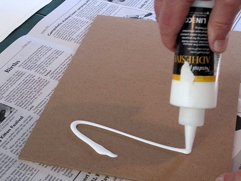
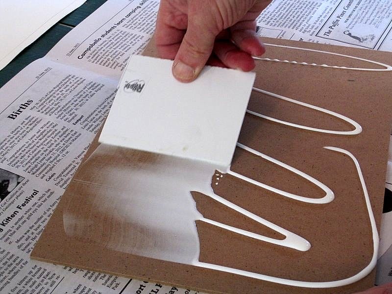
 Now, taking the board, I squeeze out enough adhesive for the job. (How much comes with experience.) I use the small square of 1/8″ hardboard to spread the adhesive evenly and all the way out to the edges. Flipping the board over so the glue side is down, I position it over the back of the painting, placing it within the pinpricks and their boundary. I press down lightly.
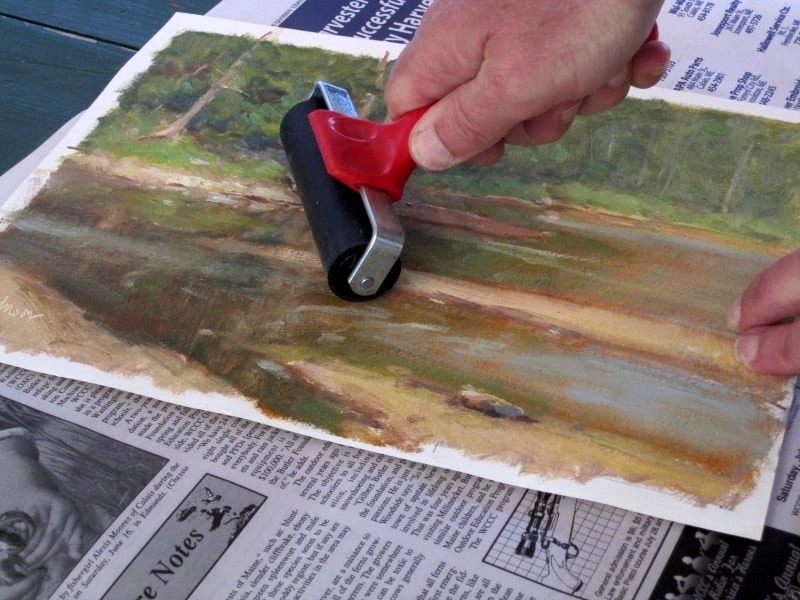
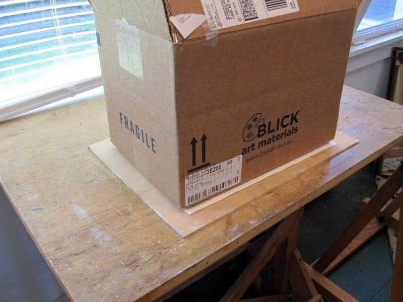 Ever so carefully, I turn over the painting and its now-attached board. This will place the painting face up. Using my brayer, I start at the center of the painting and roll out toward the edges. I press down pretty firmly to squeeze out bubbles and to flatten any warping. This is simpler than you think, especially if you are using etching paper, which is dimensionally stable and does not shrink or warp.
Once done, I flip the painting/board package over so the painting is face down. I make sure it’s on a clean surface so the paint side doesn’t pick up any dirt. Using a paper towel, I clean up any extra glue around the board’s edge. Some always oozes out in the braying step. Finally, I place a heavy weight on the assembly – a box of panels is perfect for this – and let it dry overnight.
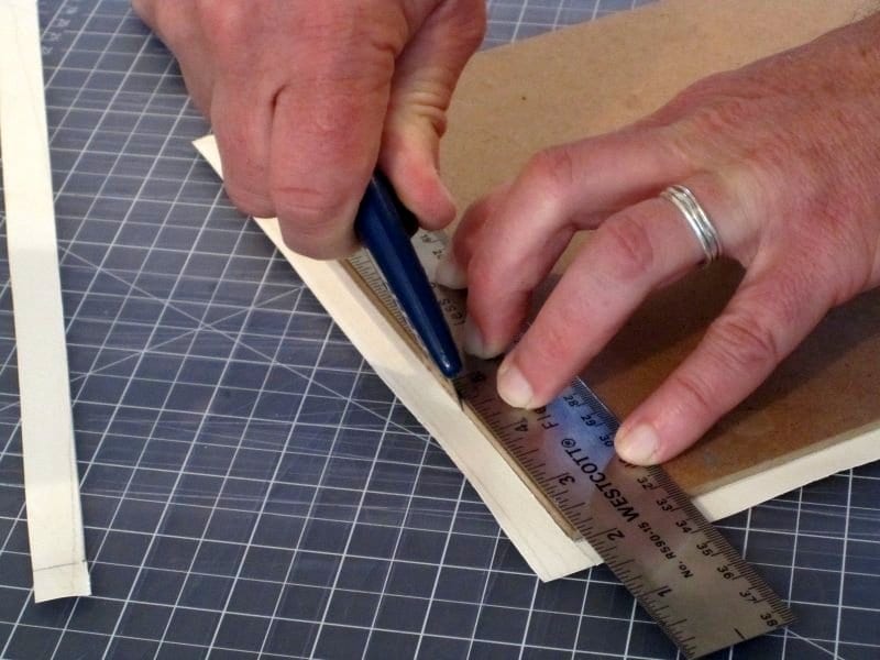
The following morning, I keep the painting with the paint side down and, using a box cutter and steel ruler, carefully cut away the excess paper or canvas. Any “burrs” created on the paper’s edge by the box cutter can be lightly sanded away with a sanding block. Sometimes I fail to get the glue all the way to the edge, and the paper may separate a bit from the board. I just squirt in a little extra glue and press down.
By painting on loose paper or unstretched canvas, I haven’t invested a lot of money in my surface. All things being equal, I’ve found paper to be a third the cost of my homemade gessoed panels. If I hate the piece, I can toss it out without guilt. But if I love it, I can mount it and frame it for a very professional look.
Earlier, I mentioned BEVA film as an alternative to mounting. This is product used by fine art conservators. The process is very similar, except that BEVA film uses heat for mounting. I use a household clothes iron set to its lowest setting (150 degrees) for activating the film. I purchase the film from www.conservationsupportsystems.com.
Visit Michael Chesley Johnson’s website to learn more about this author.
www.MichaelChesleyJohnson.com